


Former St. Louis Fed Presidents
The Federal Reserve Bank of St. Louis was chartered in 1914. Below are the former leaders of the St. Louis Fed, along with links to their bios and to archives of other materials where available.
-
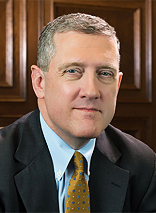
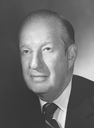
James Bullard
President, 2008-2023
James “Jim” Bullard was the 12th president of the Federal Reserve Bank of St. Louis. He served in this role from April 1, 2008, to July 13, 2023. Bullard joined the St. Louis Fed’s Research Division in 1990 as an economist and was vice president and deputy director of research for monetary analysis before becoming president.
Bio: James Bullard | Statements and Speeches of James Bullard
-
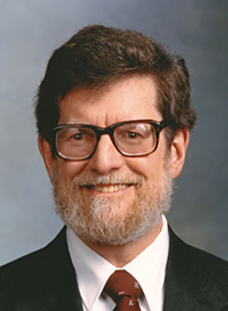
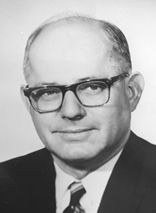
William Poole
President, 1998-2008
William Poole served as president of the Federal Reserve Bank of St. Louis from March 23, 1998, to March 31, 2008. Prior to joining the St. Louis Fed as its 11th president, Poole was Herbert H. Goldberger Professor of Economics at Brown University, where he had been a faculty member since 1974.
Bio: William Poole | Statements and Speeches of William Poole
-
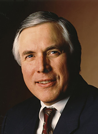
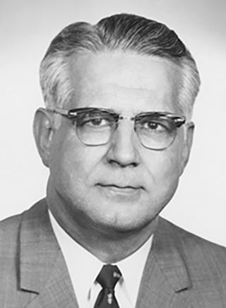
Thomas C. Melzer
President, 1985-1998
Thomas C. Melzer served as the 10th president of the Federal Reserve Bank of St. Louis. He held this role from June 1, 1985, to Jan. 30, 1998. Before joining the St. Louis Fed, Melzer spent 17 years with Morgan Stanley and ran the Government Securities Department his last five years there.
Bio: Thomas C. Melzer | Statements and Speeches of Thomas C. Melzer
-
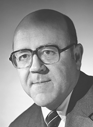
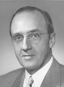
Theodore H. Roberts
President, 1983-1984
Theodore H. Roberts was the ninth president of the Federal Reserve Bank of St. Louis. He served as president from Feb. 1, 1983, to Dec. 31, 1984. Roberts brought an extensive background in banking to the role after working at Harris Trust and Savings Bank for 30 years.
Bio: Theodore H. Roberts | Statements and Speeches of Theodore H. Roberts
-
Lawrence K. Roos
President, 1976-1983
Lawrence K. Roos became the eighth president of the Federal Reserve Bank of St. Louis on March 22, 1976. He served in this role until Jan. 31, 1983. Before joining the St. Louis Fed, Roos had served as St. Louis County supervisor and also had worked as a bank executive.
Bio: Lawrence K. Roos | Statements and Speeches of Lawrence K. Roos
-
Darryl R. Francis
President, 1966-1976
Darryl R. Francis served as president of the Federal Reserve Bank of St. Louis from Jan. 17, 1966, to Feb. 29, 1976. After working as an agricultural economist at the St. Louis Fed earlier in his career, Francis rejoined the Bank in 1953 and held various positions before becoming the seventh president.
Bio: Darryl R. Francis | Statements and Speeches of Darryl R. Francis
-
Harry A. Shuford
President, 1962-1966
Harry A. Shuford was president of the Federal Reserve Bank of St. Louis from Oct. 1, 1962, to Jan. 16, 1966. Shuford joined the Federal Reserve System in 1948 as counsel for the Federal Reserve Bank of Dallas, where he was serving as first vice president before being named the St. Louis Fed’s sixth president.
Bio: Harry A. Shuford | Statements and Speeches of Harry A. Shuford
-
Delos C. Johns
President, 1951-1962
Delos C. Johns was president of the Federal Reserve Bank of St. Louis from Feb. 1, 1951, to Feb. 28, 1962. Before becoming the St. Louis Fed’s fifth president, Johns served as general counsel and secretary (and later vice president) of the Federal Reserve Bank of Kansas City, where he had worked since 1945.
Bio: Delos C. Johns | Statements and Speeches of Delos C. Johns
-
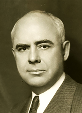
Chester C. Davis
President, 1941-1951
Chester C. Davis became the fourth president of the Federal Reserve Bank of St. Louis on April 16, 1941, and served until Feb. 1, 1951. Prior to that, Davis was a member of the Federal Reserve’s Board of Governors from 1936 to 1941. Throughout his career, he had a particular interest in agricultural issues.
Bio: Chester C. Davis | Statements and Speeches of Chester C. Davis
Note: Prior to the Banking Act of 1935, the chief executive officer of each Federal Reserve Bank held the title of governor.
-
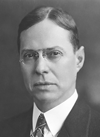
William McChesney Martin, Sr.
Governor/President, 1929-1941
William McChesney Martin Sr. was the third governor (later president) of the Federal Reserve Bank of St. Louis, a position he held from Jan. 16, 1929, to Feb. 28, 1941. Before this role, Martin became the first chairman of the board of directors and Federal Reserve agent of the St. Louis Fed on Sept. 1, 1914.
Bio: William McChesney Martin, Sr. | Statements and Speeches of William McChesney Martin, Sr.
-
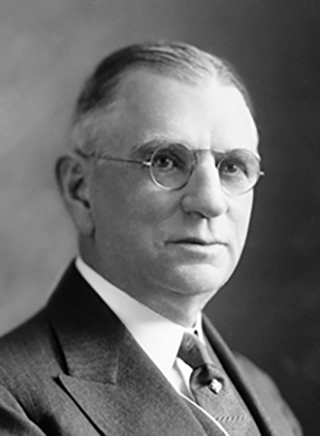
David C. Biggs
Governor, 1919-1928
David C. Biggs served as governor of the Federal Reserve Bank of St. Louis from Feb. 5, 1919, to Dec. 31, 1928. Before becoming the second governor, Biggs was on the St. Louis Fed’s board of directors, during which time he served as chairman of the board of directors’ committee of manufacturers, wholesalers and jobbers.
Bio: David C. Biggs -
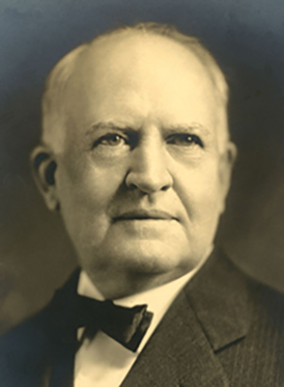
Rolla Wells
Governor, 1914-1919
Rolla Wells was the first governor of the Federal Reserve Bank of St. Louis, serving from Oct. 28, 1914, to Feb. 5, 1919. Before this role, Wells was a prominent businessman and politician in St. Louis. He later became chairman of the St. Louis Fed’s board of directors and Federal Reserve agent in 1929.
Bio: Rolla Wells | Episodes of My Life (Autobiography by Rolla Wells) (PDF)
To learn more about the history of our organization and leadership, visit the FRASER digital library and Federal Reserve History.