


The Yield Curve as a Predictor of Future Growth
In recent weeks, the steepening yield curve has become a topic of conversation among market participants. For starters, the slope of the yield curve can be measured as the difference in nominal interest rates between long- and short-term U.S. Treasury securities. Using the spread or difference between the 10-year and two-year constant maturity Treasury rates (the most common maturities used when referencing the yield curve), the difference in these yields has more than doubled from an average of 0.48% in July 2020 to 1.14% in February 2021. This increase in spread has been driven entirely by an increase in nominal yields on the 10-year Treasury note, as the Federal Reserve through open market operations has driven the yield on two-year notes very close to 0%.
Why Are 10-Year Yields Rising?
What does the increased nominal yield on the 10-year note imply, and why is it a source of angst for financial markets? One view is that the increase in 10-year yields is driven by a belief in the financial markets that fiscal and monetary stimulus throughout the COVID-19 pandemic, together with the timely arrival of vaccines, has been enough to generate expectations of higher economic growth in the future.
Another view is that under the new framework for monetary policy, a seemingly positive economic expectation is causing the fear that this growth will generate higher inflation rates than those witnessed in the last decade.
The increase in nominal yields may be problematic for future growth as borrowing costs with longer maturity dates tend to increase with Treasury yields, and this phenomenon makes long-term investment more costly.
In this post, we explore what implications the recent movement in the yield curve may have for future growth. It is common to use data from financial markets to try to extract information about the future performance of the economy. In a series of posts in 2018 and 2019, we discussed the significance of yield curve inversions as a leading indicator of U.S. recessions.See these two articles by Matthew Famiglietti and Carlos Garriga. “The data behind the fear of yield curve inversions.” FRED Blog, Oct. 11, 2018; and “Who Wants to Bet against the Yield Curve: Is This Time Different?” On the Economy, Sept. 30, 2019. We also examined which economic indicators are leading indicators of economic cycles and which ones have some predictive power over the slope of the yield curve.See this two-part series in Economic Synopses by Matthew Famiglietti and Carlos Garriga. “Predicting the Yield Curve Inversions that Predict Recessions.” Part 1, April 12, 2019, and Part 2, April 15, 2019.
The Yield Curve as Predictor
There is a very simple way to determine whether financial information contained by the yield curve has generally been accurate in their predictions of future economic growth, and that is to check whether positive changes in the curve’s slope are a leading indicator of growth in the real economy. In the figure below, generated using the charting tools available via FRED, we plotted the spread between the 10-year and two-year Treasury constant maturity rates and the growth in total nonfarm employment expressed as a percentage change from the previous year for the period from 1990 to the present. We chose to use the growth of employment as a proxy for economic growth because it is higher frequency than gross domestic product (GDP) estimates as well as being more tangible to the general public; employment status is a more concrete indicator of the economy than output.
This figure shows that the yield spread, in general, is negatively correlated with growth in employment. Peaks in employment growth follow peaks in the spread between yields on the 10-year and two-year Treasury notes. In addition, the spread is widest generally following recessions, when expectations of future growth are highest after a trough in the economy. This pattern appears generalizable and consistent over the past 25 years.
Another way to put more structure into the previous figure is to measure how the yield spread has comoved with future employment growth. The next figure establishes this relationship by depicting the correlation of the 10-year/two-year yield spread for a given month, and the actual employment growth various months later.
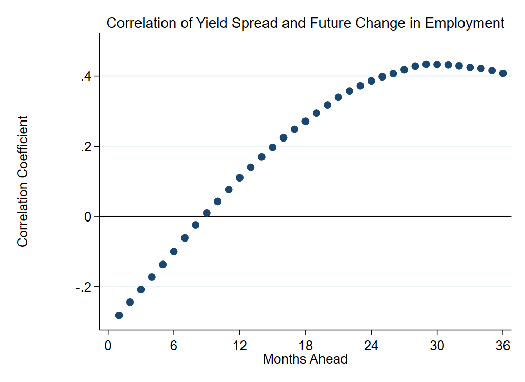
NOTE: The spread is the difference between the 10-year and two-year constant maturity Treasury rates.
SOURCES: FRED and authors’ calculations.
As observed in the first figure, initially the correlation between employment growth and the yield spread is negative. However, as you look further ahead from the current month, the yield spread’s correlation with future growth becomes increasingly positive. This relationship is very smooth and also exhibits concavity; in other words, the correlation between the two variables increases each month but by a progressively smaller magnitude. The peak of correlation occurs approximately 30 months or 2.5 years in the future. After 2.5 years in the future, the correlation begins to decline somewhat but remains relatively high.
This pattern of historic correlation between the yield curve’s slope and future economic growth approximately 1.5 to three years in the future implies that the yield curve has been a reliable and consistent indicator of future economic growth trends. If this historical trend remains constant, it is likely that the U.S. economy will experience increased economic growth in the next few years, as the market expects.
To what degree this expected growth will generate inflation remains to be seen. However, with the Federal Reserve holding down short-term interest rates, it seems likely that borrowing costs will remain relatively low for the foreseeable future, and financial markets are signaling the expectation, and likely realization, of higher economic growth in the next several years.
Notes and References
- See these two articles by Matthew Famiglietti and Carlos Garriga. “The data behind the fear of yield curve inversions.” FRED Blog, Oct. 11, 2018; and “Who Wants to Bet against the Yield Curve: Is This Time Different?” On the Economy, Sept. 30, 2019.
- See this two-part series in Economic Synopses by Matthew Famiglietti and Carlos Garriga. “Predicting the Yield Curve Inversions that Predict Recessions.” Part 1, April 12, 2019, and Part 2, April 15, 2019.
Additional Resources
- On the Economy: What Real Interest Rates Tell about the Recession to Follow
- On the Economy: What Is Yield Curve Control?
- On the Economy: Not All Bursting Market Bubbles Have the Same Recessionary Effect


Citation
Matthew Famiglietti and Carlos Garriga, ldquoThe Yield Curve as a Predictor of Future Growth,rdquo St. Louis Fed On the Economy, April 15, 2021.
This blog offers commentary, analysis and data from our economists and experts. Views expressed are not necessarily those of the St. Louis Fed or Federal Reserve System.
Email Us
All other blog-related questions