Who Wants to Bet against the Yield Curve: Is This Time Different?

One of the most robust facts in economic cycles is that a yield curve inversion has occurred within two years of every U.S. recession since at least 1960. This phenomenon occurs when the yield of a shorter-maturity bond exceeds the yield of a longer-maturity bond, and it is widely considered one of the best leading indicators of U.S. recessions. Its predictive power has led the financial and economic communities to closely follow inversions.
Negative Territory for the Yield Curve
Starting in June, the monthly spread between the 10-year and three-month Treasuries became negative, and the monthly yield spread has not returned to its usual positive territory despite the recent cuts to the target range for the fed funds rate totaling 50 basis points since July.
Analysis of Yield Curve Inversions
In October 2018, we predicted that the yield curve would have an inversion in the summer of 2019.Famiglietti, Matthew; and Garriga, Carlos. “The data behind the fear of yield curve inversions.” FRED Blog, Oct. 11, 2018. Performing a historical analysis, we identified two common leading indicators of U.S. recessions:
- The manufacturing employment growth rate
- The construction employment growth rateFamiglietti, Matthew; and Garriga, Carlos. “Predicting the Yield Curve Inversions that Predict Recessions: Part 1.” Economic Synopses, April 12, 2019.
However, our analysis provided a tighter and more robust connection using expectations regarding future housing activity and the yield curve.Famiglietti, Matthew; and Garriga, Carlos. “Predicting the Yield Curve Inversions that Predict Recessions: Part 2.” Economic Synopses, April 15, 2019.
Revisiting Yield Curve Analysis
With the new developments, we are revisiting the trends of these leading indicators and the yield curve. We performed analysis to determine what housing trends occurred in the run-up to this yield curve inversion.
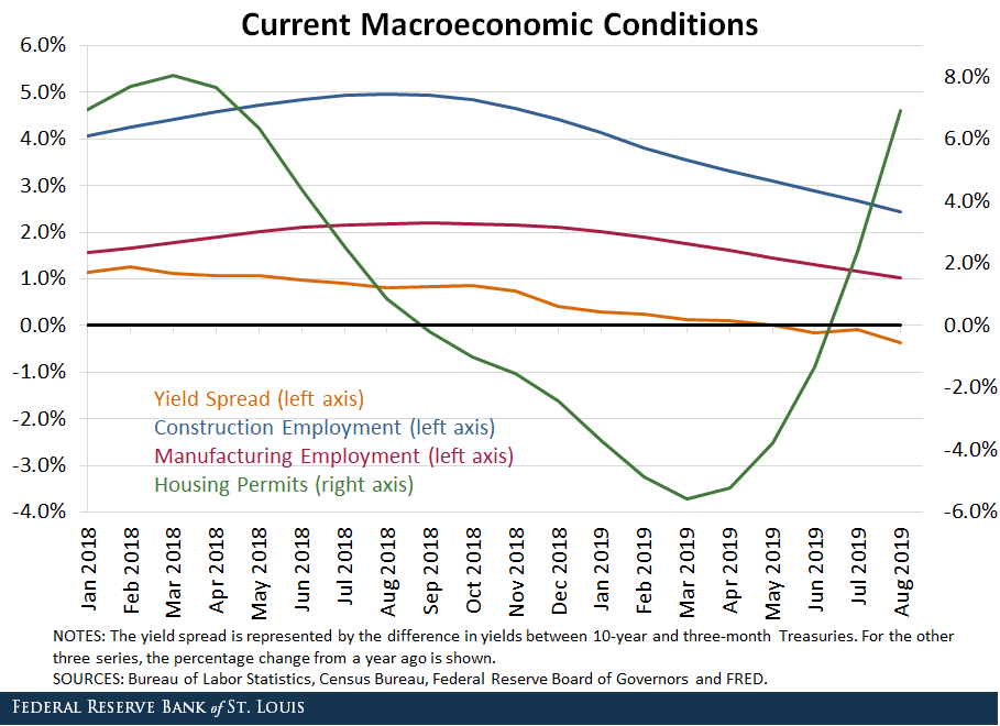
The figure below shows the percentage change from a year ago for construction employment, manufacturing employment and housing permits. Additionally, we plotted the yield spread between the 10-year and three-month Treasuries.To make the series more easily comparable, we plotted housing permits on the right y-axis to more closely examine the dynamics of the other variables. These series are plotted from January 2018 to July 2019 to observe a longer macroeconomic cycle.

The traditional leading indicators of recession—construction employment and manufacturing employment—saw their growth rates slow but not decline prior to this yield curve inversion. However, expectations of the housing market (housing permits) began to decline nine months prior to the yield curve inversion. This plot seems to suggest a nearly contemporaneous narrowing of the yield curve spread and declining rate of change in housing permits.
Housing Cycles and Recessions
This most recent instance of yield curve inversion provides further empirical evidence for the theories that housing cycles anticipate recessions and that housing expectations will often lead yield curve inversions. Compared to previous occurrences, housing expectations declined sharply prior to the recent yield curve inversion, and construction and manufacturing sectors showed some sign of softening before and after the inversion.
While some other current macroeconomic readings (such as unemployment, inflation and consumer spending levels) are solid from a historical perspective, the figure suggests that things could worsen in the relatively near future.
Given the ample historical evidence, this seems to be a classic scenario surrounding a yield curve inversion before a recession. None of the leading indicators are clearly signaling that this time could be different.
Notes and References
1 Famiglietti, Matthew; and Garriga, Carlos. “The data behind the fear of yield curve inversions.” FRED Blog, Oct. 11, 2018.
2 Famiglietti, Matthew; and Garriga, Carlos. “Predicting the Yield Curve Inversions that Predict Recessions: Part 1.” Economic Synopses, April 12, 2019.
3 Famiglietti, Matthew; and Garriga, Carlos. “Predicting the Yield Curve Inversions that Predict Recessions: Part 2.” Economic Synopses, April 15, 2019.
4 To make the series more easily comparable, we plotted housing permits on the right y-axis to more closely examine the dynamics of the other variables. These series are plotted from January 2018 to July 2019 to observe a longer macroeconomic cycle.
Additional Resources
- On the Economy: Do Yield Curve Inversions Predict Recessions in Other Countries?
- FRED Blog: The data behind the fear of yield curve inversions
- Economic Synopses: Predicting the Yield Curve Inversions that Predict Recessions: Part 1
Citation
Carlos Garriga and Matthew Famiglietti, ldquoWho Wants to Bet against the Yield Curve: Is This Time Different?,rdquo St. Louis Fed On the Economy, Sept. 30, 2019.
This blog offers commentary, analysis and data from our economists and experts. Views expressed are not necessarily those of the St. Louis Fed or Federal Reserve System.
Email Us
All other blog-related questions


