


Monetary Policy and Regional Inflation
The Federal Reserve has a dual mandate from Congress loosely stated as “full employment” and “price stability.” There are many ways to define and evaluate these mandates, but most share one thing in common: They consider the U.S. as a whole, ignoring any idiosyncrasies present among regions, states and even cities.
As such, it is possible that monetary policy works on aggregate despite not having the intended effects in a particular geographic portion of the country.
Inflation across Regions
In a 2015 post, Alejandro Badel and Joseph McGillicuddy investigated the differences in consumer price index (CPI)-based inflation rates across the four Census regions:
- West
- Midwest
- Northeast
- SouthBadel, Alejandro; and McGillicuddy, Joseph. “Where in the Map Is Low Inflation Coming from?” Federal Reserve Bank of St. Louis On the Economy, Oct. 5, 2015.
At that time, aggregate inflation for the nation was slightly above zero, but among the four regions, only the West region exhibited positive levels of inflation. The other three regions had essentially zero inflation or were even exhibiting a bit of deflation.
These differences were largely the result of higher energy- and shelter-driven inflation in the West region. Obviously, national inflation reports need not accurately represent price movements in any specific part of the country.
Inflation across Cities, Regions and the Nation
We made a comparable analysis but narrowed our focus to the metro areas of St. Louis and Chicago relative to the Midwest region and the nation as a whole.We concentrate on St. Louis for obvious reasons, and we include Chicago as a comparison because it is the largest MSA in the Midwest Census region. We used a heat map of inflation constructed separately for each geographic area.
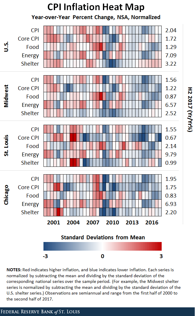
Since data on aggregate prices for cities are available only twice a year (first and second half of the year), we constructed an element for each release for each region.
Putting Together the Analysis
As an example of how we constructed the map, consider CPI-based inflation for the U.S. as a whole. Each element of the top row represents a colorized version of the year-over-year CPI-based inflation rate for that half-year after subtracting the mean and dividing by the standard deviation of the series over the entire 2000-2017 period.
Along the first row, darker red signals higher-than-average inflation for the nation, while darker blue signals lower-than-average inflation for the nation. This is repeated separately for the rows corresponding to food, shelter, energy and core CPI (or CPI after removing food and energy).
The rows for the subregions are constructed in a comparable fashion, except that we demean and standardize the Midwest and city values using the means and standard deviations from the nation as a whole.
As such, darker red signals that the area was experiencing inflation that is higher than the historical average for the nation, while darker blue signals that the area was experiencing inflation lower than the historical average for the nation.
Inflation Analysis
A few things pop out when we look at the map. First, there is a lot more red prior to the Great Recession across the nation and the subregions, indicating that aggregate inflation and food-, energy- and shelter-based inflation were higher prior to the recession.
And yet there are differences. For example, shelter-based inflation was spiking in the nation and Chicago in late 2006 and early 2007—when it was cooling off in St. Louis and the Midwest as a whole.
After the recession, differences are a bit more subtle but certainly exist. As noted in Badel and McGillicuddy’s post, shelter-based inflation was stronger in the nation as a whole (especially the West) than in the Midwest. We found that it was also stronger in the nation than in either St. Louis or Chicago.
Aggregate inflation has also been more robust at the national level. By the end of 2017, the U.S. as a whole was experiencing inflation of about 2 percent, while the Midwest and St. Louis had rates closer to 1.6 percent.
For the Midwest, this was driven by the fact that every component was lower than for the nation. In contrast, St. Louis’s average was based on a mixture of higher food- and energy-based inflation but lower shelter-based inflation.
National Policy vs. Regional Needs
This comparison is just one example of how inflation levels can differ across geographic areas within the U.S., even between cities in the same region of the country.
As such, it reminds us that monetary policy is a blunt tool. Policymakers at the Fed are unable to address separately the heterogeneous economic conditions that exist among the different parts of this large and diverse country.
Notes and References
1Badel, Alejandro; and McGillicuddy, Joseph. “Where in the Map Is Low Inflation Coming from?” Federal Reserve Bank of St. Louis On the Economy, Oct. 5, 2015.
2 We concentrate on St. Louis for obvious reasons, and we include Chicago as a comparison because it is the largest MSA in the Midwest Census region.
Additional Resources
- On the Economy: Where in the Map Is Low Inflation Coming from?
- On the Economy: How Can Venezuela Address Its Hyperinflation?
- On the Economy: The History of Prices and Inflation in the U.S.

Citation
Michael W. McCracken, ldquoMonetary Policy and Regional Inflation,rdquo St. Louis Fed On the Economy, May 8, 2018.
This blog offers commentary, analysis and data from our economists and experts. Views expressed are not necessarily those of the St. Louis Fed or Federal Reserve System.
Email Us
All other blog-related questions