


Comparing Living Standards across U.S. Metro Areas: Which Ones Fared Well?

James Bullard (Read his bio)
About 90 percent of U.S. gross domestic product (GDP) is produced in metropolitan statistical areas (MSAs). Furthermore, about 86 percent of the U.S. population lived in the 381 MSAs in 2015,1 and about 56 percent of the population lived in the 53 largest MSAs (those with at least 1 million people).
As a Federal Reserve Bank president and an economist, I am keenly interested in how incomes and prices differ throughout the U.S. To gain a better understanding of how the individual MSAs are performing, I recently examined which ones have relatively high standards of living and which ones have relatively low standards of living, based on a measure of per capita income.2 From a macroeconomic point of view, we would want all MSAs to be performing at a high level so that overall GDP and standard of living can be as high as possible.
The approach I used to compare MSAs is similar to the methodology used to compare standards of living across countries. I focused on 2015, the most recent year for which we have complete data.
A Different Way of Comparing MSAs
Comparisons across MSAs are usually based on real per capita variables that are adjusted by a nationwide price index. However, the usual comparisons can be misleading because they do not factor in the large differences in cost of living across the country. Differences in housing costs, in particular, can be substantial and are the primary driver of cost-of-living differences across MSAs.
Therefore, adjusting for price differences across MSAs is essential for generating meaningful comparisons of living standards. My colleagues at the St. Louis Fed have done just that.3 My analysis draws on their research.
The Bureau of Economic Analysis recently released data that measure the differences in price levels across MSAs for a given year. These Regional Price Parities (RPPs) are expressed as a percentage of the national price level. For 2015, these ranged from 79.7 percent for Beckley, W.Va., to 124.5 percent for Honolulu (with the national level being 100 percent). The most expensive MSAs tend to be relatively larger and located on either coast, and the least expensive MSAs tend to be relatively smaller and located in the interior.
These RPPs cover all consumption goods and services, including the cost of providing shelter to homeowners or renters. Thus, differentials in housing costs are reflected in these RPPs.
Real Income Per Capita across All MSAs
To compare MSAs, the measure of income that I used is real (i.e., inflation-adjusted) per capita personal income.4 The following figure shows the ratio of RPP-adjusted real per capita personal income to the U.S. average:
- A ratio greater than 1 means the MSA’s measure of real per capita income was higher than the national average.
- A ratio lower than 1 means the opposite.
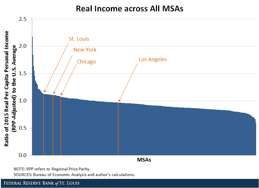
The results suggest that some MSAs have a much higher standard of living while others have a much lower standard of living than the nation as a whole. St. Louis, for instance, did extremely well. Its ratio was 1.13, implying that the RPP-adjusted real per capita personal income was about 13 percent higher than the national average. The three largest MSAs—New York, Los Angeles and Chicago—are also labeled in the figure.
Among all MSAs, St. Louis ranked No. 20, putting it in the top 6 percent. Said another way, St. Louis’s standard of living was higher than about 94 percent of MSAs in the country.
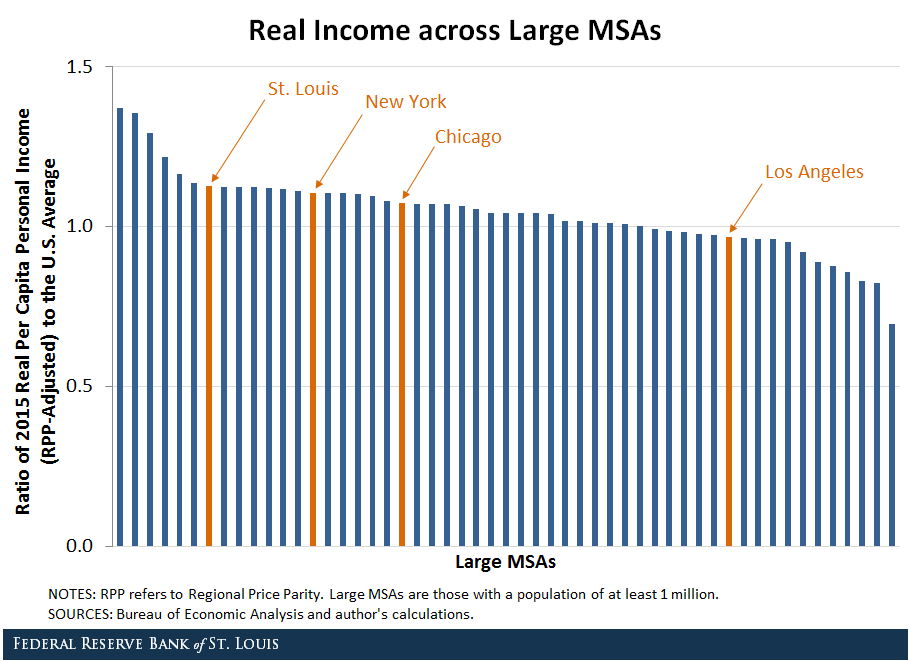
Real Income Per Capita across Large MSAs
Given the wide distribution in MSA size, it is also helpful to look at living standards across the 53 largest MSAs. St. Louis ranked No. 7 in this group, which is shown in the next figure.
The table below lists the 10 large MSAs with the highest standard of living. The top 10 include:
- Three MSAs on the West Coast: San Jose, San Francisco and Seattle
- Three on the East Coast: Boston, Hartford and Washington
- Four in the middle of the country: St. Louis, Nashville, Minneapolis and Houston
Standard of Living: The Top 10 among Large MSAs
| MSA | Rank | Real Income Ratio* | RPP (U.S.=100) | Inequality |
|---|---|---|---|---|
| San Jose, Calif. | 1 | 1.37 | 124.1 | 32.1 |
| San Francisco | 2 | 1.35 | 121.9 | 30.5 |
| Boston | 3 | 1.29 | 110.3 | 30.6 |
| Hartford, Conn. | 4 | 1.22 | 100.8 | 17.9 |
| Seattle | 5 | 1.16 | 109.4 | 21.6 |
| Washington | 6 | 1.14 | 119.1 | 15.5 |
| St. Louis | 7 | 1.13 | 90.6 | 18.2 |
| Nashville, Tenn. | 8 | 1.12 | 93.9 | 19.7 |
| Minneapolis | 9 | 1.12 | 102.4 | 19.7 |
| Houston | 10 | 1.12 | 100.9 | 28.6 |
* Ratio of 2015 real per capita personal income (RPP-adjusted) to U.S. average
NOTES: Inequality is measured by the ratio of the average household income of the top 1 percent to the average household income of the bottom 99 percent. Large MSAs are those with a population of at least 1 million. Values shown are for 2015.
SOURCES: Bureau of Economic Analysis; Sommeiller, Price and Wazeter, 2016; and author's calculations.
As the fourth column in the table shows, some MSAs among the top 10 had a high cost of living and others had a low cost of living. Only St. Louis and Nashville had a lower cost of living than the national average. This suggests that these two MSAs have a cost advantage over their other competitors in the top 10. In some cases, the cost differential was 30 percentage points or more.
Income Inequality within MSAs
While this analysis gives an idea of how MSAs are performing on average, the per capita concept does not account for the income distribution within an MSA. For this, I used data from other research.5
The main finding is that income inequality tended to be higher in larger MSAs. In addition, among the top 10 large MSAs in terms of living standards, some had very high income inequality (such as San Jose, San Francisco and Boston). Others had income inequality that was closer to the average (such as St. Louis, Nashville and Minneapolis), as seen in the last column in the table.
Conclusion
The bottom line is that, among the top 10 large MSAs, St. Louis and Nashville were the only ones that could simultaneously claim a higher-than-average standard of living, a lower-than-average cost of living and moderate income inequality.
The results of this analysis demonstrate the importance of adjusting for price differences across regions when comparing living standards. The facts uncovered here may provide the basis for future research on why some MSAs are more successful than others.
Notes and References
1 Because of data availability in earlier years, I did not include Enid, Okla., which was classified as an MSA in 2015.
2 Bullard, James. “Living Standards across U.S. Metropolitan Statistical Areas,” presentation delivered Oct. 6, 2017.
3 Coughlin, Cletus C.; Gascon, Charles S.; and Kliesen, Kevin L. “Living Standards in St. Louis and the Eighth Federal Reserve District: Let’s Get Real,” Federal Reserve Bank of St. Louis Review, Fourth Quarter 2017, Vol. 99, No. 4, pp. 377-94.
4 For each MSA, I divided real income by the appropriate RPP to obtain a measure of standard of living.
5 Sommeiller, Estelle; Price, Mark; and Wazeter, Ellis. “Income Inequality in the U.S. by State, Metropolitan Area, and County,” Economic Policy Institute Report, June 16, 2016.
Additional Resources

Citation
James Bullard, ldquoComparing Living Standards across U.S. Metro Areas: Which Ones Fared Well?,rdquo St. Louis Fed On the Economy, March 1, 2018.
This blog offers commentary, analysis and data from our economists and experts. Views expressed are not necessarily those of the St. Louis Fed or Federal Reserve System.
Email Us
All other blog-related questions