


Inflation Remains Tepid, but Shelter Costs Are Above Trend
Inflation has been relatively low for an extended period. However, not all price growth has been depressed. Shelter costs, such as rent, have been growing at a rate above trend for quite some time.
The figure below shows the St. Louis Fed’s inflation heat map, updated through July. Each colored box represents the relative level of inflation for a given consumer price index (CPI) component for a particular month.1 The deeper the color, the further from the component’s mean in terms of standard deviations.
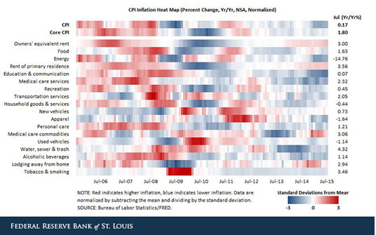
Most boxes for July are a shade of blue, indicating that the component indexes are under trend. However, the two largest shelter components measured in the map—owners’ equivalent rent of primary residence (OER) and rent of primary residence—have been above trend for the past several months. Another shelter component—lodging away from home—has been above trend for all but two months since February 2014.2
The CPI measures shelter rather than housing because it views housing as capital (or investment) goods rather than consumption goods. As the Bureau of Labor Statistics explains: “Spending to purchase and improve houses and other housing units is investment and not consumption. Shelter, the service the housing units provide, is the relevant consumption item for the CPI.”3
OER measures the cost of shelter provided by owner-occupied homes. Homeowners are asked: “If someone were to rent your home today, how much do you think it would rent for monthly, unfurnished and without utilities?”
Rent of primary residence measures the cost of shelter for renters. Renters are asked: “What is the rental charge to your [household] for this unit including any extra charges for garage and parking facilities? Do not include direct payments by local, state or federal agencies. What period of time does this cover?”
Regarding the impact on inflation, OER has been at or above its long-term average (2.2 percent) every month since June 2013, while rent of primary residence has been at or above its long-term average (2.8 percent) since May 2013.
It is also interesting to note that both of these components tend to be more persistent than the others over the past 10 years. That is, both OER inflation and rent of primary residence inflation change very little from month to month compared to the other series. This is illustrated in the figure above by the long stretches of red and blue for the OER and rent of primary residence components. Other components, such as energy, tend to switch between being above trend and being below trend much more frequently.
Notes and References
1 In an Economic Synopses essay introducing the heat map, the creators noted that while the Federal Open Market Committee’s preferred inflation measure is based on the personal consumption expenditures price index, the CPI is perhaps more familiar and widely cited.
2 The other shelter component is tenants’ and household insurance. This is by far the smallest component within shelter.
3 “How the CPI Measures Price Change of Owners’ Equivalent Rent of Primary Residence (OER) and Rent of Primary Residence (Rent),” Bureau of Labor Statistics.
Additional Resources
- Economic Synopses: Is Inflation Running Hot or Cold?
- Data: FRED CPI Heat Map (Excel file download)
- On the Economy: Should Core Inflation Be Measured Differently?
Citation
ldquoInflation Remains Tepid, but Shelter Costs Are Above Trend,rdquo St. Louis Fed On the Economy, Sept. 1, 2015.
This blog offers commentary, analysis and data from our economists and experts. Views expressed are not necessarily those of the St. Louis Fed or Federal Reserve System.
Email Us
All other blog-related questions