


Is a Soft Landing Possible? What the Beveridge Curve Reveals
In our earlier blog post, the first in this two-part series, we outlined Anton Cheremukhin and Paulina Restrepo-Echavarria’s dual vacancy model, which considers two separate job matching functions—one for unemployed workers and one for employed workers.For details of this model, see Cheremukhin and Restrepo-Echavarria’s 2022 working paper “The Dual Beveridge Curve,” which was updated in February 2023.
In today’s post, we’ll use that model to determine how the separate matching functions affect the Beveridge curve, which plots the relationship between the job vacancy rate and the unemployment rate. This, in turn, will give us insight into whether a soft landing is possible.
Adjusting the Beveridge Curve for the Dual Vacancy Model
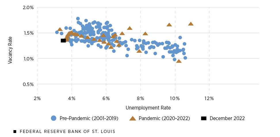
The next two figures show two separate Beveridge curves. The first corresponds to the Beveridge curve for the unemployed, plotting the unemployment rate versus the rate of unemployment vacancies (openings that would likely be filled by a jobless worker). The second corresponds to the Beveridge curve for the employed, plotting the relationship between the rate of employed workers searching for a new job and the rate of poaching vacancies (openings that would likely be filled by job-switching workers).
Beveridge Curve for the Unemployed
Beveridge Curve for the Employed
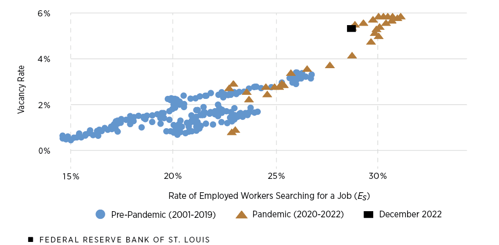
SOURCES FOR BOTH FIGURES: Cheremukhin and Restrepo-Echavarria, 2022; and authors’ calculations.
When using data that focuses only on unemployed individuals, the traditional (pre-pandemic) Beveridge curve is quite similar to the pandemic one; the slope of the pandemic Beveridge curve remains historically consistent. What looks surprising, however, is the employed Beveridge curve, as shown in the second figure.
The pre-pandemic employed Beveridge curve, unlike the usual Beveridge curve, has a positive slope, which means that as the vacancy rate rises, the rate of employed workers searching for a job also increases. Moreover, unlike the pandemic Beveridge curve for the unemployed, the pandemic Beveridge curve for the employed is a clear outlier; that is, most of the pandemic data points are scattered far from the cluster of points in the pre-pandemic period.
One explanation of this unusual behavior is that the behavior of the employed workers is positively correlated with job vacancies. When vacancies are high, the employed workers then have more incentive to look for a new job. Conversely, when the job market is relatively tight, the employed workers are less motivated to search for a new job opportunity.
Is a Soft Landing Possible?
Since a soft landing is primarily concerned with the unemployment rate, it is important for us to look at the unemployed Beveridge curve. Using the adjusted Beveridge curve for the unemployed, we can approximate what the unemployment rate would be if the total vacancy rate goes down to the pre-pandemic levels of around 4.2% (December 2019).
In December 2022, the total vacancy rate was initially around 6.5% so this meant that the total vacancy rate needed to go down by 230 basis points in order to achieve the pre-pandemic vacancy rate. However, this is the total drop for both employed and unemployed workers combined.
The magnitude of the decline is smaller if we focus on only the unemployed pool. Cheremukhin and Restrepo-Echavarria found that around 80% of total vacancies are poaching vacancies, meaning that only 20% of those are unemployment vacancies (openings that would likely be filled by jobless workers). Because of this, the back-of-the-envelope calculation suggests that unemployment vacancies have to go down by 46 (0.2 multiplied by 230) basis points.
As shown in the figure below, we then fitted a curve (dotted purple line) through the unemployed Beveridge curve to approximate its slope and shift the curve down so that it passes through the data point of December 2022 (solid purple line).
Adjusted Beveridge Curve Estimates Possible Shift in Unemployment Rate
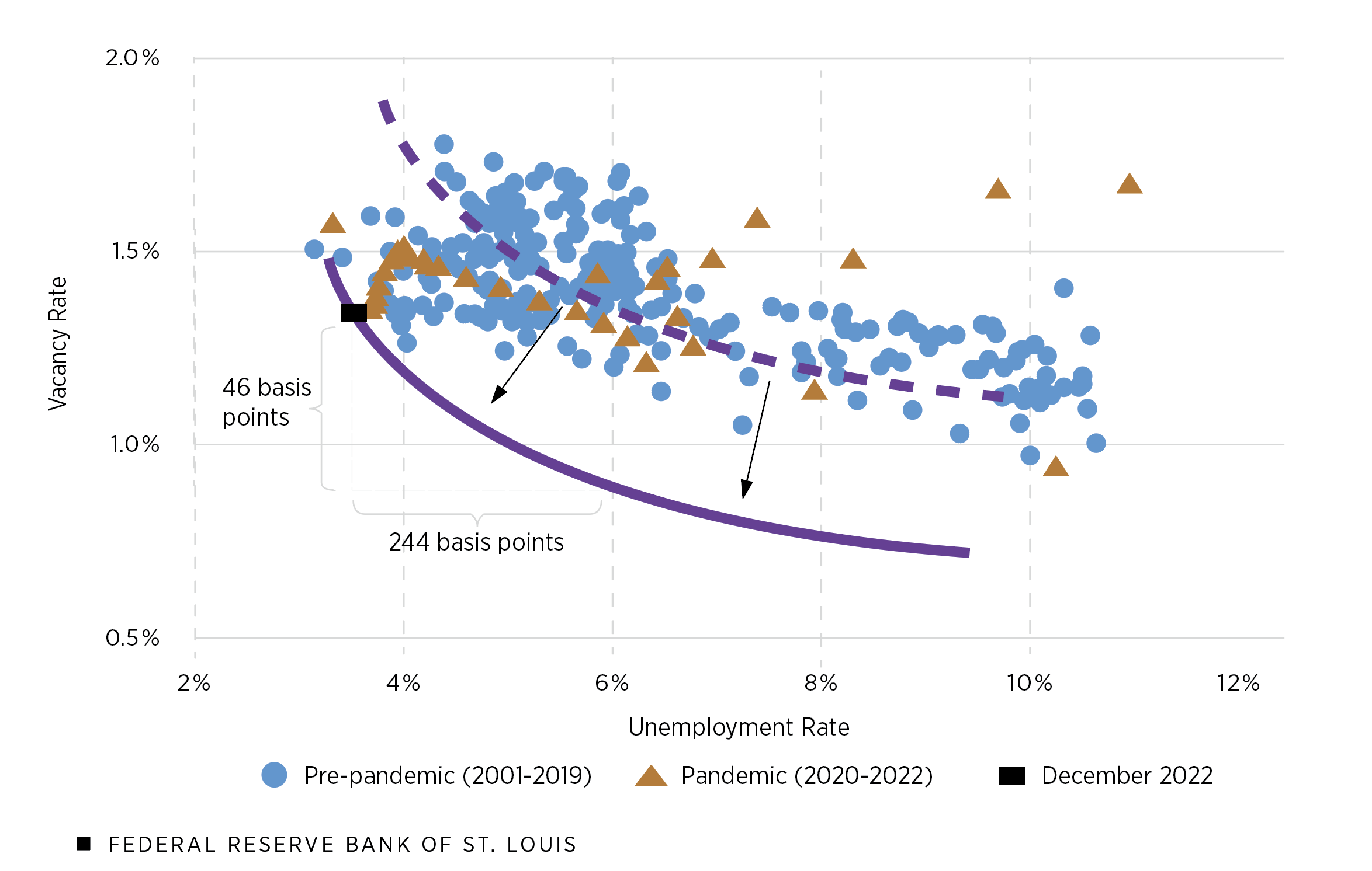
SOURCES: Cheremukhin and Restrepo-Echavarria, 2022; and authors’ calculations.
This new curve suggests that if the vacancy rate for the unemployed goes down by 46 basis points, then the unemployment rate will increase by 244 basis points. This means the unemployment rate would go up to approximately 5.95%. Of course, this unemployment rate is higher than the current unemployment rate but still lower than the average historical unemployment rate (January 2001 to January 2023) of 6.2%.
Given current labor market conditions, the findings of Cheremukhin and Restrepo-Echavarria support the argument that the Fed can keep tightening without the risk of raising the unemployment rate above its historical average.
Note
- For details of this model, see Cheremukhin and Restrepo-Echavarria’s 2022 working paper “The Dual Beveridge Curve,” which was updated in February 2023.


Citation
Paulina Restrepo-Echavarría and Praew Grittayaphong, ldquoIs a Soft Landing Possible? What the Beveridge Curve Reveals,rdquo St. Louis Fed On the Economy, Sept. 1, 2023.
This blog offers commentary, analysis and data from our economists and experts. Views expressed are not necessarily those of the St. Louis Fed or Federal Reserve System.
Email Us
All other blog-related questions