


What Does the Beveridge Curve Tell Us about the Labor Market Recovery?
The onset of the COVID-19 pandemic disrupted the labor market with an intensity not seen since the Great Depression. But just as perplexing has been the labor recovery since April 2020, a period marked by the Great Resignation and sharp wage gains for certain workers. Does the employment recovery from the COVID-19 recession reflect structural changes in the economy that impacted job hiring and search?
To explore this question, we use the Beveridge curve to describe hiring outcomes as the economy began to recover from the COVID-19 recession. This curve—which represents the relationship between unemployment rates and job opening ratesThe unemployment rate and vacancy rate data in this blog post are from the Bureau of Labor Statistics. The vacancy rate is from the JOLTS (Job Openings and Labor Turnover Survey), which started in December 2000. To have a longer time period and more economic recessions, others have used the Composite Help-Wanted Index and applied a scaling factor such that the vacancy rates are equal in December 2000. For example, Peter A. Diamond and Ayşegül Şahin used this method in their 2014 paper, extending their data series back to 1951.— reveals three distinctive phases since the COVID-19 recession: April 2020 to September 2020, October 2020 to June 2021 and July 2021 to April 2022. As we later show in this blog post, each phase suggests changes in the job matching process between employers and potential candidates.
Understanding the Beveridge Curve
The curve typically slopes downward: The vacancy rate decreases as the unemployment rate increases. Location on the curve itself indicates the health of the labor market; a low unemployment rate and a high vacancy rate indicate a “tight” labor market and a growing economy. An economy shifting from recession to expansion and vice versa represents movements along the Beveridge curve. In contrast, changes in the efficiency of the job matching process correspond to shifts in the entire curve.
For example, factors that weaken an employer’s efforts to hire potential candidates or job searchers’ efforts to secure employment shift the curve outward. Some factors that we think have played a role in the curve’s shifting since the COVID-19 recession are the pandemic relief and recovery assistance, the Great Resignation, the challenges that parents face with securing child care, and the mental health effects of the pandemic.
The figure below shows the Beveridge curve for various periods since December 2000.For details on the movements and shifts of the Beveridge curve before the COVID-19 pandemic, see Peter A. Diamond and Ayşegül Şahin’s 2014 paper. One can clearly see that the Beveridge curve (marked by red circles) shifted outward in April 2020.
The Pandemic Shifts the Beveridge Curve Outward
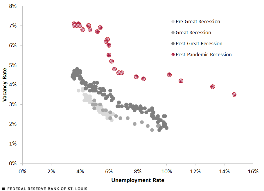
SOURCES: Bureau of Labor Statistics and authors’ calculations.
NOTES: Though the COVID-19 recession began in February 2020, that month and March 2020 are considered part of the post-Great Recession period in our analysis.
A Closer Look at the Curve since April 2020
Since April 2020, the Beveridge curve has experienced two kinks, thus revealing three distinctive phases. (See the following figure.) These kinks, or rotations, reflect the changing economic path from recession to recovery and the unique challenges facing employers and workers along the way.
The Pandemic’s Beveridge Curve Reveals Three Phases of Labor Recovery
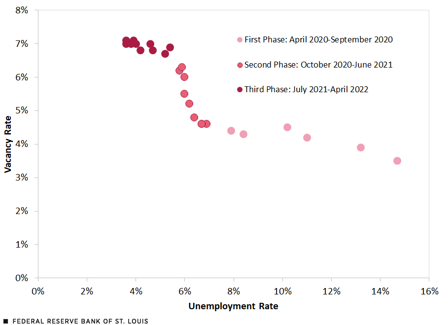
SOURCES: Bureau of Labor Statistics and authors’ calculations.
The first phase (April 2020 to September 2020) was a period of rapid reduction in the unemployment rate as people returned to work with the ending of mandatory stay-at-home orders, closures of nonessential businesses, and increased knowledge of living and working within the confines of social distancing. Vacancies increased little over this period.
During the second phase (October 2020 to June 2021), job search was less sensitive to the number of vacancies, and further reductions in unemployment required larger increases in job openings.In his 2021 paper, Thomas Lubik noted that the Beveridge curve rotated in the fall of 2020, becoming much steeper and indicating vacancy rates rose much faster than the unemployment rate fell. Competition for available workers increased, with firms needing to offer higher wages and benefits to attract job candidates. The Great Resignation began during this period (February 2021), describing a period in which a historic number of workers left their jobs. Employment increased, however, as hires outpaced quits. Workers reported being unhappy in their current job because of poor pay, few opportunities for advancement, and feeling disrespected. Labor shortages gave workers bargaining power, and many switched jobs, although they were able to take their time searching for new jobs.
The Beveridge curve flattened again in the summer of 2021 (the third phase), resuming a similar trade-off between vacancies and unemployment as the pandemic started and indicating a better job matching process, although at a higher vacancy rate.
The repeat flattening of the Beveridge curve is likely due to changes in the cost of remaining unemployed. The pullback of enhanced state unemployment insurance benefits began during this phase, providing greater economic incentive to find a job. Additionally, as firms continued to compete for workers, wages and compensation continued to rise, further increasing the cost of remaining unemployed. Firms also made their workplaces safer. More certainty emerged around school opening and their schedules, allowing parents to plan their work schedules. A countervailing impact is the larger-than-expected number of retirements among older workers who were particularly vulnerable to the COVID-19 virus and benefiting from large increases in the value of their assets
In summary, these three phases of the Beveridge curve represent different relationships between unemployment and job opening rates in a given month. As the economy reopened in the first phase, matching job seekers to employers was faster than before the pandemic as those willing or required to work returned.
That slack dissolved in the second phase as remaining potential workers were hesitant to return to jobs and fill vacancies because of concerns about workplace safety and the government assistance that families and communities were receiving. The matching of job seekers to employers deteriorated. Further reductions in the unemployment rate required more job vacancies than in the first phase.
The job opening rate finally stabilized in the third phase as unemployment began to see significant downward movement again. This lower jobless rate suggests a reduction in “structural” supports that may have previously kept job searchers from receiving and accepting offers. The sustained higher job openings rate suggests labor shortages.
Conclusion
The Beveridge curve reveals how the COVID-19 public health crisis, relief and recovery assistance, the “Great Resignation,” and other structural factors changed the job matching process between employers and potential candidates.
The pandemic shifted the Beveridge curve outward, first with the rapid increase in unemployment, followed by increasing job vacancies even as the unemployment rate returned to pre-pandemic levels. The relative changes in unemployment and job openings throughout the pandemic resulted in two rotations of the new Beveridge curve.
This post raises more questions than answers. Are the movements and shifts an economywide phenomenon? Or does the relationship between job openings and unemployment differ across demographic groups and geographic locations due to structural differences in labor market experiences? We plan to answer these questions in a future blog post.
Notes
1The unemployment rate and vacancy rate data in this blog post are from the Bureau of Labor Statistics. The vacancy rate is from the JOLTS (Job Openings and Labor Turnover Survey), which started in December 2000. To have a longer time period and more economic recessions, others have used the Composite Help-Wanted Index and applied a scaling factor such that the vacancy rates are equal in December 2000. For example, Peter A. Diamond and Ayşegül Şahin used this method in their 2014 paper, extending their data series back to 1951.
2For details on the movements and shifts of the Beveridge curve before the COVID-19 pandemic, see Peter A. Diamond and Ayşegül Şahin’s 2014 paper.
3In his 2021 paper, Thomas Lubik noted that the Beveridge curve rotated in the fall of 2020, becoming much steeper and indicating vacancy rates rose much faster than the unemployment rate fell.


Citation
William M. Rodgers III and Alice L. Kassens, ldquoWhat Does the Beveridge Curve Tell Us about the Labor Market Recovery?,rdquo St. Louis Fed On the Economy, July 14, 2022.
This blog offers commentary, analysis and data from our economists and experts. Views expressed are not necessarily those of the St. Louis Fed or Federal Reserve System.
Email Us
All other blog-related questions