


Health Care Affordability Gap Widens between the Rich and the Poor
Between 1991 and 2012, health care costs increased an average of 4.2 percent per year, while inflation increased an average of 2.5 percent per year. This increase in health care costs, together with an increase in income inequality, may have made health care unaffordable for lower-income groups, enlarging the medical consumption inequality between the rich and poor.
To shed light on this issue, we examined annual survey data from the Behavioral Risk Factor Surveillance System (BRFSS) obtained from the Centers for Disease Control and Prevention. The BRFSS data are broken down by income group, and one of the survey questions asked, “Was there a time in the past 12 months when you needed to see a doctor but could not because of cost?” Therefore, the data are suitable for investigating the relationship between affordability of health care and income. We examined the data for the period 1995-2012, excluding 2001 and 2002 due to changes in the questionnaire, and we classified households into five groups according to their income quintile.1 Given each group, we computed the “unaffordability percentage,” or the percentage of interviewees who gave a positive answer to the above question, which indicates the unaffordability of health care for that income group.
The figure below plots the unaffordability percentage for all households in each income quintile over time. The first quintile represents the poorest 20 percent of the population, and the fifth quintile represents the richest 20 percent.
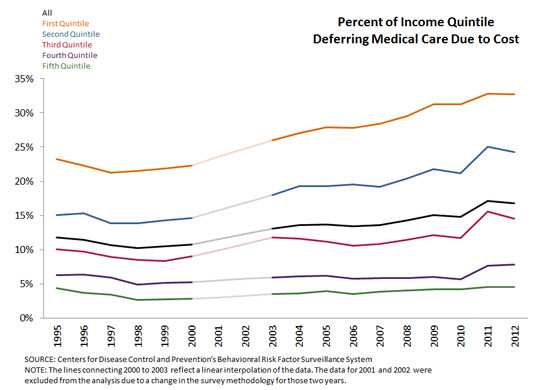
Clearly, for each given year, the index level is negatively associated with income. It is not surprising that health care is more affordable for high-income households than it is for low-income households. Over time, the unaffordability index of all households showed an upward trend. From 1995 to 2012, the index increased from 11.8 percent to 16.8 percent, showing that the rapidly increasing cost of health care, in fact, burdened more U.S. households.
More importantly, there was a diverging trend of the index between the rich and the poor. The bottom quintile percentage rose from 23.3 percent in 1995 to 32.7 percent in 2012, exhibiting an almost 10-percentage-point surge. Similarly, the second quintile was also heavily affected. The index increased from 15.1 percent to 24.2 percent, also an almost 10-percentage-point escalation.
On the other hand, the top two quintiles were much less affected. Their indexes were much lower and exhibited a slightly upward, but insignificant, trend. The middle quintile also suffered, though not as much as the bottom two quintiles. The diverging trends clearly indicate that higher health care costs significantly enlarged the gap of accessibility to health care across the income distribution over the past two decades.
This post only provides a rough look at this issue, while the result delivers a somewhat surprising message. We might expect that low-income households would be covered by social insurance programs like Medicare or Medicaid. Hence, the poor should not be affected as much as shown in the data. On the contrary, the poor were more affected by the rising cost of health care than the rich.
Notes and References
1 Around 12 percent to 14 percent of the sample did not report income data, so those responses are excluded from the calculation. In addition, the raw data only provide a fixed range of income for each household. Therefore, the income quintile is imputed.
Additional Resources

Citation
YiLi Chien, ldquoHealth Care Affordability Gap Widens between the Rich and the Poor,rdquo St. Louis Fed On the Economy, Sept. 29, 2014.
This blog offers commentary, analysis and data from our economists and experts. Views expressed are not necessarily those of the St. Louis Fed or Federal Reserve System.
Email Us
All other blog-related questions