U.S. Income Inequality May Be High, but It Is Lower Than World Income Inequality
U.S. income inequality has become a focal point of public discussion and debate over the past couple of years. For example:
- In early December, President Obama cited a growing divide between the top 10 percent and the rest of the U.S. income distribution as an impetus for new legislation that would raise the minimum wage.1
- In their efforts to shrink the budget deficit, lawmakers decide who should pay the most taxes based on the income and wealth distributions.
- Occupy Wall Street activists denounced the disparity between the earnings of the top 1 percent of the income distribution and those of everybody else.
All of this gives a sense that income inequality in the U.S. is severe and that the distribution has become increasingly unequal over time. To assess the validity of those claims, you need to develop a firm understanding of the facts. Toward that end, we analyzed data on income in America and show how it is distributed across the population, with additional analysis based on various demographics. We used a simple ratio to quantify the level of income inequality across individuals in the U.S. and then shifted that analysis to the state and international levels. We moved beyond income and broke down the U.S. wealth distribution by similar demographics. Ultimately, wealth inequality, as measured by our inequality ratio, was substantially more severe than income inequality.
Breaking Down the Income Distribution
Households in the top 10 percent of the income distribution have earnings so great that they raise mean income over the median for the entire population. For example, the median household income in 2010 was about $46,000, while the mean income was close to $78,500.2 Within the top 10 percent of the distribution, mean income was about 70 percent higher than the median. To avoid the upward bias contributed by the outliers at the top of the distribution, we looked at median income for our analysis.
The Census Bureau's inflation-adjusted income distribution going back to 1968 offers insights into the evolution of income brackets over time. The poorest households—those earning less than $15,000 a year—comprised 17 percent of the population in 1968, but that group's share declined 4 percentage points as individuals moved to higher income brackets by 2013. This upward shift was relatively small given the lengthy reference period, but it was still a hopeful sign of upward mobility among the poorest Americans.
The middle class, households earning $35,000 to $75,000, contracted the most since the late 1960s, dropping to 31 percent of the population from 43 percent.
In contrast, the upper end of the earnings distribution gained the largest share over this period. This trend captures what is often referred to as the hollowing out of the middle class. The share of households earning at least $75,000 doubled from 17 percent to close to 34 percent of the distribution.
The top echelon—those earning over $150,000—jumped from about 2 percent of households to almost 10 percent.
The good news is that Americans are generally earning more across the distribution. The bad news is that the middle class and the poor have very different upward mobility. This divide has amplified income inequality as the middle class shrinks and joins the upper-income brackets while the poor stagnate.
Top Income Cutoffs
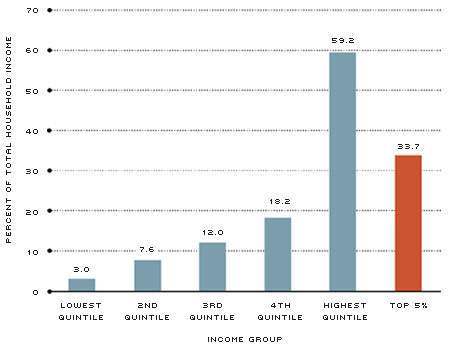
Figure 1 shows the share of 2010 aggregate income allocated to income groups, as well as the share claimed by the top 5 percent. The top-heavy nature of the income distribution alluded to by the difference between the mean and median stands out. The lowest quintile is the 20 percent of households that earn the least amount of income; the highest quintile is the 20 percent that earn the most. More than half of all income went to the top quintile of households, and just over a third of all income went to the top 5 percent alone. Those in the highly publicized 1 percent earned at least $365,000, and the income of the outliers who comprise the top 0.1 percent started at $1.6 million.3
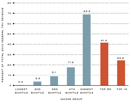
While these incomes are high, there is a balancing effect from the U.S. system of progressive taxation. Figure 2 offers a look at what these income groups contribute back to society in the form of federal tax revenue.4 Close to 70 percent of federal tax revenue came from the top quintile of the income distribution. Within that, the top 5 percent paid more than 40 percent of total federal taxes. The bottom quintile paid almost nothing in federal taxes, given that government-funded transfer programs are an important source of income for this group.
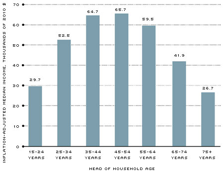
Looking at income by age reveals a natural source of inequality within the income distribution. Figure 3 shows median household income in 2010 by the age of the head of the household; this distribution characterizes the classic life cycle model that has remained largely unchanged for most of the modern era. The income of 15- to 24-year-olds is relatively low because many are investing in human capital, such as higher education, and have a tenuous attachment to the labor force. The 25-54 age range is considered the prime age for working; median earnings rise as workers gain job experience, improve their technical skills and bolster their education. After age 54, workers begin to leave the labor force to retire, and median earnings steadily fall in each consecutive age bracket. The average American will move along this same hump-shaped income profile during his or her life. Consequently, a comparison between individuals at any one point in time will yield some income inequality due to age.
Share of 2010 Household Income, by Income Group
SOURCE: Survey of Consumer Finance: Board of Governors and authors' calculations.
Shares of 2010 Federal Tax Revenue, by Income Group
SOURCE: Congressional Budget Office.
2010 Median Household Income, by Head of Household Age
SOURCE: Census Bureau/Haver Analytics.
How Do You Get to the Top 20 Percent?
It's not unusual to hear people say that you can't be a top earner unless you are in the ranks of Warren Buffett, Bill Gates or the Koch brothers. The truth of the matter is that many households in the top income quintile have professions that don't fit the stereotype of boundless riches. The Bureau of Labor Statistics' Occupational Outlook Handbook yields some interesting job combinations that would qualify a married household for the top quintile.5 For example, a librarian ($55,000) and a fashion designer ($63,000), a writer ($56,000) and an accountant ($64,000), or a chemist ($73,000) with a chef ($43,000) would all qualify. Most individuals with a professional degree would qualify by themselves: An unmarried dentist would qualify for the top 10 percent with a median annual pay of about $149,000.
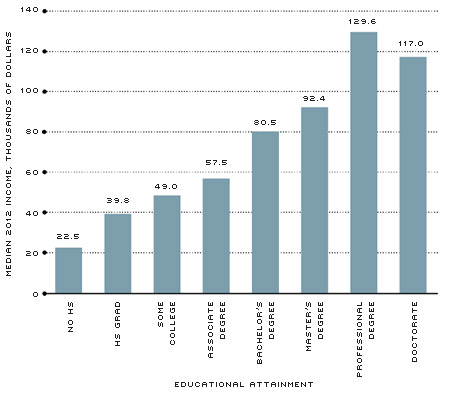
2012 Median Income, by Educational Attainment
SOURCE: Census Bureau/Haver Analytics.
There is one thing that characterizes the vast majority of the households in the upper end of the income distribution: educational attainment. Figure 4 shows median income by educational attainment. A high school diploma provides a 77 percent increase in median earnings over a high school dropout. A bachelor's degree increases median earnings by 102 percent over only a high school diploma. The median earnings of a professional degree are 61 percent higher than that of a bachelor's degree. And so on. Investing in education remains a smart decision, given these potential income gains. With about 4,600 degree-granting postsecondary institutions in the U.S., Americans have ample opportunities to pursue human capital and increase their earnings potential. This opportunity is not available to a large share of the world's population.
How Does Income Inequality Compare across States and the World?
From the previous analysis, it is clear that inequality exists in the U.S. income distribution. Some of it naturally develops between age groups, and a lot of it is determined by educational attainment. So, how does it compare at a higher level—across states and around the world? Economists often use Gini coefficients and other statistics to answer that question. We constructed a simpler measure that is readily available from the data and is more intuitive to a general audience. We used the ratio of the median income of the top 10 percent of the income distribution ($203,900) divided by the median income of the bottom 10 percent ($9,900). The resulting ratio of 21 quantifies the substantial divide between the rich and poor in the U.S.
We began our comparison at the state level and took the median of the five highest state per capita personal incomes and divided that by the median of the five lowest. Ranked by 2012 per capita personal income, the top five states were North Dakota, Connecticut, Wyoming, Massachusetts and South Dakota. The bottom five were Hawaii, New Mexico, Arizona, Idaho and Utah. The interstate inequality ratio equates to 1.4, far lower than the household ratio of 21. This makes sense: The rich and poor aren't concentrated in one state over another, and the earnings potential is mostly similar across states.
Moving beyond the U.S., we looked at income inequality between member nations of the Organization for Economic Cooperation and Development (OECD), an international organization dedicated to global development. The OECD has 34 members, including many of the world's most advanced countries (such as the U.S.) as well as some emerging countries. We similarly grabbed the medians of the four highest and lowest 2012 GDP per capita estimates for the member countries. The top performers were Luxembourg, Norway, Switzerland and Australia; they tout a median per capita income of about $89,300. Ranking at the bottom were Poland, Hungary, Turkey and Mexico; they have a median GDP per capita of $11,500. The resulting OECD inequality ratio of 7.7 provides the first look at income inequality among nations. However, the developing nations that are members of the OECD are far more advanced than much of the developing world.6 The International Monetary Fund's Economic Outlook database contains data for 189 countries and offers a much larger sample of nations.
The table shows the highest and lowest 19 (representing roughly the top and bottom 10 percent of the sample) countries in the IMF data with respect to 2012 GDP per capita. The top 19 developed nations had a median GDP per capita of about $51,700; this was also the GDP per capita of the U.S. For the bottom 19 developing countries, we originally took those with the lowest GDP per capita as we did for the state and OECD analysis. This sampling consisted of almost all African nations and had very little geographic diversity. Consequently, African nations were temporarily omitted from the sample used in the table. Of the bottom 19, Yemen fell in the middle with a GDP per capita of about $1,400. The global inequality ratio of 38.2 surpasses that of the U.S. household income inequality (21), and adding the African nations back to the sample raises that ratio to 99.
While not to diminish the ample income inequality in the U.S., a focus on absolute inequality would suggest income disparity among the world's population is a far greater concern. To put things in perspective, the poorest 10 percent of the U.S. income distribution hold a median income that is more than seven times that of the poorest 19 developing nations as listed in the table. Upward income mobility is out of the question when basic human rights (food and water, medical care, safety) are not available.
U.S. Wealth Inequality
A discussion of U.S. wealth inequality in terms of net worth is a natural follow-up to our analysis of income inequality. Net worth is defined as household assets less liabilities; assets are both financial (retirement accounts, stocks, bonds, etc.) and nonfinancial (car, home, small business, etc.). The distinction between income and net worth is often misunderstood in popular discussion. By definition, income is a flow variable that is measured over an interval of time. An income of $1,000 has a very different meaning if it is accrued over a minute, day, week or year. In contrast, net worth is a stock variable that is understood without a time qualifier. Median net worth of all households in 2010 was $77,300. Just as there was with the income statistics, there is a substantial divide between median and mean net worth.7 Mean net worth was $499,000, indicative of an even more top-heavy distribution than that of income.
In 2010, the bottom 50 percent of the distribution owned little more than 1 percent of total net worth.8 The subsequent 40 percent of households held about 24 percent of total net worth. That leaves close to 75 percent of net worth concentrated in the top 10 percent of households. Within that group, the top 1 percent held close to 35 percent of total net worth.9
Using the income distribution, we can look at wealth statistics for the same groups used in our income inequality analysis. The median net worth of the bottom 10 percent of the income distribution is $3,100. Paired with a median net worth of the top 10 percent totaling $1,194,000, the wealth inequality ratio is 385. These statistics change dramatically when the net worth distribution is used to define population groups. For example, the bottom 20 percent of the distribution has a negative median net worth. The ratio of the median for the top 10 percent (about $1.9 million) divided by the median for the bottom 30 percent ($700) yields a massive ratio of 2,714.
What's the Right Amount of Inequality?
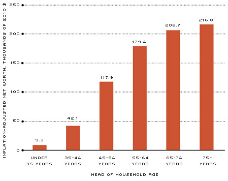
The magnitude of wealth inequality in the U.S. is certainly not an ideal status quo, but neither would be a perfectly equal distribution. Net worth inequality is a natural development of maintaining a stable path of consumption over our life spans. Figure 5 shows median net worth by age of the head of household. In our youth, we tend to be unskilled and have little money to our name. To make a future for ourselves, we borrow money to pay for things like school, our first home and a car to get to work.
2010 Median Net Worth, by Head of Household Age
SOURCE: 2010 Survey of Consumer Finances: Board of Governors/Haver Analytics.
During our middle years, we start to repay the debt we acquired and then accumulate wealth for our retirement. As you recall from Figure 1, this is also the point in life where we achieve peak earnings. Upon entering the twilight years, it is time to start spending down the wealth we accumulated in order to maintain our same level of consumption that we enjoyed throughout earlier life.
This natural life cycle of wealth accumulation hasn't changed much, and most Americans will progress along a similar path. While the process is the same for most people, at any one point in time you're going to have relative inequality: poor, middle and rich based on age alone. While this natural inequality doesn't account for the entire wealth disparity across the population, it is important to understand that some inequality isn't inherently bad.10
Much of the inequality in the net worth distribution that concerns people stems from an imbalance in asset ownership. Households in the bottom 25 percent of the net worth distribution derived close to three-quarters of their income from wages, about 4 percent from business equity and only 0.2 percent from interest or dividends and capital gains. In contrast, the top 10 percent of the net worth distribution gathered a little over half of their income from wages, 24 percent from business equity and about 11 percent from financial assets.
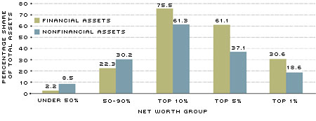
Figure 6 plots the ownership shares of total financial and nonfinancial assets by net worth group. Financial assets are significantly concentrated among the wealthiest households. The top 10 percent of households in the wealth distribution hold the majority of both financial and nonfinancial assets. Ninety percent of the population holds just under a quarter of total financial assets and almost 39 percent of total nonfinancial assets. In contrast, the top 5 percent of the distribution holds more than 60 percent of financial assets and over a third of nonfinancial assets.
Share of 2010 Financial and Nonfinancial Assets, by Net Worth Group
SOURCE: 2010 Survey of Consumer Finances: Board of Governors/Haver Analytics.
The S&P 500 stock price index has increased in value about 16 times since 1980. Over the same period, average weekly earnings have increased less than three times their value. With the substantially higher returns to financial assets over time, it's clear that the ownership imbalance will continue to worsen wealth inequality. Fortunately, financial assets have become more accessible and affordable for everyone, thanks to discount online brokerages. An increased policy focus on promoting financial literacy across the country, particularly in the poorest communities, would better equip the poorest Americans to take advantage of financial assets.
Conclusion
Income inequality in America is not as dire as that between developed and developing nations, but it remains a contentious domestic issue that will likely lead to greater class division and unrest. The labor market has changed into a system that places a greater value on education than physical labor and rewards skilled workers with wage premiums. This system is characterized by substantial inequality, but it doesn't inherently exclude anyone from climbing the income brackets. Indeed, the fiscal solvency of the country is heavily dependent on those who have reached the upper end of the income distribution. Wealth inequality is a much greater dilemma, but it is often unaddressed in the public debate outside of tax proposals. The heavy concentration of financial assets on the balance sheets of the rich will only worsen the already severe wealth inequality without greater democratization of ownership of capital.11 A large portion of the U.S. population remains financially illiterate and misses the potential gains provided by financial assets. Financial education initiatives could use some of the energy devoted to the fierce policy debate surrounding income inequality in the U.S.
Endnotes
- See www.whitehouse.gov/the-press-office/2013/12/04/remarks-president-economic-mobility for remarks by the president on economic mobility. [back to text]
- Data taken from the 2010 Survey of Consumer Finances (SCF) collected by the Federal
Reserve Board in cooperation with the Department of the Treasury. See Bricker et al. for a thorough analysis and description of the SCF dataset. [back to text] - Income thresholds taken from the World Top Incomes Database assembled by Facundo Alvaredo, Tony Atkinson, Thomas Piketty and Emmanuel Saez. [back to text]
- Federal taxes include individual and corporate income taxes, social insurance (or payroll) taxes, and excise taxes. [back to text]
- All incomes are estimates of 2012 median annual pay. See www.bls.gov/ooh. [back to text]
- Developing nations in the OECD include: Chile, Czech Republic, Estonia, Hungary, Mexico, Poland, the Slovak Republic, Slovenia and Turkey. [back to text]
- Net worth data also taken from the 2010 Survey of Consumer Finances. [back to text]
- See Kennickell and Levine. [back to text]
- These statistics are for the distribution of net worth (assets less liabilities) by net worth group. In contrast, Figure 6 shows the distribution of financial and nonfinancial assets by net worth group. [back to text]
- For more on the life cycle model and its implications for a natural level of income and wealth inequality, see speech by St. Louis Fed President James Bullard to the Council on Foreign Relations on June 26, 2014, at http://research.stlouisfed.org/econ/bullard/pdf/Bullard_CFR_26June2014_Final.pdf. [back to text]
- Thomas Piketty, a prominent economist and expert on wealth and income inequality, offers a similar message in his recent book Capital in the Twenty-First Century. While we don't necessarily advocate any specific policy recommendations provided in his text, it does offer a wealth of data and analysis for the interested reader. [back to text]
References
Bricker, Jesse; Kennickell, Arthur B.; Moore, Kevin B.; and Sabelhaus, John. "Changes in U.S. Family Finances from 2007 to 2010: Evidence from the Survey of Consumer Finances." Federal Reserve Bulletin, June 2012, Vol. 98, No. 2.
Kennickell, Arthur B. "Ponds and Streams: Wealth and Income in the U.S., 1989 to 2007." FEDS Working Paper 2009-13, Federal Reserve Board, Washington, D.C., January 2009.
Levine, Linda. "An Analysis of the Distribution of Wealth across Households, 1989-2010." CRS Report for Congress, July 17, 2012.
Piketty, Thomas. Capital in the Twenty-First Century, Belknap Press, March 10, 2014.
Views expressed in Regional Economist are not necessarily those of the St. Louis Fed or Federal Reserve System.
For the latest insights from our economists and other St. Louis Fed experts, visit On the Economy and subscribe.
Email Us


