


Industry Mix May Help Explain Urban-Rural Divide in Economic Growth
KEY TAKEAWAYS
- The BEA recently released county-level GDP, thus providing another way to analyze differences between urban and rural areas in the U.S.
- Data suggest that rural areas have been growing more slowly because of greater exposure to the government sector and lower exposure to the private service-providing sector.
- The urban-rural divide appears greater in the Eighth District. This may be due to the composition of the District’s goods-producing sector.

Real gross domestic product (GDP), the measure of all goods and services produced in the economy, is often highlighted as the key measure of a region’s economic performance. Estimates of real GDP are produced by the Bureau of Economic Analysis (BEA), which reports the estimates on a quarterly basis for the U.S. economy and U.S. states.
Recently, the BEA began releasing annual real GDP for U.S. counties. County-level GDP allows geographic comparisons of economic performance and, in this case, comparisons between urban and rural areas. To examine the urban-rural divide in economic growth, we have divided U.S. counties into two groups: counties that belong to metropolitan statistical areas (MSAs) and counties outside of MSAs (nonmetropolitan counties).A metropolitan statistical area is an area associated with at least one urbanized area that has a population of at least 50,000. The MSA comprises the central county or counties containing the core, plus adjacent outlying counties having a high degree of social and economic integration with the central county or counties as measured through commuting.
MSAs are collections of counties that can generally be thought of as a city and its sprawling suburbs, whereas nonmetro counties are generally small towns and rural areas. That is not to say that counties belonging to MSAs do not have rural areas, but residents in those rural parts of an MSA are often employed in the urban areas. These two types of county clusters provide a succinct way to compare growth in urban (metro) areas and rural (nonmetro) areas.
Figure 1 plots the distribution of average annual real GDP growth rates for metro counties and nonmetro counties between 2012 and 2015.
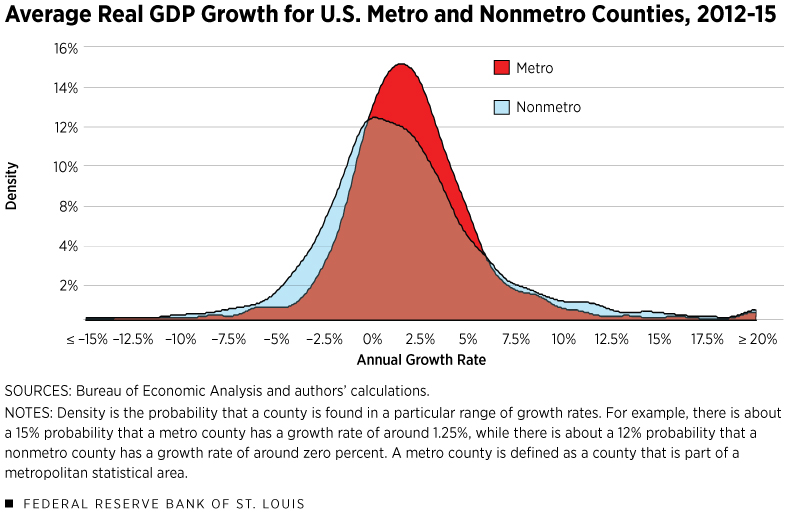
A few points emerge from this figure. First, annual growth rates across nonmetro counties are more dispersed than those of metro counties. This can be seen by the lower peak and the fatter tails in the nonmetro distribution.
Second, distribution growth across metro areas exceeds nonmetro growth, with an average growth rate of 1.97% compared with 1.68% for nonmetro areas. The median values show greater divergence—1.70% (metro) and 1.18% (nonmetro). Furthermore, 75% of metro counties expanded, while only 64% of nonmetro counties expanded.
The Role of Industry Mix in Disparate Growth Outcomes
While there are many reasons to expect divergent economic performance between urban and rural counties, one straightforward way to understand this difference is by looking at the industry mix between these two groups.See DiCecio and Gascon, and Boshara.
Table 1
| U.S. Metro | U.S. Nonmetro | Eighth District Metro | Eighth District Nonmetro | |
|---|---|---|---|---|
| Private Goods-Producing | 17.9% | 32.4% | 20.0% | 33.8% |
| Private Service-Providing | 70.1% | 51.9% | 67.4% | 51.5% |
| Government and Government Enterprises | 11.9% | 15.7% | 12.5% | 14.8% |
SOURCES: Bureau of Economic Analysis and authors' calculations.
Table 1 decomposes county-level real GDP into the three major sectors of the economy: private goods-producing, private service-providing, and government and government enterprises. Around 70% of metro area real GDP comes from the private service-providing sector, while around 50% of nonmetro GDP comes from this sector.
A key reason for this difference is due to what economists call agglomeration effects. In other words, firms (particularly service firms) experience greater productivity by locating in cities where they have easier access to resources like airports and large pools of consumers.
While improvements in technology may reduce these agglomeration benefits, in many instances they have increased those benefits. For example, urban hospitals can use a city’s amenities to attract physicians and then utilize telemedicine to provide services to rural areas.
The effect is not only a greater share of overall real GDP but also a faster growth rate in metro counties. The median service-providing sector growth rate in metro counties was 2.12%, compared with 1.17% in nonmetro counties.
Another takeaway from Table 1 is that the public sector has a greater share of real GDP in nonmetro counties: Government accounts for 16% of output compared with 12% in metro counties. This difference also partially explains the slower growth in nonmetro areas, as real output in the government sector declined across most U.S. counties during this period. (See Figure 2.)
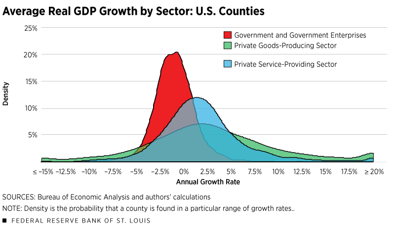
Lastly, notice in Figure 2 that the distribution of growth across the goods-producing sector is much flatter than the distribution of growth in the other two sectors. The greater dispersion of growth across nonmetro counties seen in Figure 1 can be attributed to the greater role of the goods-producing sector in these counties. (See Table 1.)
A Closer Look at the Eighth District
Within the Eighth Federal Reserve District,Headquartered in St. Louis, the Eighth Federal Reserve District includes all of Arkansas and parts of Illinois, Indiana, Kentucky, Mississippi, Missouri and Tennessee. metro-nonmetro divergent trends are more prevalent.
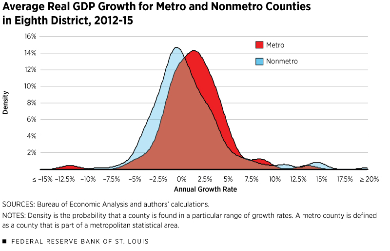
Figure 3 shows the distribution of growth (similar to Figure 1) for only the counties in the District. The bimodal distribution is much more evident in Figure 3 than in Figure 1 and the nonmetro distribution is shifted to the left (that is, growth is more negative). The median growth rate of metro counties in the District is 1.38%, while the nonmetro median is only 0.17%. Also, 67% of metro counties expanded, while 52% of nonmetro counties expanded.
Looking again at Table 1, it is somewhat surprising that there is a wider gap in growth rates between metro and nonmetro counties in the District than in the nation since the industry sector shares are similar. In fact, the difference in same-sector shares between metro and nonmetro counties is less pronounced in the District than in the nation.
So what is going on? While the gap in service-sector shares between metro and nonmetro counties is narrower in the District, the gap in median performance is slightly wider: 1.46% growth for metro counties and 0.32% growth for nonmetro counties.
The goods-producing sector also plays a major role in explaining the divergent outcomes in the District. Nationally, the median growth rate in the goods-producing sector is about 2.42%, and this is essentially the same in both metro and nonmetro counties. This relatively fast rate of growth can primarily be attributed to strong performance of the energy sector during this period.
In the District, the goods-producing sector typically resembles traditional manufacturing and agribusiness. As such, the overall median growth rate was slower, at about 2.09%. Moreover, metro and nonmetro counties experienced divergent outcomes, with stronger growth (2.44%) in metro counties and slower growth (1.66%) in nonmetro counties.
Conclusion
We found that urban (metro) counties have grown faster than rural (nonmetro) counties in the U.S. from 2012 to 2015. Further, this disparity is greater in the District than in the nation.
There are some caveats to our analysis. First of all, the BEA’s county GDP statistics are a prototype. The BEA will continue to incorporate new sources that could change our results. Also, this is only a four-year horizon, so one cannot extrapolate trends with so few data. However, our conclusion that rural areas grow more slowly than urban areas is corroborated by other studies.
Endnotes
- A metropolitan statistical area is an area associated with at least one urbanized area that has a population of at least 50,000. The MSA comprises the central county or counties containing the core, plus adjacent outlying counties having a high degree of social and economic integration with the central county or counties as measured through commuting.
- See DiCecio and Gascon, and Boshara.
- Headquartered in St. Louis, the Eighth Federal Reserve District includes all of Arkansas and parts of Illinois, Indiana, Kentucky, Mississippi, Missouri and Tennessee.
References
DiCecio, Riccardo; and Gascon, Charles S. “Income Convergence in the United States: A Tale of Migration and Urbanization.” Annals of Regional Science, October 2010, Vol. 45, No. 2, pp. 365-77.


Views expressed in Regional Economist are not necessarily those of the St. Louis Fed or Federal Reserve System.
For the latest insights from our economists and other St. Louis Fed experts, visit On the Economy and subscribe.
Email Us