Changes in Income Gaps Might Overstate Changes in Welfare Gaps
Discussions about changes in income among the poor, middle class and rich have become popular, especially after Thomas Piketty's recent publication of Capital in the Twenty-First Century. What these discussions sometimes leave out is that income must be adjusted by the relevant prices before it can be used to evaluate welfare.1 This article argues that the evolution of income by households of different income levels since the early 1980s may overstate differences in the evolution of welfare because the cost of goods consumed predominantly by the rich rose faster than the cost of goods consumed predominantly by the poor and middle class.
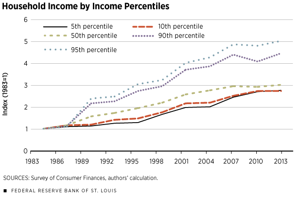
Figure 1 shows that income rose faster for richer than poorer households over the past three decades. We used data from the Federal Reserve's Survey of Consumer Finances (SCF) and plotted the income paths for the 5th, 10th, 50th, 90th and 95th percentiles of household income (lowest to highest). The household in the 95th percentile in 2013 was five times richer than its 1983 counterpart,2 while the median household (50th percentile) and the 5th-percentile household saw an increase of about three times.
This pattern is robust to demographic changes. To control for potential bias caused by change in age distribution (for example, baby boomers are aging during this period, and older households usually have more income than younger households), we also looked at the income of those households whose heads were between 35 and 55. We found that income inequality for those middle-aged households evolved in a quite similar way as for the whole population, as shown in Figure 1. We also looked at labor earnings separately from income since the latter includes, in addition to labor earnings, income from such things as unemployment insurance, food stamps, self-employment, and investments in stocks, bonds and real estate. When we performed the same exercise just for labor earnings, we found only slightly different patterns from what can be seen in Figure 1: The 95th, 50th and 5th percentiles of the household wage distribution increased by six, three and four times, respectively.
The pattern in Figure 1 is also very similar to that seen when other data sources for household income are used, sources such as the Current Population Survey (CPS). The only difference with CPS is in the top of the income distribution (95th percentile), where the increase is smaller (4.5 times), probably due to top-coding.3
After characterizing the change in household income, the next step is usually to adjust the change in income by changes in consumption prices. For instance, if the income of a given group is three times higher now than in 1983, but consumption prices are also three times higher, most would likely agree that their welfare did not improve. But which are the relevant prices?
We argue that the relevant prices are the prices of the goods actually purchased by those households. Importantly, households of different income levels consume different goods. Imagine that a household had an increase in income and that it increased expenditures on all goods. How much would the expenditures in each particular good increase? That could be measured by the expenditure elasticity estimated in a study soon to be published by Mark Aguiar and Mark Bils.4 They found great dispersion across products. The consumption of most goods increases as total expenditure increases;5 so, the real question is whether the increase is more or less than proportional. For instance, if consumption of food is $10 and total expenditure is $100, when total expenditures increase to $200, are food expenditures smaller or greater than $20? If they are exactly $20, the expenditure elasticity of food is exactly 1. If they are smaller (larger) than $20, the elasticity is smaller (larger) than 1.
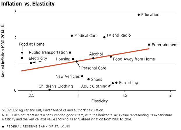
As total expenditures increase 1 percent, expenditures on the three categories of food at home, utilities and children's clothing go up only by 0.37, 0.47 and 0.67 percent, respectively. Items in all three categories are, therefore, labeled as "necessity goods." As a consequence, the fraction spent on these goods drops as total expenditures increase. The elasticity of housing to total expenditure is close to 1 (0.92), indicating that households tend to allocate almost a fixed proportion of their expenditures to housing expenditures.
On the other hand, some goods account for a bigger fraction in total expenditures as the latter increases. A person's spending on food away from home, for example, increases 1.33 percent when total expenditures increase 1 percent. Similarly, a 1 percent increase in total expenditures leads to spending increases greater than 1 percent on entertainment, child care and education. This indicates that the composition of consumption goods changes when income increases. In other words, the poor and the rich have different baskets of consumption goods.
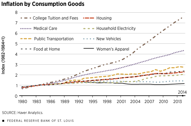
To have a fuller picture of welfare comparison, we need to investigate further the price changes for the different goods mentioned above. Figure 2 uses the Consumer Price Index for All Urban Consumers from the Bureau of Labor Statistics and plots the inflation trends (1982-1984=1) for eight consumption goods from 1980 to 2014. The inflation rates are uneven across goods. The price of education is more than seven times higher today than three decades ago. The price level for medical care, though lower than education, has also increased significantly, at a magnitude of more than four times. Inflation for housing, food and public transportation is moderate, increasing between two and three times from 1980 to 2014.
For the past three decades, some goods have also seen limited change in price levels. The prices for new vehicles and for women's apparel increased until the mid-1990s and decreased thereafter. The price for household electricity was almost flat until the 2000s, when the price started to go up steadily.
A casual observation of the change in prices and the income elasticities suggests that the goods consumed more by richer households, such as education, have become more costly over the past three decades. To show that this relationship also extends to additional consumption goods, Figure 3 plots the inflation rate from 1980 to 2014 and expenditure elasticity for 16 consumption goods/categories. The two show a positive correlation, i.e., goods consumed more by richer households had a higher increase in cost.
Overall, the findings suggest the increase in the income gap between rich and poor households might overstate the welfare differences. The reason is that the rich and poor generally consume a different basket of goods, and the goods consumed predominantly by richer households have risen faster in price.
Endnotes
- Technically, we are thinking about the concept of compensating variation (CV) to evaluate the welfare change of a change in prices. This concept answers: When the price of one good rises, how much more do you have to spend to maintain your initial level of happiness? [back to text]
- Note that, due to mobility, those who are at the top distribution in 2013 are generally different from those who were at the top in 1980. [back to text]
- Top-coding indicates that values above a certain threshold are coded as the threshold value. [back to text]
- See Aguiar and Bils. [back to text]
- A notable exception is tobacco. [back to text]
References
Aguiar, Mark; and Bils, Mark. "Has Consumption Inequality Mirrored Income Inequality?" American Economic Review, forthcoming.
Piketty, Thomas. Capital in the Twenty-First Century. English version. Cambridge, Mass.: Harvard University Press, 2014.
Views expressed in Regional Economist are not necessarily those of the St. Louis Fed or Federal Reserve System.
For the latest insights from our economists and other St. Louis Fed experts, visit On the Economy and subscribe.
Email Us


