


Asset Bubbles: Detecting and Measuring Them Are Not Easy Tasks
After the financial storm that spread from the United States in the summer of 2007 to many advanced economies by the fall of 2008, the economics profession was criticized for not being able to predict the crisis and for the profession's limited understanding of the mechanisms that generated the upheaval and allowed it to spread. Today, there is an abundance of new research that places the crisis in a historical context and links it to the development and bursting of asset bubbles—those periods of explosive behavior of prices. Hopefully, this and future research will help ward off the "this-time-is-different" syndrome (popularized by economists Carmen Reinhart and Kenneth Rogoff), that is, the mistaken idea that old rules about taking risks no longer apply once financial innovation and "reforms" occur in financial markets and the economy.
In this article, we explain the difficulties of defining and anticipating asset bubbles, focusing on the two types of assets that attract the lion's share of households' wealth—stocks and real estate. We discuss the way booms and busts in asset prices relate to financial crises, as well as the difficulties economists face in identifying bubbles. We then use a novel statistical technique, developed in the aftermath of the financial crisis, to compare past asset bubbles in the U.S.
Precursors of Financial Crises
Reinhart and Rogoff jokingly compared financial crises to family dynamics by quoting Leo Tolstoy's Anna Karenina, "All happy families are alike; each unhappy family is unhappy in its own way."1 Reinhart and Rogoff's extensive research on financial crises acknowledges the distinctions but identifies common factors that appear as precursors of most financial crises, as well as facts that characterize the aftermath of financial crises.2
Typically, four macroeconomic indicators in a country show common features before financial crises: 1) a slow run-up of asset prices followed by sharp contractions just before the onset of the crisis, 2) a slowdown of real gross domestic product (GDP) growth, 3) a sizable increase in government debt-to-GDP ratios, and 4) large capital inflows translating into negative current accounts. These elements can be observed in the U.S. and other advanced economies just before the crisis erupted in 2007-08.
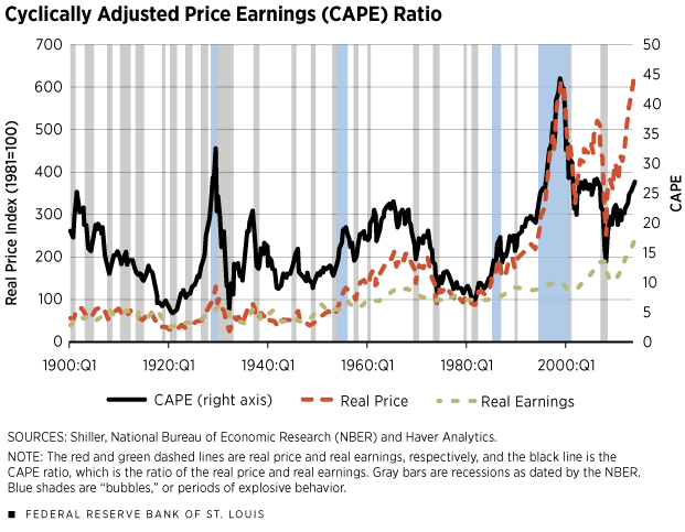
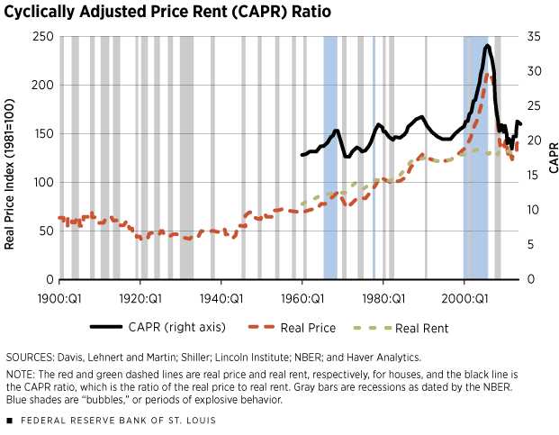
Here, we focus on the first indicator because the exuberant behavior of asset prices occurred before the eruption of financial turmoil in several financial crises. The two main categories of assets that constitute the majority of households' wealth and for which data are available are stocks and real estate. For the U.S., there exist century-long indexes for stock prices and house prices, which have been constructed and made available by Nobel-winning economist Robert Shiller on his website.3 The red dashed line in Figure 1 displays the S&P 500 price index; in Figure 2, the red line displays the Case-Shiller real home price index.4 These lines show clear episodes of run-ups and contractions. But which ones are bubbles, and which ones are normal movements of asset prices?
Defining Bubbles
The popular press often uses the term "bubble" to describe a situation in which the price of an asset has increased significantly in such a short period of time so as to suggest that the price is susceptible to an equally sudden collapse. Recent popular examples of these movements are the run-up in prices of information technology stocks in the late 1990s and the housing boom and bust in the 2000s.
Academic economists have occasionally invoked this definition, as well. For example, Charles Kindleberger and Robert Aliber defined a bubble as "an upward price movement over an extended range that then implodes."5 While this is an intuitive notion and resembles the run-up and contraction of asset prices, Reinhart and Rogoff are careful in describing large increases in asset prices without defining them as bubbles. More generally, economists find the definition of asset bubbles problematic because the proper identification of a bubble requires some metrics, and there is little agreement about what those metrics should be.
Shiller defined a bubble as "a situation in which news of price increases spurs investor enthusiasm, which spreads by psychological contagion from person to person, in the process amplifying stories that might justify the price increases and bringing in a larger and larger class of investors … despite doubts about the real value of an investment."6
Some economists conceptualize bubbles as situations in which the price of the asset grows faster than the asset's fundamental value, a notion that is similar to Shiller's explanation. When the asset price surpasses the asset's fundamental value, the asset can be considered overvalued. The idea behind this definition is that prices serve as signals of market conditions, derived by demand and supply: The increase in price signals a shortage of supply; eventually, supply increases, the price drops and there is a new equilibrium in price and quantity. However, in times of bubbles, prices may not serve as good signals and, thus, may not reflect market conditions or changes in the underlying value of the asset. Instead, the bubble sends out a signal that the asset is more valuable than it actually is.
The problem with this scenario is that the fundamental value of an asset is not easy to measure. Generally, we think of the value of an asset as a stream of payments in the form of dividends to the owner over time. Thus, the fundamental value of the asset should be defined as this total expectation of this stream of payments, discounted to present value.
Accordingly, to properly evaluate the presence of a bubble, we should compare the price of an asset to a measure approximating the stream of future dividends. In the case of stock prices, this is done by comparing prices or price indexes to earnings or earnings indexes; various measures of earnings can be used, such as current earnings, the average over the previous few years of earnings, or forecasts of future earnings. In the case of real estate markets, the comparison is typically between house price indexes and indexes on the amount charged to rent a similar house.7
In the two charts, the green lines represent an index of S&P 500 earnings and an index of rent, both normalized to 100 in 1981 to provide a comparison with the normalized indexes for S&P 500 stock prices and home prices. In addition to these lines, we plot two black continuous lines. In the first chart, we plot Shiller's CAPE index (Cyclically Adjusted Price Earnings), i.e., the ratio of the S&P 500 index to the average inflation-adjusted earnings from the previous 10 years. In the second chart, we construct and plot a conceptually analogous index that we created and call CAPR (Cyclically Adjusted Price Rent), i.e., the ratio of a house price index to the average inflation-adjusted rents indexed from the previous 10 years.8
These graphs show that once we divide by a measure approximating the fundamental value of the asset and its recent trend, the CAPE and CAPR ratios are a bit different from their corresponding price indexes because they now take into account the previous 10 years of earnings or rents (as proxies from the recent return to the asset). Even so, they show notable increases and contractions that may or may not be due to explosive behavior followed by busts.
Explosive Behavior
Recent developments in statistics and econometrics have built on a statistical notion of explosive behavior to create tests for detecting asset price bubbles. (We will call them "periods of explosive behavior" for reasons we explain later.) One prominent example of this approach was provided in a series of articles by econometrician Peter C.B. Phillips in collaboration with co-authors Shu-Ping Shi and Jun Yu; they developed a test based on the co-movement between the price of the asset and its fundamental value, as approximated by earnings.9 Intuitively, when price and fundamental value diverge too fast, we can suspect a period of explosive behavior.
In their work, the notion of explosive behavior is not exactly the same as the notion of bubbles, as the work is based on a statistical definition of explosive behavior in prices or price/earnings that does not analyze the underlying reasons why these measures increase or decrease. As we discuss later, there may be various reasons that induce movements in price ratios that are not necessarily due to unjustified behavior of prices, earnings or rents.
In particular, we used one of the statistical tests they developed to identify periods of explosive behavior of the CAPE and the CAPR indexes.10 We used the entire Shiller CAPE series for stocks (January 1881-December 2014) and data from the Lincoln Institute series for house prices (1960:Q1-2014:Q1). Because we need price ratios and not just price indexes (to correct price movements by changes in the recent average returns of the asset), the length of the CAPR is unfortunately shorter than that of the CAPE.
The test detects four periods of explosive behavior for the CAPE that are consistent with research by Phillips and co-authors, as well as our knowledge of bubbly periods in modern American history: 1928:Q4-1929:Q3 (four quarters), 1954:Q3-1956:Q2 (eight quarters), 1986:Q1-1987:Q3 (seven quarters) and 1995:Q3-2001:Q3 (25 quarters). For our shorter CAPR series, the test also stamps three periods of explosive behavior for the CAPR: 1965:Q3-1968:Q4 (14 quarters), 1977:Q4-1978:Q1 (two quarters) and 2000:Q2-2006:Q1 (24 quarters). These periods of explosive behavior are represented by light-blue-shaded areas in the graphs. (The gray shaded areas represent recessions as identified by the National Bureau of Economic Research.)
A Historical Perspective
To compare these episodes over time, we adapted a measure of severity of the financial crises that was developed by Reinhart and Rogoff and constructed a measure of the magnitude of the historical asset price run-ups and contractions for the period of explosive behavior just identified.11 Reinhart and Rogoff collected data on real GDP per capita for several countries and identified large contractions of this measure. Three features characterized this contraction: (1) the time it takes real GDP per capita to return to the previous peak level (duration), (2) the percentage drop of real GDP from peak to the lowest trough (depth), and (3) the existence of double or even triple dips characterizing the contraction and recovery of real GDP per capita. They then constructed a severity index, which is the sum of depth and duration.
We constructed a related measure but one that is based on the period of explosive behavior. We measured the duration of this period as the number of quarters between the beginning date detected by the statistical test we used and the end date in which the level of CAPE or CAPR returned to the pre-explosive behavior period. The size is the percentage increase in the value of the price index between the beginning of the episode and the highest peak reached before the end of the episode. The sum of duration and size is then a measure of the magnitude of the episode, reported in the last column of the table. We call this measure "the exuberance index." In the index, a higher reading indicates more exuberance, and vice versa.
The measure shows that the housing boom and bust of the 2000s was the most severe episode for real estate in the country in the 1960-2014 period, while the technology boom and bust of 1995-2001 was the most severe in the 1890-2014 period for stock prices. The index we constructed increases with price increases and duration. The period before the Great Depression is characterized by a large increase in the stock price index that was relatively short-lived, compared with the technology boom. Therefore, the combination of size and duration places the exuberance of the 1920s only fourth historically for stocks.
Bubbles or Not?
Are these periods of explosive behavior in price/earnings and price/rents necessarily bubbles? The short answer is "no," and it relates to the difficulties in measuring fundamentals properly. Economic theory suggests that price/earnings and price/rent ratios can change even if we are not in the presence of the irrational behavior of investors.
It is perhaps easier to see why in the context of housing markets. The ratio of price to rent could be considered as an equilibrium quantity capturing the relative cost of buying vs. renting; this ratio should be relatively stable over the years if nothing fundamental changes in the economy. What determines this equilibrium level? The price of a house is not the only determinant of the cost of owning it; so, rising house prices do not necessarily indicate that homeownership has become more expensive relative to renting, but may indicate that something has changed in the fundamental value of the house. Supply conditions in the real estate market, expected appreciation rates, taxes, maintenance costs and mortgage features also affect the volatility of price/rent ratios. As studied in the real estate economics literature, the sensitivity of house prices to changes in fundamentals is larger when interest rates are low and in locations where expected price growth is high; so, fast price increases (relative to rent) do not necessarily signal the presence of a bubble even when they appear as "exuberant." The correct measure to use, as a comparison for rents, is the imputed annual rental cost of owning a home, a variant of what economists call the "user cost," which is particularly difficult to measure.
Similarly, in the stock market, price/earnings are affected by the risk-free rate in the economy, the equity premium and the growth rate of earnings, all of which can change over time and, therefore, can affect the price/dividend ratio independently of the presence of a bubble.
These considerations do not affect the validity of the statistical approach to detect episodes of explosive behavior—an approach that is now available and very helpful for monitoring various markets. However, these considerations warn us to be careful when we interpret the findings that we abstract from an economic model.12
Endnotes
- See Reinhart and Rogoff (November 2014). [back to text]
- This article focuses on the precursors to such crises, not the aftermath. However, in a nutshell, the aftermaths of financial crises share deep and lasting depressed asset prices, output and employment, as well as an increase in public debt. [back to text]
- See www.econ.yale.edu/~shiller/data.htm. [back to text]
- In order to obtain this series (real price indexes normalized to 100 in 1981), we spliced the Case-Shiller data with the quarterly data provided by the Lincoln Institute at the 1960 data point. In the graph for real estate, the frequency of the real price index data is annual before 1953, monthly during 1953-1960 and quarterly after 1960. [back to text]
- See Kindleberger and Aliber. [back to text]
- See Shiller. [back to text]
- Researchers also compare price indexes to measures of income. [back to text]
- The CAPR ratio is calculated using the real price divided by the average of the real rent over the past 10 years, when available. We used nominal price and rent data from the Lincoln Institute, constructed by Davis, Lehnert and Martin. We converted the nominal price and rent series to real using the consumer price index (CPI) to be consistent with Shiller's stock market data. [back to text]
- See Phillips, Shi and Yu. [back to text]
- We used Philip et al.'s GSADF 95 percent test to date-stamp the bubbles and include only periods of explosive behavior that are longer than a half-year. [back to text]
- See Reinhart and Rogoff (May 2014). [back to text]
- For an application of this procedure to housing markets in an international context, see www.dallasfed.org/institute/houseprice. [back to text]
References
Davis, Morris A.; Lehnert, Andreas; and Martin, Robert F. "The Rent-Price Ratio for the
Aggregate Stock of Owner-Occupied Housing." Review of Income and Wealth, 2008,
Vol. 54. No. 2, pp. 279-84.
Kindleberger, Charles P.; and Aliber, Robert Z. Manias, Panics, and Crashes: A History of Financial Crises. Hoboken, N.J.: John Wiley & Sons, 1996.
Phillips, Peter C.B.; Shi, Shu-Ping; and Yu, Jun. "Testing for Multiple Bubbles: Historical Episodes of Exuberance and Collapse in the S&P 500." International Economic Review, forthcoming.
Reinhart, Carmen M.; and Rogoff, Kenneth S. "Recovery from Financial Crises: Evidence from 100 Episodes." American Economic Review, May 2014, Vol. 104, No. 5, pp. 50-55.
Reinhart, Carmen M.; and Rogoff, Kenneth S. "This Time Is Different: a Panoramic View of Eight Centuries of Financial Crises." Annals of Economics and Finance, November 2014, Vol. 15, No. 2, pp. 1,065-188.
Shiller, Robert J. Irrational Exuberance. First Edition. Princeton, N.J.: Princeton University Press, 2000.
Views expressed in Regional Economist are not necessarily those of the St. Louis Fed or Federal Reserve System.
For the latest insights from our economists and other St. Louis Fed experts, visit On the Economy and subscribe.
Email Us