


The Unequal Recovery: Measuring Financial Distress by ZIP Code
KEY TAKEAWAYS
- Aggregate changes in the balance sheets of U.S. households show improvements since 2010, but the recovery has not been the same for everyone.
- Analyzing changes in wealth, debt and financial distress by ZIP code offers a different perspective on household financial resilience.
- Neighboring ZIP codes, even within the same city, often experience divergent outcomes defying the national trend.
- Since 2015, housing wealth, debt and financial distress have been rising the fastest in the poorest ZIP codes, increasing their vulnerability to housing price downturns.

In its most recent Financial Stability Report, the Federal Reserve Board of Governors tempered a largely positive view of the U.S. financial system with several concerns about remaining vulnerabilities. Noticeably absent, however, were any major concerns over household balance sheets. The report held instead that “household borrowing has advanced more slowly than economic activity and is largely concentrated among low-credit-risk borrowers.”See Board of Governors of the Federal Reserve System, p. 17. What is more, this assessment came just after a historic announcement by the Federal Reserve in June 2018 that aggregate U.S. wealth had surpassed the $100 trillion mark for the first time in history.See Torry.
This is important progress, especially because of the outsized role that deteriorating household balance sheets played in the Great Recession. Many narratives have been told for exactly why that recession was as bad as it was, but a common plot element is that declining house prices forced highly leveraged households to reduce consumption drastically. For example, economists Atif Mian, Kamalesh Rao and Amir Sufi estimated that for every dollar of housing wealth lost, households' consumption decreased by 5 to 7 cents.See Mian, Rao and Sufi. While that may not seem like much out of any given dollar, the effect quickly becomes massive when added up across all home value losses suffered by all households.
Furthermore, using county and ZIP code level data, Mian, Rao and Sufi show that this effect differs substantially across regions, and that the consumption patterns of poorer areas with high leverage tend to be significantly more sensitive to changes in wealth. In other words, it is not merely the aggregate changes in wealth that are significant determinants of consumption but also the way that those changes in wealth are distributed across households. A decline in house prices that occurs in a poorer area with high leverage is going to have a larger effect dollar for dollar than the same change made to a wealthy area with relatively low debt.
Our Data
Recent research by Fed economists Kartik Athreya, José Mustre-del-Río and Juan Sánchez suggests that for individual borrowers, financial distress is not a transitory phenomenon but rather a highly persistent one. To put it differently, while most people never have credit card payments over 120 days delinquent, they found that among those who at some point do, more than 30 percent spend at least a quarter of their time that way.See Athreya, Mustre-del-Río and Sánchez. In this article, we use a data set prepared for the follow-up paper, which is currently research in progress entitled “The Aggregate Implications of Household Financial Distress.”
The methodology—which is similar to that in Mian, Rao and Sufi—creates a data set of household balance sheets at the ZIP code level and examines whether the change since the beginning of the economic recovery in 2010 has been as positive as it seems at the aggregate level. ZIP codes, being nothing more than a collection of individuals within certain geographical boundaries, are thus used to represent individuals with certain characteristics.
Four components of net wealth are considered: total debt, housing wealth, stocks and bonds. In constructing total debt, we distribute total household and nonprofit liabilities from the Federal Flow of Funds across ZIP codes to match the distribution in total debt found in the Federal Reserve Bank of New York/Equifax Consumer Credit Panel (CCP) data set. Housing wealth is measured simply as the median home price by ZIP code multiplied by the corresponding number of households.For this measure, we use Zillow data to find the median home price and census data to find the number of households in a ZIP code. Census data are not available over all years, so we interpolated missing data linearly. Finally, stocks and bonds are found similar to total debt, first by taking aggregate financial assets as recorded in the Flow of Funds, then distributing them across ZIP codes to match the distribution of earnings on interest in the IRS Statistics of Income (SOI) data sets.Unfortunately, the most recent year for which IRS SOI data are available is 2016. In 2017 and 2018, then, we are forced to assume that the distribution of interest earnings has not changed since 2016 and that only the aggregate totals have changed. This does limit the accuracy of our estimates of financial wealth, but calculations based upon the years for which we do have full information would suggest that our data are sufficient to account for about 40 percent of the variation in the change in financial wealth at the ZIP code level from 2015 to 2018.
Next, in addition to these variables on net wealth by ZIP code, we compute a measure of households’ financial distress at the ZIP code level. Specifically, we track the percentage of people within a ZIP code that have reached at least 80 percent of their credit limit, that is, the maximum balance that they can hold on their bank-issued credit cards.
In total, the data that we will use for this article include yearly measures for some 38,977 distinct ZIP codes (there are about 42,000 in the U.S.). Of these, we have data from 36,944 in each of the three key years—2010, 2015 and 2018—on which this analysis will be focused. This will allow for a comparison of year-over-year changes in household balance sheets at the ZIP code level, affording a much more disaggregated perspective than can be provided by national statistics.
The Distribution of Wealth Growth since 2010
In Table 1, the economic recovery since 2010 is divided into two periods based upon the monetary policy that presided over each. In the first, lasting until 2015, the Federal Reserve pushed interest rates near zero to stimulate the economy. Then, beginning in December 2015, the Federal Reserve has been lifting interest rates.
For each period, the table’s bottom row displays the national average yearly growth rate for the corresponding category of wealth taken from the Federal Flow of Funds. Just above that is the corresponding weighted average from our sample, which is very close to the Flow of Funds rate in all cases. While both periods saw similarly robust growth in terms of net wealth (7.4 percent for 2010-2015 and 6.2 percent for 2015-2018), the composition of that growth is quite different. From 2010 to 2015, financial wealth was the strongest component of growth (6.9 percent), and debt accumulation was very low (0.5 percent).
Beginning in 2015, however, U.S. housing wealth posted the largest gains (6.1 percent) and brought with it faster debt accumulation as well (2.7 percent). Should house prices drop again, households may find themselves more highly leveraged and vulnerable than they were at the beginning of 2015.
The rest of the table shows the dispersion of these growth rates across ZIP codes in our sample, ranked from lowest to highest in each category. Over the years 2010-2015, for example, ZIP codes at the 90th percentile in terms of debt accumulation saw their debt grow by 6.2 percent annually, well above the national average of 0.5 percent annually. The dispersion is even wider from 2015 to 2018.
Similarly, during the period 2010-2015, 10 percent of ZIP codes experienced declines in financial distress—the share of households that reached at least 80 percent of their credit limit—greater than 1.9 percentage points, while at the other extreme, 10 percent of ZIP codes experienced increases in financial distress no less than 1.1 percentage points.
The differences are again more drastic for the period 2015-2018, with the best-performing 10 percent of ZIP codes reducing financial distress by over 1.8 percentage points each year and the worst-performing 10 percent of ZIP codes increasing in financial distress by no less than 2.7 percentage points each year.
Table 1
Variations in Balance Sheet Components and Financial Distress by ZIP Code
Average Year-over-Year Changes during Two Phases of the Economic Recovery
| Percentiles of growth for each variable | Debt | Financial Wealth | Housing Wealth | Net Wealth | Financial Distress | |||||
|---|---|---|---|---|---|---|---|---|---|---|
| 2010-15 | 2015-18 | 2010-15 | 2015-18 | 2010-15 | 2015-18 | 2010-15 | 2015-18 | 2010-15 | 2015-18 | |
| 1% | -16.1% | -17.8% | -14.3% | -12.2% | -5.9% | -0.8% | -8.8% | -10.1% | -3.4 | -4.0 |
| 10% | -6.6% | -6.1% | 1.4% | -1.1% | -0.7% | 3.2% | 2.0% | 0.5% | -1.9 | -1.8 |
| 25% | -3.2% | -1.9% | 4.1% | 3.3% | 1.2% | 5.0% | 4.4% | 4.3% | -1.2 | -0.7 |
| 50% | 0.1% | 2.1% | 6.5% | 5.8% | 3.6% | 7.1% | 6.9% | 6.8% | -0.4 | 0.4 |
| 75% | 3.3% | 6.3% | 8.9% | 7.6% | 6.3% | 6.6% | 9.6% | 9.0% | 0.4 | 1.6 |
| 90% | 6.2% | 10.7% | 11.8% | 9.8% | 8.8% | 11.9% | 12.5% | 11.3% | 1.1 | 2.7 |
| 99% | 13.1% | 21.0% | 19.6% | 18.6% | 13.7% | 16.6% | 19.2% | 18.0% | 2.7 | 5.2 |
| Weighted Sample Mean | 0.5% | 2.7% | 6.8% | 5.4% | 4.1% | 7.4% | 7.4% | 6.5% | -0.4 | 0.5 |
| Federal Flow of Funds | 0.5% | 2.7% | 6.9% | 5.8% | 5.0% | 6.1% | 7.4% | 6.2% | — | — |
SOURCES: Federal Reserve Bank of New York/Equifax Consumer Credit Panel, IRS Statistics of Income, Zillow, Federal Flow of Funds, U.S. Census Bureau and authors’ calculations.
NOTES: ZIP codes have been divided into percentiles for each variable and period separately; for example, a ZIP code in the bottom 10 percent of debt growth may not be in the bottom 10 percent of financial wealth growth, and a ZIP code in the top 10 percent of financial distress growth from 2010 to 2015 may not be in the top 10 percent of financial distress growth from 2015 to 2018. The financial distress columns show the annual percentage point change in the fraction of people in a ZIP code who have reached at least 80 percent of their total credit limit across all their bank-issued credit cards. From 2015 to 2018, for example, the number of people with financial distress in an average ZIP code was increasing at a rate equal to 0.5 percent of their population each year. The national change for household wealth was constructed from the Federal Flow of Funds’ category of household and nonprofit real estate.
A Geographic Perspective
Another way of seeing the diversity in households’ financial stability is by plotting the data geographically. Figure 1 shows the average yearly change in financial distress between 2010 and 2015, and Figure 2 does the same for 2015 and 2018. In Figure 2, for example, if a ZIP code’s shading is in the category of 1 to 2 percentage points, then the percentage of its population in financial distress increased by 3 to 6 percentage points from 2015 to 2018.
We also marked only changes that are statistically different than zero, which is why much of each map shows “no change,” especially in large rural areas with small populations.
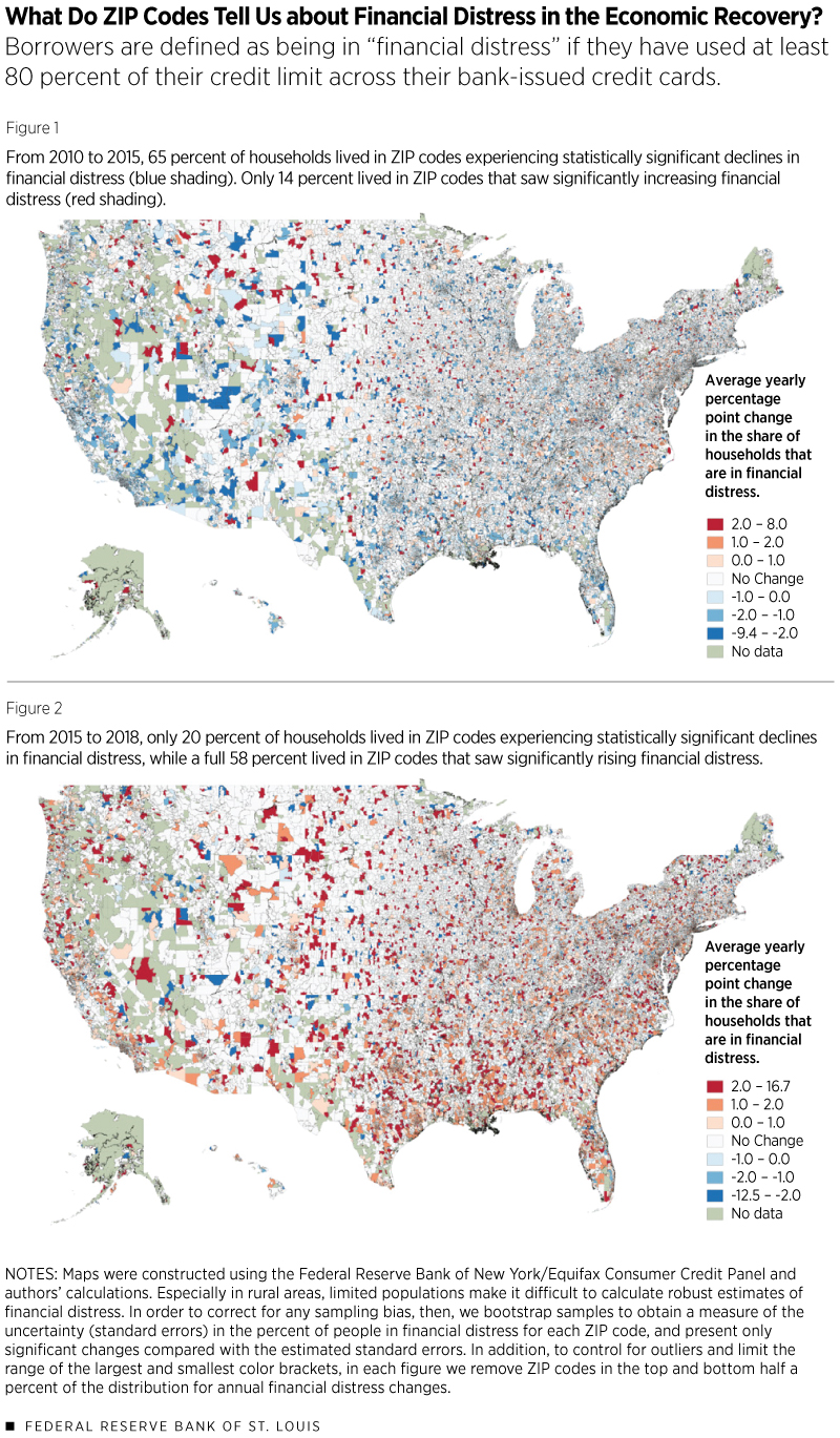
The national trend is immediately apparent in both maps: While financial distress along our measure improved across most of the country from 2010 to 2015, it deteriorated with similar yearly magnitude from 2015 to 2018.
At the same time, it is equally apparent that this national trend masks a large amount of variation within states and even within counties. To give some perspective on these numbers, the national weighted average of borrowers reaching at least 80 percent of their credit limit in our sample was 16.5 percent, 14.7 percent and 16.1 percent in the years 2010, 2015 and 2018, respectively. Those ZIP codes in the deepest shade of red, then, were deteriorating each year by around an eighth or more of the national average. Compare that to the darkest shade of blue, which marks ZIP codes that were improving each year by around an eighth or more of the national average.
That so many areas show these two extremes directly adjacent to one another points to how conditions of financial distress can diverge rapidly across neighborhoods. This effect is particularly pronounced in major population centers where ZIP codes parcel out smaller areas of land, such that they are impossible to distinguish in the national graphs of Figures 1 and 2.
Consider, for example, Hennepin County in Minnesota and, within that, the city of Eden Prairie, which is composed of three mutually adjacent ZIP codes: 55344 to the east, 55346 to the west, and 55347 to the south. The eastern ZIP code experienced almost no change in net wealth from 2010 until 2015 but a slight increase in financial distress, while the western and southern ZIP codes experienced sizable increases in net wealth and slight decreases in financial distress over the same period.
After these changes, in 2015, the share of residents in all three ZIP codes that had used at least 80 percent of their credit limit was nearly identical: about 10.6 percent. During the period from 2015 until 2018, however, the eastern and southern ZIP codes each experienced increases in financial distress of about 6 percentage points, putting them near the national mean of 16.1 percent in 2018. By contrast, financial distress in the western ZIP code remained nearly unchanged over the same time period.
Clearly, the recovery experiences of these three ZIP codes were very different, even though all of them are in the same city; they share the same community center, send their children to the same public high school, and have but one McDonald’s restaurant.
What This Distribution Suggests about Aggregate Financial Stability
Given that there has been a wide dispersion in measures of wealth growth across ZIP codes since 2010, it seems fair to reconsider what the current distribution of households’ financial conditions means for financial stability. If it is the case that growth has been concentrated in the hands of wealthy ZIP codes with low leverage, then the poor and high-leverage ZIP codes that are more affected by wealth shocks may still be vulnerable. What’s more, trends in less affluent groups are masked in nationally aggregated statistics by groups with more wealth.
Imagine an economy with two people, one of whom has $1 of wealth and the other $99. Imagine further that the poorer individual’s wealth drops to nothing the next year, while the other's remains unchanged. A nationally aggregated statistic will observe $100 of wealth in the first period and $99 in the next, which represents a 1 percent decrease in net wealth. The poorer individual, however, experienced a life-changing 100 percent decrease. Given how the top 1 percent in our country has around 40 percent of all wealth, this contrived example is not entirely unlike the real world. Life-changing shocks to net wealth at the lowest percentiles may be entirely invisible under near trivial changes at the highest percentiles.
Table 2 divides the ZIP codes into five groups—quintiles—in order of increasing average gross income per household and then reports average year-over-year changes like those of Table 1 for each group. From 2010 to 2015, for example, the poorest group of ZIP codes made an average of $32,000 in gross income per household and had an average year-over-year growth rate in net wealth equal to 4.1 percent.
Table 2
Variations in Balance Sheet Components and Financial Distress by Income
Average Year-over-Year Changes during Two Phases of the Economic Recovery
| Quintiles | Adjusted Gross Income | Debt | Financial Wealth | Housing Wealth | Net Wealth | Financial Distress | ||||||
|---|---|---|---|---|---|---|---|---|---|---|---|---|
| 2010-15 | 2015-18 | 2010-15 | 2015-18 | 2010-15 | 2015-18 | 2010-15 | 2015-18 | 2010-15 | 2015-18 | 2010-15 | 2015-18 | |
| First | $32,000 | $35,000 | 0.1% | 3.3% | 3.0% | 4.9% | 2.5% | 9.0% | 4.1% | 6.8% | -0.4 | 0.8 |
| Second | $42,000 | $47,000 | -0.1% | 3.1% | 4.3% | 4.7% | 2.7% | 8.7% | 4.8% | 6.4% | -0.4 | 0.8 |
| Third | $51,000 | $58,000 | 0.3% | 2.9% | 5.1% | 5.0% | 3.3% | 8.4% | 5.7% | 6.7% | -0.3 | 0.5 |
| Fourth | $64,000 | $73,000 | 0.3% | 3.0% | 6.3% | 5.2% | 3.8% | 8.0% | 6.9% | 6.5% | -0.4 | 0.5 |
| Fifth | $115,000 | $141,000 | 0.9% | 2.5% | 7.9% | 4.4% | 4.8% | 6.7% | 8.3% | 5.3% | -0.4 | 0.1 |
SOURCES: Federal Reserve Bank of New York/Equifax Consumer Credit Panel, IRS Statistics of Income, Zillow, Federal Flow of Funds, U.S. Census Bureau and authors’ calculations.
NOTES: Adjusted gross income is rounded to the nearest thousand. Financial distress shows the average annual percentage point change in the fraction of people in a ZIP code who have reached at least 80 percent of their credit limit.
Strikingly, since 2015, housing wealth, debt and financial distress have all been rising fastest in the poorest ZIP codes by average gross income. It was mentioned earlier that at the national level, the rapid accumulation of housing wealth and debt in this period increased the economy’s vulnerability to a housing price shock like the one that predated the Great Recession. Now it is seen that this change in vulnerability was concentrated among poorer households, which makes intuitive sense given that they tend to have a higher percentage of their wealth in their homes and less in financial markets than do wealthier households.
By contrast, housing wealth, debt and financial distress all rose the slowest since 2015 for the wealthiest of households, signaling that the aggregate growth in stability since 2015 against this type of housing shock may have been concentrated in the hands of those who need it the least.
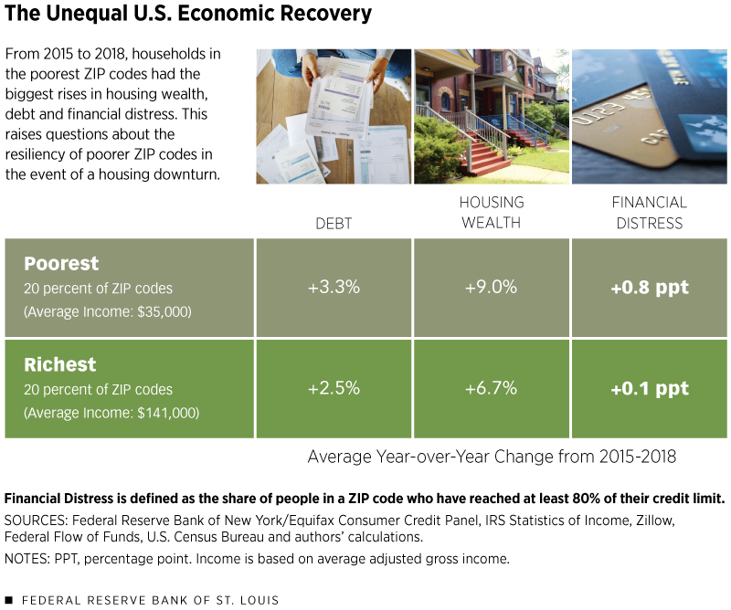
For the moment, though, the strong increases in housing wealth for the lower-income ZIP codes after 2015 have produced some of the largest gains in net wealth for that period, which is a very positive thing if house prices remain high. This comes as a strong reversal of the trend in the previous period: After the end of the recession in 2009, the wealthier households in terms of gross income began to recover faster in terms of net wealth, with the highest-income group experiencing an average annual growth rate in excess of 8 percent until 2015.
For all income groups, our measurement of financial distress decreased on average each year from 2010 to 2015, and then increased on average in the years from 2015 to 2018. Given that the period from 2015 to 2018 was also marked by Federal Reserve decisions to raise interest rates, this was a relatively expensive time to accumulate debt and therefore an unfortunate period to show this trend in financial distress.
Again, the dynamics of financial distress across income groups are interesting. While all groups saw distress decrease at approximately the same rate from 2010 to 2015, the increase in financial distress for the period that followed was concentrated in the poorest areas.
Conclusion
On almost every aggregate measure, the national recovery in household balance sheets since 2010 has been positive. Even our measure of financial distress, which increased nationally from 2015 until 2018, shows a net national decrease when compared against 2010. Underneath that rosy narrative of recovery, however, lies substantial heterogeneity at the level of ZIP codes, and mixed messages on the resiliency of many households to face another recession.
Endnotes
- See Board of Governors of the Federal Reserve System, p. 17.
- See Torry.
- See Mian, Rao and Sufi.
- See Athreya, Mustre-del-Río and Sánchez.
- For this measure, we use Zillow data to find the median home price and census data to find the number of households in a ZIP code. Census data are not available over all years, so we interpolated missing data linearly.
- Unfortunately, the most recent year for which IRS SOI data are available is 2016. In 2017 and 2018, then, we are forced to assume that the distribution of interest earnings has not changed since 2016 and that only the aggregate totals have changed. This does limit the accuracy of our estimates of financial wealth, but calculations based upon the years for which we do have full information would suggest that our data are sufficient to account for about 40 percent of the variation in the change in financial wealth at the ZIP code level from 2015 to 2018.
References
Athreya, Kartik; Mustre-del-Río, José; and Sánchez, Juan M. “The Persistence of Financial Distress.” The Review of Financial Studies; Feb. 1, 2019.
Board of Governors of the Federal Reserve System. “Financial Stability Report.” November 2018.
Mian, Atif; Rao, Kamalesh; and Sufi, Amir. “Household Balance Sheets, Consumption, and the Economic Slump.” The Quarterly Journal of Economics, November 2013, Vol. 128, No. 4, pp. 1687-1726.
Torry, Harriet. “Americans’ Wealth Surpasses $100 Trillion.” The Wall Street Journal, June 7, 2018.


Views expressed in Regional Economist are not necessarily those of the St. Louis Fed or Federal Reserve System.
For the latest insights from our economists and other St. Louis Fed experts, visit On the Economy and subscribe.
Email Us