Living Arrangements Matter Not Just to Your Parents but Also to Policymakers
The United States has 115 million households, the makeup of which varies across the board. Some people live alone. In other households, many people reside—the average is 2.6. Some occupants are married. Some are cohabiting. Some have never married. Should the composition of U.S. households and the living arrangements of people in them matter to economists and policymakers? Yes. Think of unemployment and income inequality, for example. No question, these are issues of interest to policymakers. The decision to look for a job, as well as some measures of income inequality, are closely connected with the living arrangements people choose, as I will show in this article with a few statistics.
First, let's take a look at how the composition of U.S. households has changed over the years. According to the Current Population Survey, the fraction of households headed by a married couple has decreased since the 1970s from 70 to 50 percent. Over the same period, the fraction of households made up of men or women living alone has increased, from just below 20 to just below 30 percent. These trends reveal another set of trends: The marriage rate of Americans has decreased, and the divorce rate has increased. Another phenomenon is the increasing number of people cohabiting but not getting married.1
So, how does economic life differ for people in different living arrangements? The possible indicators are many. Consider the decision to be a member of the labor force or not. Being a member of the labor force does not always mean that one is employed. One may be unemployed and looking for a job and still be included in the "labor force participation" data. However, if one does not even look for employment, then one is not part of the labor force.
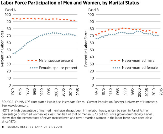
A person who is sufficiently economically secure may choose not to participate in the labor market. Figure 1, Panel A shows that more than 90 percent of married men between the ages of 18 and 50 who live with their spouses have participated in the labor market since at least the 1970s. Quite different are the numbers for married women living with their spouses. In 1970, fewer than half were in the labor force; that percentage grew by 1990 to 70 percent, where it remains, more or less, today. This trend has been the object of many studies and, in fact, was under way before the 1970s.
The picture of labor force participation changes when one looks at never-married individuals, as in Figure 1, Panel B. There, the difference between men and women appears insignificant compared with Panel A. About 75 percent of never-married men and women participate in the labor force today; this figure has been remarkably steady since the 1970s.
To be sure, Figure 1 does not answer the "which comes first" question, that is, are people deciding to participate in the labor force based on their living arrangement, or are they choosing their living arrangement based on whether they are members of the labor force? These are interesting questions, but not the ones I am trying to answer here. My point is that living arrangements and economic lives are correlated.
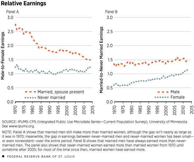
Let's turn to another indicator of economic performance: income. More precisely, let us look at the income received from labor and exclude other sources of income, such as financial assets, Social Security payments, etc. It is well-known, and often discussed, that income inequality is large. One form of inequality is the so-called gender gap in labor income, that is, the fact that men tend to be paid more than women. Panel A of Figure 2 shows the ratio between men's and women's labor income. When this number is close to 1, men and women have similar levels of income. When the number is far above 1, men earn more than women. The people considered here are similar in age (between 30 and 40) and education (they have at least a high school diploma). Also, they are all working.
The figure reveals that, when comparing married men and married women, the gap in earnings tends to be large, albeit decreasing over time. In the 1970s, a married man of this type made 2.5 times more money working than a married woman of the same age and with the same education. What is remarkable, however, is that there was almost no difference between never-married men and never-married women. The ratio is much closer to 1, which, again, means that they earn the same amount of money at work. This is more evidence that the arrangement in which people spend their lives has important implications for their economic lives; this is particularly true for women.
Panel B of Figure 2 reveals another aspect of the data that is interesting. It shows the relative earnings between married and never-married people. Again, they are all between 30 and 40, have at least a high school diploma and work. Clearly, for men it is better financially to be married. Married men make about 50 percent more money than never-married men. However, for most of the sample period, it is exactly the opposite for women: Married women tend to make less money (50 percent less in the 1970s) than never-married women (at least until the end of the sample period). Once again, the question of causality is not addressed here: Are the married men making more money than the single men because they are married, or is it the case that more-productive men are better at getting married?
In the end, the lesson from this discussion is that living arrangements are informative about people's economic lives.
Endnote
- The source is the U.S. Census Bureau, Current Population Survey, Annual Social and Economic Supplement, selected years, 1970 to 2012. [back to text]
Views expressed in Regional Economist are not necessarily those of the St. Louis Fed or Federal Reserve System.
For the latest insights from our economists and other St. Louis Fed experts, visit On the Economy and subscribe.
Email Us


