COVID-19 Death Gap by County Income Widened after Vaccine Availability
KEY TAKEAWAYS
- U.S. counties with the highest average household income had lower COVID-19 death rates than the lowest-income counties, with the gap widening in the second year of the pandemic.
- The level of vaccination acceptance may be the reason for this widening gap, as the highest-income counties had higher vaccination rates than the lowest-income counties.
- The recent omicron wave of the pandemic has affected regions more uniformly, although the number of deaths were still significantly higher in poorer regions.
A fast-growing literature is exposing the relationship between COVID-19 and income inequality.A recent working paper (PDF) by Kartik Athreya, Ryan Mather, José Mustre-del-Río and Juan M. Sánchez documents a positive correlation between household financial distress and exposure to economic shocks, including the COVID-19 pandemic shock. This article analyzes this relationship by documenting the progression of COVID-19 deaths among groups of counties with different levels of average household income and highlighting the role of uneven vaccination rates. Overall, counties with the highest household income averages experienced lower incidences of COVID-19 deaths and were more likely to have adult residents with completed COVID-19 vaccinations than lower-income counties.
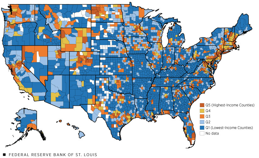
Tax-return data for the year 2018 from the Internal Revenue Service (IRS) measure pre-pandemic average county-level household income. There are five groups of counties (quintiles) sorted by income in all the figures below; each of the quintiles has approximately the same total population. The first quintile contains counties with the lowest household income averages, and the fifth quintile contains counties with the highest household income averages. The dataset covers 99% of the U.S. population and 96% of aggregate COVID-19 deaths. Data on county-level COVID-19 deaths in the United States come from the Centers for Disease Control and Prevention (CDC) and start on Jan. 22, 2020. Because relative income among counties changes slowly, the 2018 income data will closely approximate the income data for 2020. The map below shows the geographical distribution of these quintiles.
Quintiles of Income, 2018

SOURCES: IRS and authors’ calculations.
Changing Patterns of COVID-19 Death Inequality during 2020
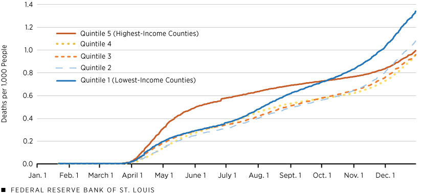
The figure below shows that at the beginning of the pandemic, the highest-income counties (Quintile 5) rapidly accumulated the most COVID-19 deaths out of the five groups. By October 2020, however, cumulative deaths in the lowest-income counties (Quintile 1) surpassed those of all other quintiles. This trend continued, and by the end of 2020 (the last data point in the figure), the lowest-income quintile of counties experienced 1.35 times the death rate as the highest-income quintile of counties.
Cumulative COVID-19 Deaths by Quintile of County Income per Household: 2020

SOURCES: USAFacts, IRS and authors’ calculations.
What may be the causes for this discrepancy? It is well documented that age is a large risk factor for COVID-19 mortality. In the lowest-income quintile, approximately 17.2% of the population is 65 years of age or older, compared with 15.2% in the highest-income quintile. Given the COVID-19 mortality rate of this age group, this difference in the share of older population could account for approximately one-quarter of the discrepancy in cumulative deaths between the two quintiles.From this CDC table and 2019 U.S. population estimates, we find that COVID-19 has killed 1.4 in 100 people over age 65 and only 0.08 in 100 in the rest of the population. We use these mortality rates to obtain a back-of-the-envelope estimate of the impact of the age structure of income quintiles in COVID-19 deaths. Given that the first quintile has 17.2% of its population over age 65 and the fifth quintile has 15.2%, the death rates per 100,000 cases in the two areas would be 307.0 and 280.6 in Quintiles 1 and 5, respectively. This simple calculation gives a ratio of 1.09—smaller than the 1.35 we find for 2020 and much smaller than the 2.5 corresponding to 2021. Thus, there must be something else about the quintiles that is also contributing to the gap in deaths.
Differences between the lowest- and highest-income quintiles in the average size of counties may also be important for understanding these early trends. Counties in the lowest-income quintile tend to be smaller; on average, they have 30% of the population size of counties in the highest-income quintile. Income and prices are higher in large cities, which dominate the fifth quintile. On the other hand, the first quintile is dominated by rural areas, which have lower prices and incomes. (See the earlier U.S. map.)
To connect with the evolution in the rate of COVID-19 deaths in the first figure, recall that large cities were hit hard by the first wave of COVID-19 infections because these areas contain major ports and airports and have the most exposure to pathogens from the rest of the world. These cities responded with strict lockdown and mitigation measures, and the rate of COVID-19 deaths began declining early in the summer of 2020.
In contrast, rural areas were hit hardest by the second and third waves of the virus. More restricted access to health care in poor rural areasSee Rural Health: Preventing Chronic Diseases and Promoting Health in Rural Communities at the CDC website., among other reasons, contributed to high rates of COVID-19 deaths toward the end of 2020. Federal Reserve Bank of New York Senior Economists Rajashri Chakrabarti and Maxim Pinkovskiy and Senior Research Analyst Ruchi Avtar detail the negative relationship between income and comorbidities in a January 2021 blog post. Comorbidities are known to increase severity and worsen outcomes of the infection.
A Gap in Vaccinations
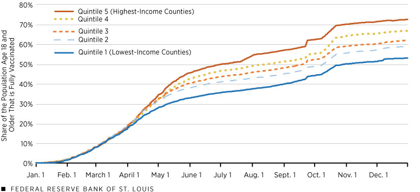
By the end of 2020, the United States began rolling out another mitigation tactic: the COVID-19 vaccine. The figure shows that at the beginning of 2021, COVID-19 vaccination rates were similar among the five groups of counties. Recall that only individuals facing the highest risk of contracting COVID-19 or complications from COVID-19 infection received vaccines during this period. On April 19, 2021, vaccines became available to all adults within the United States. The percentage of fully vaccinated adults within each quintile diverged by the end of April, with the differences growing over time. As of Dec. 1, 2021, the highest-income quintile of counties had approximately 70% of adults fully vaccinated, while the lowest-income quintile of counties sat about 20 percentage points lower, with only half of adults fully vaccinated.
Percentage of 18+ Population That Is Fully Vaccinated by Quintile of County Income per Household: 2021

SOURCES: CDC, IRS and authors’ calculations.
Colorado (Aug. 3), Texas (Oct. 22) and Virginia (Sept. 22) had sizable jumps in reported vaccinations to the CDC.
The timing of events suggests that differences in vaccination rates come from individual choices. The U.S. Census Household Pulse Survey may be useful for understanding differences in vaccinations because it collected various demographic statistics information about national vaccine hesitancy. As of October 2021, the national hesitancy rate for people with a high school diploma as their highest level of educational attainment was 14.5%, compared with 6.1% for those with a bachelor’s degree or higher. In turn, the link of income with education is significant; for example, the lowest-income group of counties (the first quintile) had only 49% of adults“Adults” in this context refers to those who are 25 years and older. with at least some college education, whereas the highest-income group had 72%. Thus, these data suggest that differences across income quintiles in education and what those differences imply for vaccine hesitancy may help to explain these recent trends in vaccination rates.
Increasing Inequality in Cumulative COVID-19 Deaths
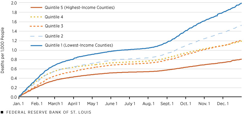
Finally, the next figure shows cumulative COVID-19 deaths beginning in January 2021. In the figure, each quintile starts the year with zero cumulative deaths. Over the year, the lowest-income counties accumulated the most pandemic-related deaths, while the highest-income counties accumulated the least. Note also that the divergence in trends accelerated in August 2021. By Dec. 31, 2021, the lowest-income group had accumulated 2.5 times the rate of COVID-19 deaths compared with those in the highest-income group of counties. These numbers indicate a much stronger correlation between COVID-19 deaths and income in 2021 than during 2020 (2.5 times vs. 1.35 times, respectively).
Cumulative COVID-19 Deaths in 2021 by Quintile of County Income per Household

SOURCES: USAFacts, IRS and authors’ calculations.
Final Remarks
The evidence above suggests that income inequality in COVID-19 deaths has emerged primarily during 2021 and had widened by the end of the year. The recent omicron wave of the pandemic has affected regions more uniformly, although the number of deaths were still significantly higher in the poorer regions. Our most recent data, from Feb. 17, has the ratio of Quintile 1 to Quintile 5 deaths during 2022 at 1.8, which is lower than 2021 but higher than 2020.
Endnotes
- A recent working paper (PDF) by Kartik Athreya, Ryan Mather, José Mustre-del-Río and Juan M. Sánchez documents a positive correlation between household financial distress and exposure to economic shocks, including the COVID-19 pandemic shock.
- From this CDC table and 2019 U.S. population estimates, we find that COVID-19 has killed 1.4 in 100 people over age 65 and only 0.08 in 100 in the rest of the population. We use these mortality rates to obtain a back-of-the-envelope estimate of the impact of the age structure of income quintiles in COVID-19 deaths. Given that the first quintile has 17.2% of its population over age 65 and the fifth quintile has 15.2%, the death rates per 100,000 cases in the two areas would be 307.0 and 280.6 in Quintiles 1 and 5, respectively. This simple calculation gives a ratio of 1.09—smaller than the 1.35 we find for 2020 and much smaller than the 2.5 corresponding to 2021.
- See Rural Health: Preventing Chronic Diseases and Promoting Health in Rural Communities at the CDC website.
- Federal Reserve Bank of New York Senior Economists Rajashri Chakrabarti and Maxim Pinkovskiy and Senior Research Analyst Ruchi Avtar detail the negative relationship between income and comorbidities in a January 2021 blog post. Comorbidities are known to increase severity and worsen outcomes of the infection.
- “Adults” in this context refers to those who are 25 years and older.
Views expressed in Regional Economist are not necessarily those of the St. Louis Fed or Federal Reserve System.
For the latest insights from our economists and other St. Louis Fed experts, visit On the Economy and subscribe.
Email Us


