


How Inflation and Relative Price Increases Differ
Economists distinguish between the general price level and the relative price level. To understand the difference, consider a basket consisting of one apple and one orange, each costing $1. The basket’s price is $2, and an orange is just as expensive as an apple.
Relative Price Differences
Imagine a scenario in which the apple’s price decreases to 50 cents while the orange’s price increases to $1.50. The basket’s price is still $2, but an orange now costs three times as much as an apple. There is no inflation since the general price level, reflected by the basket’s price, is constant.
Yet relative prices are quite different, and consumers are likely to change their purchasing behavior in response to the increased relative price of oranges. They may purchase fewer oranges and more apples than before.
Introducing Inflation
Now, consider a second scenario in which the prices of apples and oranges each increase from $1 to $2. Then the basket’s cost increases to $4, up from $2. Yet, an orange is still just as expensive as an apple. There is inflation, but relative prices have not changed.
Again, consumers are likely to change their behavior, but for a different reason than in the first scenario. Since everything is more expensive, they might purchase less of everything, unless their income also increases in the same proportion as all prices.
Examining CPI since 2000
The figure below shows the U.S. consumer price index (CPI) for various expenditure types, as computed by the Bureau of Labor Statistics. For each series, the units are chosen to equal $1 in January 2000 so that their evolution over time can be compared.
Consumer Price Index by Expenditure Categories since January 2000
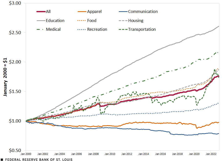
SOURCES: Bureau of Labor Statistics and author’s calculations.
The CPI represents how the dollars needed to purchase a particular basket of consumption change over time. The “All” line (solid red) represents a basket of all goods and services typically purchased by a consumer in the U.S.
The other lines represent components of that basket. For example, the “Medical” line (broken green) represents medical care services and commodities while the “Recreation” line (dotted blue) represents cable and satellite television, radio services, pet-related commodities and services, admission to movies and related services. Thus, the “All” line represents the general price level, and the other lines represent relative prices.
The “All” line (solid red) increased from $1 in January 2000 to about $1.80 in December 2022. This means that a person needed about $1.80 in December 2022 to purchase the same basket as he or she could have purchased with $1 in January 2000. This is inflation. The recent increase in inflation can be seen in the steepening of the curve since mid-2020.
The fact that other lines increased either faster or slower than the “All” line is an indication that some prices are increasing faster than others. In other words, relative prices are changing along with the rising general price level.
One extreme case is that of education-related expenditures (solid gray line): Their prices have multiplied by 2.6 since January 2000. Another extreme case is communication-related expenditures (solid blue line): Their prices have decreased from $1 to about $0.80. Between these two extremes, other prices have increased at similar rates, such as food and housing.
Examining CPI since 2020
The second figure reproduces the same calculation as in the first figure, but with January 2020 as the starting date. The key difference between the two figures is that, even though the price of education- and medical-related expenditures have increased faster than other prices in the long run (as seen in the first figure), transportation- and food-related expenditures (dashed green line and dotted orange line, respectively) are the fastest-growing prices since January 2020.
Consumer Price Index by Expenditure Categories since January 2020
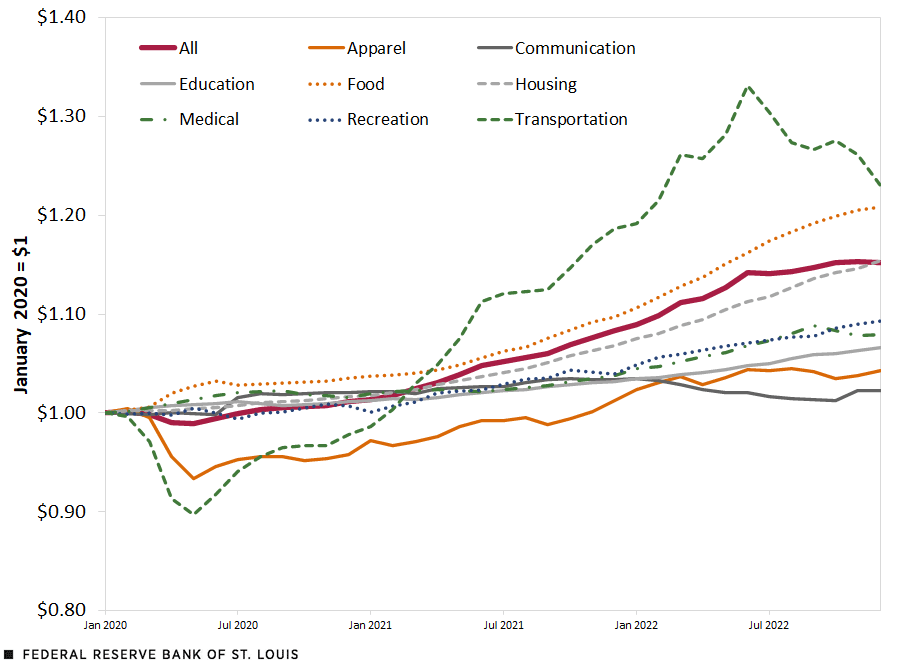
SOURCES: Bureau of Labor Statistics and author’s calculations.
The two figures are reminders that, in trying to understand the effects of inflation (either in the short run or the long run), one must keep in mind that price increases are not even across different categories of expenditures.
In addition, inflation masks changes in relative prices, which may affect people’s spending decisions regardless of the changing general price level.

Citation
Guillaume Vandenbroucke, ldquoHow Inflation and Relative Price Increases Differ,rdquo St. Louis Fed On the Economy, Feb. 13, 2023.
This blog offers commentary, analysis and data from our economists and experts. Views expressed are not necessarily those of the St. Louis Fed or Federal Reserve System.
Email Us
All other blog-related questions