


The Relationship between Wage Growth and Inflation, One Recession Later
A 2015 blog post showed that both inflation and wage growth remained low in the years following the Great Recession when compared with historical trends. In this post, we present updated series on inflation and wage growth to assess changes in both wage growth and inflation since the COVID-19 recession.
The earlier post measured yearly nominal wages as the ratio of aggregate worker compensation to total nonfarm payroll employment. The figure plots the yearly growth using this measure of wages against yearly inflation; each point represents one month from January 1960 to December 2021.
The orange dots are observations from January 1960 to June 2009. The blue dots are observations from July 2009 to March 2020 and represent the period between the start of the recovery after the Great Recession and the beginning of the COVID-19 recession. The orange diamonds show observations from the April 2020 (the first full month of the COVID-19 pandemic) to March 2021, and the blue diamonds show the most recent observations (April 2021–December 2021) in our data set.
The light gray line is a combination of points in which inflation is equal to wage growth. It allows us to easily see whether real wages are increasing or decreasing. Any points below the light gray line (southeast side of the plot) are periods in which yearly inflation is greater than yearly growth in average wages. Likewise, any points above the line (northwest side of the plot) are periods in which yearly inflation is less than wage growth. As in the original post, the fitted line’s slope (the curved black line) is smaller than for the line of no real wage growth, suggesting that periods of high inflation are, in general, periods of lower real wage growth.
Relationship between Estimated Wage Growth and Inflation
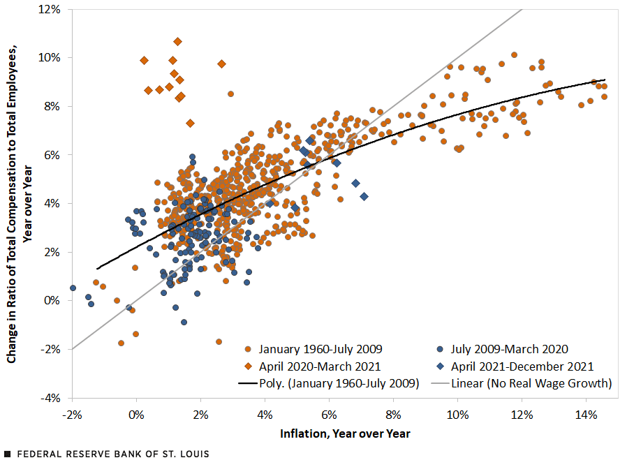
SOURCES: FRED (Federal Reserve Economic Data), Bureau of Labor Statistics, Bureau of Economic Analysis and authors’ calculations.
NOTES: Inflation is measured by changes to consumer price index for all urban consumers. The curved black line represents the relationship between nominal wage growth and inflation over this period.
Something surprising emerges in this figure once the data for the latest years are incorporated. The observations for the first year of the pandemic (marked with orange diamonds) show very large real wage growth. This result, however, is a composition effect due to the sharp decline in total employment in low-wage sectors during the pandemic. To control for this composition effect, in the next figure we use a measure of median wage growth as reported by the Federal Reserve Bank of Atlanta’s Wage Growth Tracker.
Relationship between Atlanta Fed Wage Growth and Inflation
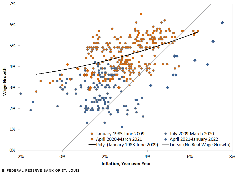
SOURCES: FRED (Federal Reserve Economic Data), Bureau of Labor Statistics, Federal Reserve Bank of Atlanta and authors’ calculations.
NOTES: Inflation is measured by changes to consumer price index for all urban consumers. The curved black line represents the relationship between nominal wage growth and inflation over this period.
The number of observations in this figure is smaller because the median wage growth series starts in January 1983. First, note that the very large wage growth during the first year of the pandemic disappears, suggesting that the composition effect was indeed causing that result. Second, note that most observations prior to April 2021 show positive real wage growth—they are above the gray line marking no real wage growth.
However, the most recent observations (the blue diamonds) show negative real wage growth. For example, in January 2022, median yearly wage growth was 6.1% and yearly inflation was 7.5%. Again, the fitted line has a slope smaller than the line of no real wage growth, confirming the finding in the first figure that periods of high inflation are, in general, periods of low real wage growth.


Citation
Juan M. Sánchez and Olivia Wilkinson, ldquoThe Relationship between Wage Growth and Inflation, One Recession Later,rdquo St. Louis Fed On the Economy, Feb. 25, 2022.
This blog offers commentary, analysis and data from our economists and experts. Views expressed are not necessarily those of the St. Louis Fed or Federal Reserve System.
Email Us
All other blog-related questions