


Denver Leads U.S. Metros in Rising Housing Valuations in Past 30 Years
Lofty house prices are often associated with wealthy cities like San Francisco or New York. Rapid and sustained house-price increases have drawn attention at various times in California, the desert Southwest, Texas, Florida and the Northeast.
Yet the largest increase in housing valuation of a major metro area during the last 30 years, measured as the net change in a metro area’s house price-to-rent ratio, was in Denver. Between the first quarter of 1991 and the first quarter of 2021, house prices in the Mile High City grew more than twice as fast as local rents. No other major metro area came close to this dizzying pace of housing valuation increase.
Housing Valuations Rising Fast in U.S. Interior Regions
National average house prices surpassed their 2005-07 peaks early in 2021, as measured by the nationwide house price-to-rent ratio. But while the current boom thus far has reached a similar nationwide housing valuation to the housing boom of 15 years ago, regional characteristics of the two boom periods differ. Housing valuations have increased much more in the interior regions of the country this time, while coastal regions experienced the biggest booms last time. (For details on the data and calculations used in this post, see the appendix; in this article, “coastal” regions are those on the Pacific or Atlantic coasts.)
Individual metropolitan areas illustrate the regional differences. House price-to-rent ratios in coastal areas like Miami and Tampa, and several West Coast cities (along with Phoenix, in the Mountain census division) increased the most in the previous boom, as the table below shows. Interior markets, like St. Louis, Chicago, Houston and Dallas appear in the bottom half of the ranking. (Atlanta, while not a coastal city, is part of the South Atlantic census division, which I classify as a coastal area.)
| Change in House Price-to-Rent Ratio for Largest Metro Areas First Quarter of 1991 through Peak Quarter Set during 2005-07 |
||
|---|---|---|
| Metropolitan Area | Percentage Point Change in the Indexed Ratio (1991:Q1=100) | Quarter during 2005-07 with Highest Ratio |
| Miami-Miami Beach-Kendall, Fla., metro division | 128 | 2006:Q3 |
| Phoenix-Mesa-Chandler, Ariz. | 111 | 2006:Q1 |
| Tampa-St. Petersburg-Clearwater, Fla. | 90 | 2006:Q2 |
| San Diego-Chula Vista-Carlsbad, Calif. | 75 | 2005:Q3 |
| Seattle-Bellevue-Kent, Wash., metro division | 75 | 2007:Q1 |
| Los Angeles-Long Beach-Glendale, Calif., metro division | 74 | 2006:Q1 |
| Minneapolis-St. Paul-Bloomington, Minn.-Wis. | 71 | 2006:Q1 |
| Riverside-San Bernardino-Ontario, Calif. | 70 | 2006:Q1 |
| Washington-Arlington-Alexandria, D.C.-Va.-Md.-W.V., metro division | 66 | 2005:Q4 |
| San Francisco-San Mateo-Redwood City, Calif., metro division | 66 | 2006:Q3 |
| Boston, Mass., metro division | 62 | 2005:Q3 |
| New York-Jersey City-White Plains, N.Y.-N.J., metro division | 61 | 2005:Q4 |
| Baltimore-Columbia-Towson, Md. | 57 | 2005:Q4 |
| Denver-Aurora-Lakewood, Colo. | 55 | 2005:Q4 |
| Detroit-Livonia-Dearborn, Mich., metro division | 47 | 2005:Q1 |
| Philadelphia, Penn., metro division | 47 | 2007:Q2 |
| St. Louis, Mo.-Ill. | 46 | 2007:Q1 |
| Chicago-Naperville-Evanston, Ill., metro division | 41 | 2006:Q2 |
| U.S. | 39 | 2006:Q1 |
| Atlanta-Sandy Springs-Alpharetta, Ga. | 31 | 2006:Q1 |
| Houston-The Woodlands-Sugar Land, Texas | 16 | 2007:Q4 |
| Dallas-Plano-Irving, Texas, metro division | 13 | 2007:Q2 |
NOTES: The table shows the percentage point change in each metropolitan area’s ratio of house prices to owners’ equivalent rent between the first quarter of 1991 and the quarter in which the respective ratio peaked during 2005 to 2007. The ratio is indexed to 100 in the first quarter of 1991 for all metro areas. The quarter of peak valuation for each metro area is shown in the final column. The metro areas shown were the largest in the U.S. by population in 2019, all with at least 2.8 million residents.
SOURCES: Federal Housing Finance Agency, Bureau of Labor Statistics and author’s calculations
The current housing boom is very different, as shown in the table below. Measured from the peak of the last boom through the first quarter of 2021, housing valuations have increased the most in Denver, Dallas, San Francisco and Houston—all in the interior of the U.S. except San Francisco. Meanwhile, many coastal markets are clustered near the bottom of the table, including New York, Tampa, Los Angeles, Baltimore, Miami and Riverside.
| Change in House Price-to-Rent Ratio for Largest Metro Areas Peak Quarter during 2005-07 through First Quarter of 2021 |
|
|---|---|
| Metropolitan Area | Percentage Point Change in the Indexed Ratio (1991:Q1=100) |
| Denver-Aurora-Lakewood, Colo. | 66 |
| Dallas-Plano-Irving, Texas, metro division | 32 |
| San Francisco-San Mateo-Redwood City, Calif., metro division | 24 |
| Houston-The Woodlands-Sugar Land, Texas | 23 |
| Atlanta-Sandy Springs-Alpharetta, Ga. | 14 |
| Philadelphia, Penn., metro division | 12 |
| Seattle-Bellevue-Kent, Wash., metro division | 5 |
| Boston, Mass., metro division | 2 |
| U.S. | -1 |
| Detroit-Livonia-Dearborn, Mich., metro division | -2 |
| St. Louis, Mo.-Ill. | -9 |
| San Diego-Chula Vista-Carlsbad, Calif. | -17 |
| Minneapolis-St. Paul-Bloomington, Minn.-Wis. | -18 |
| Washington-Arlington-Alexandria, D.C.-Va.-Md.-W.V., metro division | -21 |
| New York-Jersey City-White Plains, N.Y.-N.J., metro division | -25 |
| Tampa-St. Petersburg-Clearwater, Fla. | -25 |
| Los Angeles-Long Beach-Glendale, Calif., metro division | -26 |
| Chicago-Naperville-Evanston, Ill., metro division | -32 |
| Baltimore-Columbia-Towson, Md. | -35 |
| Phoenix-Mesa-Chandler, Ariz. | -38 |
| Miami-Miami Beach-Kendall, Fla., metro division | -47 |
| Riverside-San Bernardino-Ontario, Calif. | -49 |
NOTES: The table shows the percentage point change in each metropolitan area’s ratio of house prices to owners’ equivalent rent between the quarter in which the respective ratio peaked between the period 2005- 07 and the first quarter of 2021. The ratio is indexed to 100 in the first quarter of 1991 for all metro areas. The metro areas shown were the largest in the U.S. by population in 2019, all with at least 2.8 million residents.
SOURCES: Federal Housing Finance Agency, Bureau of Labor Statistics and author’s calculations.
A Rocky Mountain High
Measured over the last 30 years, Denver’s house-price valuation has increased the most on balance among the nation’s largest metropolitan areas. Two features of the movement of Denver’s house price-to-rent ratio are noteworthy.
First, metro areas that experienced the greatest increases in housing valuation in the first boom generally had weaker increases or even valuation declines in the second boom, and vice versa. In fact, the correlation coefficient between metro areas’ percentage point changes in the two periods was strongly negative, at -0.59. In Denver’s case, however, the very strong increase in the second boom was not a reaction to a very weak performance in the first boom. Denver ranked near the middle of the pack in the first boom.
Second, Denver avoided a large decline after the previous boom subsided—there was little bust after Denver’s first boom. The figure below shows that the house price-to-rent ratio in Denver decreased much less in the years after 2006 than in metro areas like Miami, which was a common pattern.
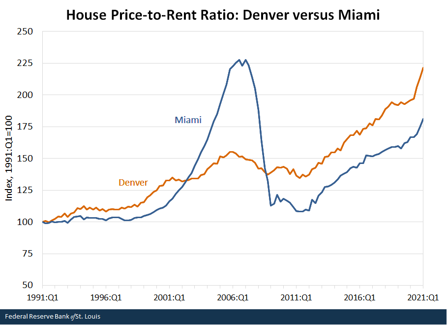
NOTES: The figure shows how the ratio of house prices to owners’ equivalent rent changed between the first quarter of 1991 and the first quarter of 2021 in the Denver and Miami metropolitan areas. The ratio is indexed to 100 in the first quarter of 1991 for both metropolitan areas.
SOURCES: Federal Housing Finance Agency, Bureau of Labor Statistics and author’s calculations.
The net result, shown in the figure below, is that housing valuation in Denver increased more than in any other major metropolitan area between the first quarter of 1991 and the first quarter of 2021. At the other extreme, house prices in Chicago barely increased more than rent in relative terms. Thus, while the relative attractiveness of owning and renting changed little in Chicago, owning became much more expensive in Denver.
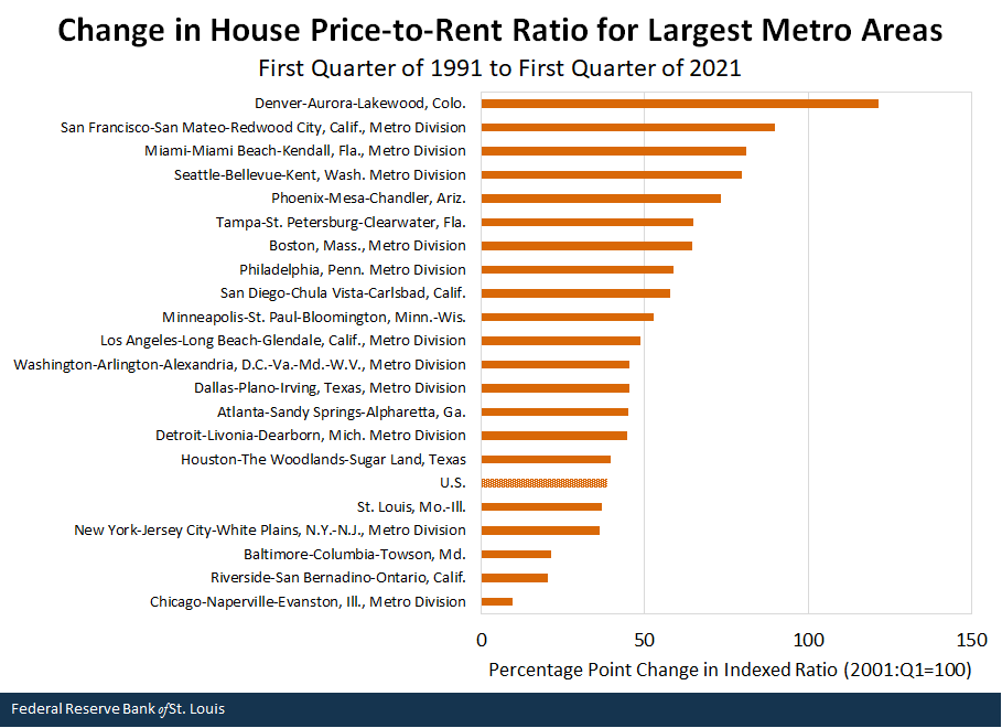
NOTES: The figure shows how the ratio of house prices to owners’ equivalent rent changed between the first quarter of 1991 and the first quarter of 2021. The ratio is indexed to 100 in the first quarter of 1991 for both metropolitan areas. The metropolitan areas shown were the largest in the U.S. by population in 2019, all with at least 2.8 million residents.
SOURCES: Federal Housing Finance Agency, Bureau of Labor Statistics and author’s calculations.
Is Denver Vulnerable to a House Price Correction?
I examined the house price-to-rent ratio in this and two previous posts because it is a good measure of housing valuation—that is, its movements help detect the impacts of changes in fundamental determinants of house prices and potential deviations from fundamentally driven house price levels. Research suggests that a large decline in the mortgage rate or a large increase in average household income typically result in a higher house price-to-rent ratio.See Kamila Sommer, Paul Sullivan and Randal Verbrugge’s 2013 article in the Journal of Monetary Economics and references in the first note of my May 24, 2021, post. Could changes in these factors explain why housing valuations increased so much nationwide and especially in Denver, but virtually not at all in Chicago during the last three decades, with a range of experiences in between?
The answer is essentially no. The 30-year fixed mortgage rate declined from 9.5% in the first quarter of 1991 to 2.9% in the first quarter of 2021, so we would expect the house price-to-rent ratio to increase. But the mortgage rate is the same everywhere in the U.S., so this factor alone would exert the same influence in all metro areas. It doesn’t explain why there was such a wide divergence of experiences.
Regarding the second key fundamental determinant, average household incomes increased a lot—by 196% in Denver, by 177% in Chicago and by 182% nationwide between 1991 and 2019 (latest available).These figures are per-capita personal income levels in nominal dollars from the Bureau of Economic Analysis. So the house price-to-rent ratio might be expected to increase. But the difference in income growth between Denver and Chicago is relatively small. This fundamental factor thus doesn’t explain the gap between Denver’s 510% house price increase and Chicago’s 147% gain during the 30-year period.Prices are based on the repeat-sales home price indexes from Federal Housing Finance Agency.
Another factor that might explain the large relative increase in Denver’s house price-to-rent ratio is the cost of construction. Joseph Gyourko, Jonathan Hartley and Jacob Krimmel’s 2019 working paper points to differing land-use regulations as a factor in housing construction costs and, subsequently, the evolution of house prices. Denver ranked 14th and Chicago ranked 35th (out of 44) in the authors’ 2018 ranking of an index of housing construction restrictiveness in major metro areas. But the Mountain region (as defined by the authors) ranked highest (among eight regions) for decreasing restrictiveness over time. So this factor seems unlikely to be the answer.
Lacking other convincing explanations for the nationwide house price boom that culminated in the 2005-07 period, Kamila Sommer, Paul Sullivan and Randal Verbrugge concluded in their 2013 article:
In our view, the fact that this carefully specified and calibrated rational expectations equilibrium model can explain only a fraction of the observed increase in house prices provides indirect support for the hypothesis that overly optimistic expectations about house price growth contributed to a bubble in the housing market.
The same conclusion ultimately may be applied to Denver and other metro housing markets that have experienced large increases in local house price-to-rent ratios in the latest boom. In other words, Denver’s mile-high house price-to-rent ratio may be at risk of falling at some point just as those in many coastal cities did after the previous boom.
Notes and References
- See Kamila Sommer, Paul Sullivan and Randal Verbrugge’s 2013 article in the Journal of Monetary Economics and references in the first note of my May 24, 2021, post.
- These figures are per-capita personal income levels in nominal dollars from the Bureau of Economic Analysis.
- Prices are based on the repeat-sales home price indexes from Federal Housing Finance Agency.
Additional Resources
- On the Economy: House Prices Surpass Housing-Bubble Peak on One Key Measure of Value
- On the Economy: High Housing Valuations Move Inland
Appendix
The house price indexes: The house price indexes I used were the quarterly Federal Housing Finance Agency Purchase-Only House Price Indexes for the 100 Largest Metropolitan Statistical Areas in the United States, seasonally adjusted. These data series run from the first quarter of 1991 to the first quarter of 2021. They are repeat-sales indexes that use data from only actual sales of existing homes—that is, appraised values (such as those used in a refinance transaction) are excluded because they can be unreliable estimates of market values. This is especially true when market-based house prices are changing rapidly.
The rent indexes: I used the owners’ equivalent rent of primary residence (OER) series for selected metropolitan areas and, in some cases, for the four census regions. OER is a subcomponent of the shelter index. When a metropolitan area’s OER index was available only in selected months in certain years—for example, March, June, September, December—I used the monthly observations to create quarterly data. I did this for the years 1991-97 in the following metropolitan areas: Atlanta, Denver, San Diego and Seattle. I did this for the years 1998-2006 for St. Louis. No OER indexes exist for Tampa and Washington, D.C., between 1991 and 1997, and no OER indexes exist for the following metropolitan areas between 1991 and 2017: Baltimore, Phoenix, Riverside and Tampa. I used the appropriate census region’s OER index for metropolitan areas with more than 2.5 million residents to replace the missing series for each metropolitan area, splicing these to the actual data when they became available.

Citation
William R. Emmons, ldquoDenver Leads U.S. Metros in Rising Housing Valuations in Past 30 Years,rdquo St. Louis Fed On the Economy, July 15, 2021.
This blog offers commentary, analysis and data from our economists and experts. Views expressed are not necessarily those of the St. Louis Fed or Federal Reserve System.
Email Us
All other blog-related questions