


Growth around the World Is Still Below the Trend; U.S. Faring Better than Most
The recovery of the U.S. economy from the 2007-09 recession has been slow but uninterrupted. Unfortunately, the same cannot be said about other regions in the world. Put in the context of international headwinds, the U.S. recovery looks stronger and the projected growth for this year more valuable to overall world growth. As will be seen below, more of the world’s new output will be generated by the U.S. in 2014-2015 than in 2000-2007.
According to the Oct. 7 World Economic Outlook (WEO) of the International Monetary Fund (IMF),1 during the first half of 2014 there were several pieces of disappointing news: weaker activity in Russia; slower growth in Latin America, mainly Brazil; weaker-than-forecast expansion of gross domestic product (GDP) in Japan; weaker activity in China; and stagnant growth in the euro area. These international headwinds are not new, we argue here, and may account, at least partly, for the slow recovery of the U.S. economy.
The world’s output for 2014 is projected to be only 3.3 percent. (See table.) This is much lower than previous averages at the world level. For instance, in 2006 and 2007, the two years prior to the recession, yearly world output growth was about 5.6 percent. The poor performance of world output in the past year is primarily due to the low growth projected for advanced economies,2 only 1.8 percent. Again, this is significantly lower than the growth rate of advanced economies in previous years—close to 3 percent in 2006 and 2007. Among the advanced economies, the U.S. has the highest projected growth rate for 2014, at 2.2 percent. Growth in the euro area, however, is projected to be much lower, 0.8 percent.
Projected Growth by Region
| Percent Change | ||||
|---|---|---|---|---|
| October Projections | Difference from July Projections | |||
| 2014 | 2015 | 2014 | 2015 | |
| World Output | 3.3 | 3.8 | –0.1 | –0.2 |
| Advanced Economies | 1.8 | 2.3 | 0.0 | –0.1 |
| United States | 2.2 | 3.1 | 0.5 | 0.0 |
| Euro Area | 0.8 | 1.3 | –0.3 | –0.2 |
| Germany | 1.4 | 1.5 | –0.5 | –0.2 |
| France | 0.4 | 1.0 | –0.4 | –0.5 |
| Italy | –0.2 | 0.8 | –0.5 | –0.3 |
| Spain | 1.3 | 1.7 | 0.1 | 0.1 |
SOURCE: The International Monetary Fund's World Economic Outlook.
Projections for the year 2015, also shown in the table, are slightly better. The world output is projected to increase 3.8 percent in 2015 vs. 3.3 in 2014. Advanced economies’ output is projected to grow 2.3 in 2015 vs. 1.8 in 2014. The euro area is projected to grow 1.3 in 2015 vs. 0.8 in 2014. Although growth is projected to be better in 2015, the projections are below previous averages. The average growth for the years 2000-2007 was 4.5 percent for the world, 2.6 percent for advanced economies and 2.2 for the euro area.
The last two columns of the table contain useful information to understand how things changed since July 2014, when the previous projections of the WEO were published. Those columns report the change in the projections between July and October 2014. If we focus on projected output growth, an increase in the forecast (a positive number in the last two columns of the table) means that forecasters must have received positive news during those periods. If changes in projections were negative, bad news must have been received. Notice that most of the numbers in the last two columns are negative, except for those for the U.S. and Spain (and Spain’s numbers are very close to zero). And some of those changes are very large. For instance, for 2014 the growth projected for Germany, France and Italy was reduced by 0.5, 0.4 and 0.5 percentage points, respectively.
How We Got Here: A "News Index"
Based on the table discussed above, we created a “news index” that accumulates the revisions to the forecast. As mentioned above, in the context of output growth, the sign of the revision in the projections indicates the sign of the news. Moreover, the size of the revision is indicative of the dimension of the news. In particular, the size of the revision can be compared with the usual growth of output (or any other variable for that matter) to have a sense of the size of the news. Considering output growth, a 0.1 revision (as observed for Spain for 2014 and 2015) can be interpreted as mildly positive news, while a –0.5 revision (as observed for Italy for 2014) indicates very negative news.
Moreover, note that this metric can be computed for the forecast of any macro-economic variable. The difference is that the sign of the revision may not necessarily coincide with the sign of the news. For instance, in an inflationary context, a reduction in the predicted inflation would be good news.
Since we intend to use this metric to analyze how we got to the forecasts of October 2014, we accumulated this news (changes in forecasts) since September 2011. In particular, we accumulated the revisions for both years (the year of the report and the next year) for each report. The fact that we used both years explains why there are two observations for every date.3 At any particular period, the index indicates the sum of all revisions in all the WEO publications for that variable forecast starting in September 2011.
Since forecasters use data with “noise,” every time they produce a new forecast we expect it to be different from the previous one. But if these changes in the projections are based on noise and not on news, we expect no systematic pattern when we accumulate the series. If forecasts are accurate, we also would expect little noise; so, changes should be small unless there is news about the state of the economy.
The Deflation Scare
Figure 1 shows inflation in the advanced economies since September 2011. The red line fluctuates around zero, with the largest accumulated value at 0.7 percentage point. As mentioned above, fluctuations around zero are expected if revisions do not contain much news but just noise corrections.
However, note the decline of almost 1 percentage point from April 2013 to April 2014. Although the decline may seem small, it represents an adjustment of about 50 percent, given that inflation in advanced economies is usually about 2 percent. These accumulated downward revisions of inflation for advanced economies are in line with news during that time that generated fear of deflation.

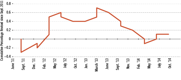
Bad News on Output Growth
Figure 2 shows the same news index but constructed with the projections of output growth in the world and advanced economies. The results are a clear indication of international headwinds since September 2011. Focus first on world output growth (blue dotted line). It reached a depth of 4.5 percent in October 2014. To realize how large this number is, recall that average growth for the years 2000-2007 was 4.5 percent. Notice that about half of the decline occurred during the first quarter considered (fall 2011-winter 2012), when Europe entered into a recession. But after a few reports with good news (until July 2012), there was a very long sequence of negative news, accounting for the other half of the decline.
The index for advanced economies (red line) is even more surprising. It declines to almost 4 percentage points. (Recall that the average growth for advanced economies during 2000-2007 was only 2.6 percent.) A large part of the bad news about world output growth can be accounted for by the performance of advanced economies. In particular, as it will be clearer below, international headwinds fly to North America over the North Atlantic Ocean from Europe.
Europe, Again
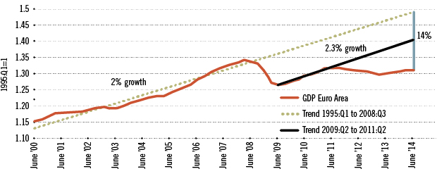
Europe’s economic performance has been quite poor, with some exceptions, since the third quarter of 2008. Figure 3 shows euro area GDP since 2000. As shown above, the projected growth for 2014 and 2015 is well below average. Figure 3 shows GDP in the euro area at constant prices, normalized such that 1995:Q1 is equal to 1.
Two other series are included in Figure 3. The first one is the trend growth before the crisis (from 1995:Q1 to 2008:Q3). Growth averaged 2 percent during that period. The other series is the trend for the two years following the end of the recession (2009:Q2 to 2011:Q2). The growth during that period was back to trend (actually a bit higher, 2.3 percent vs. 2.0 percent before). This figure also shows that GDP is 14 percent below the prefinancial crisis trend and about 7 percent below the trend from 2009:Q2 to 2011:Q2.
Importantly, the recovery that followed the 2011-12 recession in the euro area was very weak, with GDP growing slower than the two trends discussed above. Thus, the gap between GDP and its trend (sometimes referred to as “the output gap”) is not narrowing but expanding.
Double Dip or Triple Dip?
As shown in Figure 3, Europe had what is called a double-dip recession. This term is used to describe a recession that follows right after another one. Recent data indicate that Europe may be close to a new recession. This would be a very rare triple-dip recession.
There exists an index that can be used to evaluate the performance of Europe in the month after the last report of GDP. This index, called EuroCOIN, is a real-time cyclical indicator for the euro area; it is constructed using 1,000 macroeconomic time series from the major countries in the area. EuroCOIN is available quickly and at monthly frequency. While the last data available (at this writing) on GDP correspond to the second quarter, EuroCOIN is already available for September 2014. In this last month, the indicator fell to 0.13 (from 0.19 in August), the lowest level in 12 months. This indicates that Europe, again, will be the source of headwinds for U.S. growth during the coming years.
Monetary Policy in Europe
The European Central Bank (ECB) has announced a range of actions to bolster its economy: a reduction in policy rates in September, targeted credit easing and other measures to boost liquidity. In particular, the ECB has declared an objective of expanding its balance sheet back to early 2012 levels, implying a 1 trillion euro expansion.
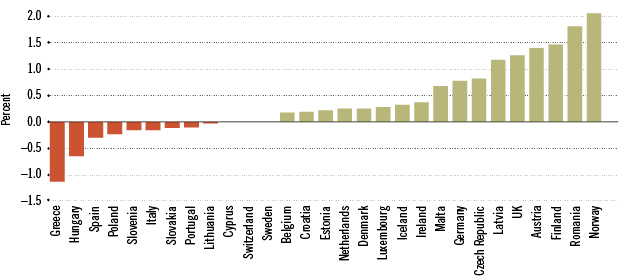
This policy is a response to the poor projected growth and the low inflation in Europe. Figure 4 displays the change in prices (inflation) between September 2013 and September 2014. Only two countries, Norway and Romania, had inflation close to 2 percent (2.1 and 1.8 percent, respectively). Several countries had negative inflation. For instance, Greece's inflation was –1.1 percent.
The ECB’s actions to bolster its economy and boost liquidity may include purchases of member countries' government bonds. For most of the countries in the euro area, the yields for 10-year government bonds are already very low. They actually declined abruptly during September, perhaps in anticipation of this policy. This plan to buy bonds may improve economic conditions, to the extent that it helps in reducing financing costs and in stimulating demand.
China and the U.S.: Engines of Growth in 2015
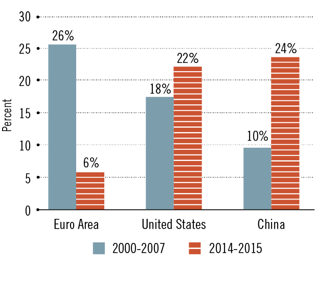
Finally, the conditions described above for Europe imply that China and the U.S. will probably account for most of the world’s growth in 2015. The blue bars in Figure 5 display the share of the growth in output that was contributed between 2000 and 2007 by the euro area, the U.S. and China: 26, 18 and 10 percent, respectively. The contributions for the expected growth between 2014 and 2015 are very different. The euro area will contribute only 6 percent; the lion’s shares will be contributed by the U.S. (22 percent) and China (24 percent).
Endnotes
- The World Economic Outlook is available on the website of the International Monetary Fund at www.imf.org/external/ns/cs.aspx?id=29 [back to text]
- The main criteria used by the WEO to classify the world into advanced economies and emerging market and developing economies are (1) per capita income level, (2) export diversification—so oil exporters that have high per capita GDP would not make the advanced classification because about 70 percent of their exports are oil, and (3) degree of integration into the global financial system. The list of countries that are considered to be advanced economies includes Australia, Austria, Canada, France, Germany, Italy, Japan, the United Kingdom and the United States. [back to text]
- For some periods, there is only one observation. That happens when one of the revisions is zero. [back to text]

Views expressed in Regional Economist are not necessarily those of the St. Louis Fed or Federal Reserve System.
For the latest insights from our economists and other St. Louis Fed experts, visit On the Economy and subscribe.
Email Us