

How Widespread Are Price Increases in the U.S.?
In the first blog post of this two-part series, I discussed the recent surge in inflation and identified some upside and downside risks for future inflation. In this second blog post, I will focus on evaluating whether higher inflation can be attributed to a small group of goods and services or whether it is a more generalized event. This exercise is motivated by Federal Reserve Chair Jerome Powell’s speech at Jackson Hole in August 2021, in which he stated: “The spike in inflation is so far largely the product of a relatively narrow group of goods and services” and that “households, businesses, and market participants also believe that current high inflation readings are likely to prove transitory.”
Methodology
The Bureau of Economic Analysis (BEA) publishes data on personal consumption expenditures (PCE). The BEA publishes several aggregate price indexes (e.g., PCE price index, core PCE price index, GDP price index) and also disaggregated price indexes, as well as nominal and real quantities. I will use the disaggregated data to evaluate the narrative that recent high inflation is due to a few goods and services. In the BEA data set, there are a total of 244 listed product categories with monthly series on expenditures, prices and real quantities.There is some double counting in the report, so the actual number of product categories is slightly smaller. See NIPA tables 2.4.4U, 2.4.5U and 2.4.6U.
I will focus on comparing two periods: 2016-19 (pre-pandemic) and the one starting in March 2020 (with August 2021 being the most recent data point), which is labeled “COVID-19” in the analysis and figures below. As presented in the first blog post of this series and in a table below, the annualized rate of inflation was 1.8% in 2016-19 and 3.1% during COVID-19. I will now look at the disaggregated data to better understand the difference in inflation rates.
Outliers
The figure below shows a histogram of monthly price changes for the two periods, weighted by expenditure shares. Expenditure shares for each product category are computed using the same methodology used to construct the PCE price index. The relevant formulas can be found, for example, on page 5 of this article (PDF). For each product category, I computed the annualized price change and the expenditure share in a given month. The horizontal axis of the figure shows bins of monthly price changes that have been annualized while the vertical axis represents the share of consumption expenditures that corresponds to each of these bins.Alternatively, I could have simply shown an unweighted histogram, where we count the number of products rather than weight them by their expenditure share. However, this would not have been informative as expenditure shares vary widely across product categories. For example, “new domestic autos” represents roughly 0.4% of total consumption expenditures, while “rental value of farm dwellings” represents about 11%. The range or size of each bin is equal to 1 percentage point of annualized monthly change in the price level of a product category. So, for example, the figure indicates that for 2016-19 (indicated by the blue bars), about 13% of consumption expenditures involved goods and services that registered a monthly price change of between 2% and 3% at an annual rate. Note that the same product can (and typically does) appear in multiple bins as its price change varies by month, sometimes significantly so. Also note that since we are looking at consumption shares, the bars for each time period sum up to 100%.
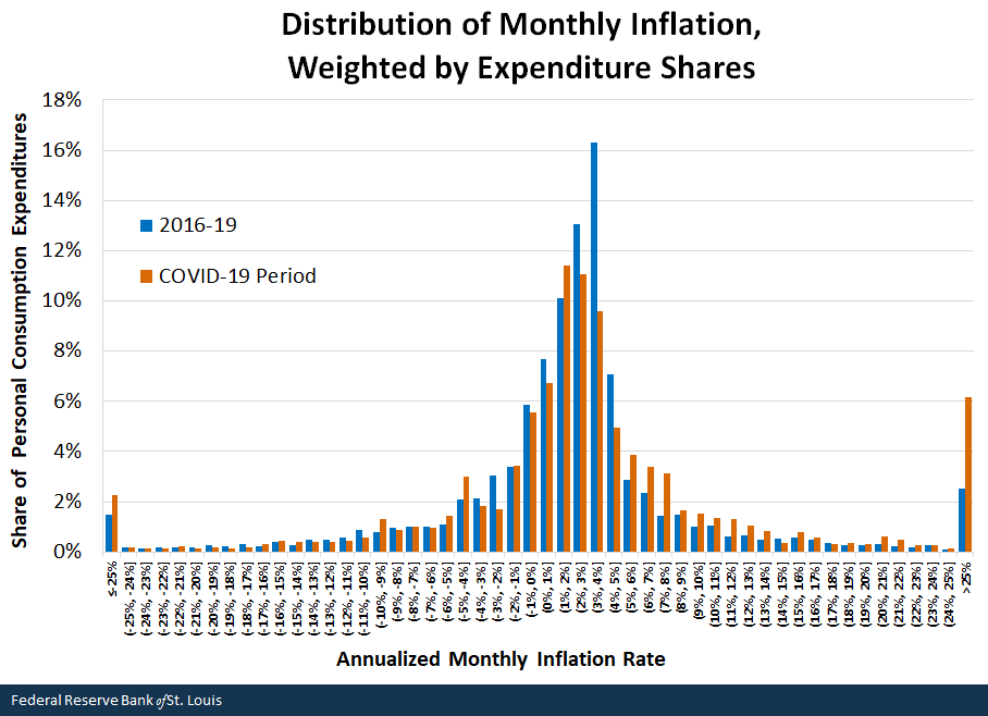
SOURCES: Bureau of Economic Analysis and author’s calculations.
NOTES: The COVID-19 period starts in March 2020 and ends in August 2021. The x-axis labels represent bins of inflation; for example (0%, 1%] represents rates ranging from just over 0% up to and including 1%.
Comparing the two sets of columns, we can readily conclude that the dispersion of monthly inflation rates across product categories has changed substantially during COVID-19 (indicated by the orange bars). There is less expenditure mass in the middle bins of inflation and more toward extreme bins. Most significantly, we observe a sharp increase in the consumption share of products that in a given month registered more than a 25% annualized increase in their price. This analysis confirms that some goods and services experienced exceptionally sharp increases in their price during the pandemic.
A More General Problem?
The previous figure shows an increased dispersion in price changes during the COVID-19 period. However, prices may rise sharply and then also decline sharply (and vice versa). This is particularly the case in situations, like during COVID-19, in which supply and demand vary significantly over time. It may thus be more appropriate to look not only at monthly changes but also at the total price change over each period.
The two figures below conduct a similar exercise as above, but instead of looking at price changes per month, it displays price changes over each period. Since some prices do indeed go up and down, the dispersion is much smaller when looking at inflation over these longer periods. We also observe the near absence of extreme price changes. The lighter shaded color represents the contribution from durable goods.
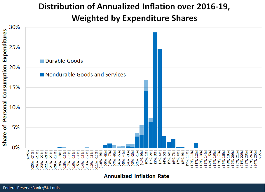
SOURCES: Bureau of Economic Analysis and author’s calculations.
NOTE: The x-axis labels represent bins of inflation; for example (0%, 1%] represents rates ranging from just over 0% up to and including 1%.
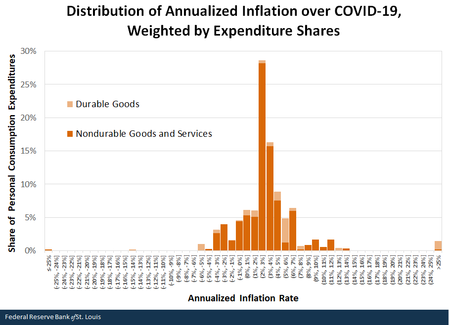
SOURCES: Bureau of Economic Analysis and author’s calculations.
NOTES: The COVID-19 period starts in March 2020 and ends in August 2021. The x-axis labels represent bins of inflation; for example (0%, 1%] represents rates ranging from just over 0% up to and including 1%.
During the COVID-19 period, there is a lower proportion of expenditures in the center of possible price changes and more to the left and right. That is, even when looking at each period as a whole, we observe more downward and upward pressure on average inflation during COVID-19, the latter force dominating the former. We also see that some outliers (more than 25% annualized inflation) remain, but not as dramatically as when focusing on monthly changes.
The above figures highlight the contribution of durable goods to each inflation bin. It has been argued that durable goods are largely responsible for the rise in inflation. As we can see from the lightly shaded bars, durable goods have indeed shifted in the price change distribution, from mostly registering deflation during 2016-19 to now experiencing inflation. However, their contribution is too small to be the only driver of higher inflation.In any given month, durable goods only make up approximately 10% to 14% of expenditures in the PCE. That is, the shift in the distribution of inflation appears more generalized across categories.
The histograms displayed above can be tricky when comparing distributions, due to their discrete nature and since the inflation bins were chosen to be intuitive. To address this concern and make the comparison easier, the next figure presents a smooth estimate of the distribution of inflation across product categories. The figure highlights the differences described above and supports the conclusions drawn from the weighted histograms.
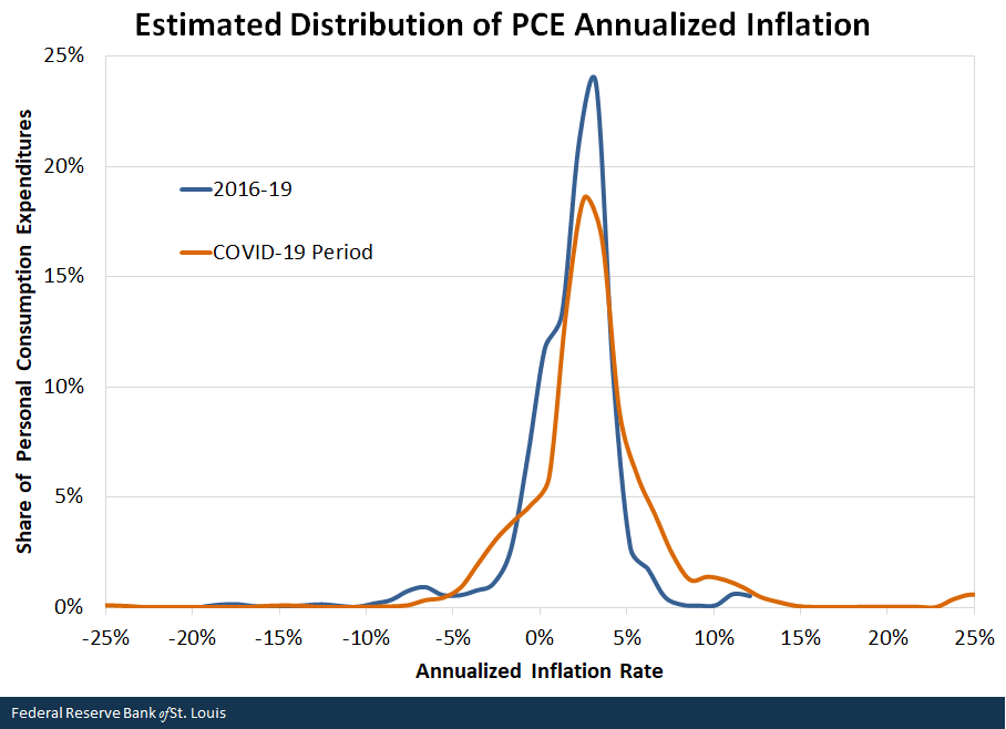
SOURCES: Bureau of Economic Analysis and author’s calculations.
NOTES: Distributions are computed with Kernel Density Estimation in STATA, using the optimal bandwidth for each period. The COVID-19 period starts in March 2020 and ends in August 2021.
Trimmed Inflation
We can further assess the role of outliers by “trimming” inflation.The Federal Reserve Bank of Dallas publishes the trimmed mean PCE inflation rate. See the most recent release and the description of the series. That is, remove outliers from the calculation of inflation to capture the broad underlying trend. The following table computes inflation for the two periods analyzed by focusing on specific ranges.
| All | Goods and Services with Inflation Range of -25% to 25% | Goods and Services with Inflation Range of -10% to 10% | Goods and Services with Inflation Range of -5% to 5% | |
|---|---|---|---|---|
| 2016-19 | 1.8% | 1.8% | 1.8% | 1.9% |
| COVID-19 | 3.1% | 2.8% | 2.6% | 1.9% |
| SOURCES: Bureau of Economic Analysis and author’s calculations. | ||||
| NOTE: The COVID-19 period starts in March 2020 and ends in August 2021. | ||||
For the period 2016-19, focusing on narrower bands of inflation (up to a point) does not make much of a difference. Even when looking only at those product categories whose price decreased by at most 5% annually or increased by at most 5% annually and discarding everything else, measured inflation goes from 1.8% to 1.9% annually. This should not surprise us, given the properties of the weighted histogram analyzed above.
In contrast, we obtain some differences when looking at the COVID-19 period. If we only focus on product categories that fall in the -25% to +25% annualized inflation range, measured inflation falls from 3.1% to 2.8% annually. This reflects the effect of outliers, as shown in the histogram above. But it also tells us that the impact of extreme outliers is small. Inflation would still be high relative to the Federal Reserve’s 2% target.
We have to narrow all the way to the -5% to +5% range to obtain no change in inflation between the pre-pandemic and the COVID-19 periods. However, by doing so we would be excluding about 20% worth of consumption. Thus, it is possible to “trim” inflation so that it does not vary from period to period, but it comes at the cost of ignoring a large portion of consumers’ expenditure basket.
Conclusions
Studying inflation at the product category level reveals that there have been wild swings in the monthly change of prices since the pandemic started. When looking at the overall price change over the period, the role of outliers is greatly diminished, revealing that higher inflation is perhaps a broader phenomenon.
Olivia Wilkinson, a research associate at the Federal Reserve Bank of St. Louis, provided research assistance.
Notes and References
- There is some double counting in the report, so the actual number of product categories is slightly smaller. See NIPA tables 2.4.4U, 2.4.5U and 2.4.6U.
- Expenditure shares for each product category are computed using the same methodology used to construct the PCE price index. The relevant formulas can be found, for example, on page 5 of this article (PDF).
- Alternatively, I could have simply shown an unweighted histogram, where we count the number of products rather than weight them by their expenditure share. However, this would not have been informative as expenditure shares vary widely across product categories. For example, “new domestic autos” represents roughly 0.4% of total consumption expenditures, while “rental value of farm dwellings” represents about 11%.
- In any given month, durable goods only make up approximately 10% to 14% of expenditures in the PCE.
- The Federal Reserve Bank of Dallas publishes the trimmed mean PCE inflation rate. See the most recent release and the description of the series.

This blog offers commentary, analysis and data from our economists and experts. Views expressed are not necessarily those of the St. Louis Fed or Federal Reserve System.
Email Us
All other blog-related questions
