

What Wealth Inequality in America Looks Like: Key Facts & Figures
For an updated analysis of wealth inequality in the U.S., see U.S. Wealth Inequality: Gaps Remain Despite Widespread Wealth Gains, which was published Feb. 7, 2024.
The following charts help to illustrate the state of wealth inequality in America.
The St. Louis Fed’s Center for Household Financial Stability looks at the relationship between wealth and different demographic characteristics: race or ethnicity, education, and age or birth year. We believe this demographic lens is more informative than looking at wealth by income bands, because while income can (and frequently does) change from year to year, demographics are more stable.
We find that families who are thriving tend to be white, college-educated and/or older. We find that families who are struggling tend to have one or more of these characteristics: black or Hispanic; no four-year college degree; and/or younger.
We also find that many families across the board are striving for more economic security.
Using data from the Federal Reserve Board’s Survey of Consumer Finances, we discuss trends in a series of charts and discuss pathways toward building that security.Dollar values in all figures and text are adjusted with the Consumer Price Index for All Urban Consumers (CPI-U) to 2016 dollars (i.e., inflation-adjusted to represent comparable values or “real terms”).
1) Income inequality has grown.
Income is a fairly common indicator of financial well-being. Let’s examine how income inequality has changed from 1989 to 2016, the earliest and latest years for which Survey of Consumer Finances data are available.
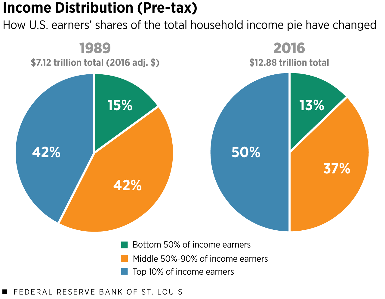
Notes: Totals may not equal 100% due to rounding.
Sources: Federal Reserve Board’s Survey of Consumer Finances and authors’ calculations.
Description: This figure includes two pie charts. The chart on the left shows the 1989 share of total pre-tax income for the bottom 50% of income earners, the middle 50% to 90%, and the top 10% of income earners. The values are 15% share, 42% share and 42% share, respectively. The right pie chart shows the 2016 shares of those same groups: a 13% share for the bottom 50% of income earners; a 37% share for the middle group; and a 50% share for the top 10% of income earners.
The charts above show different groups of U.S. income earners:
- The bottom 50% — In 2016, households in the 0-50th percentiles had incomes of $0 to $53,000.
- The middle 50%-90% — These households had incomes between $53,000 and $176,000.
- The top 10% — Households in the 90th percentile had incomes of $176,000 or above.
Consider that the U.S. has a total “income pie.” Think of it as all of the pre-tax household income combined—including wages, interest, capital gains, food stamps, Social Security and all other sources of income.
That pie was worth $7.12 trillion in 1989 and grew to be worth $12.88 trillion in 2016.
How has each group’s share of the pie changed over the past three decades? The bottom 50% and middle 50%-90% of income earners have slightly smaller shares of the pie, while the share of the top 10% has grown to half the pie.
2) Wealth inequality is starker.
Income allows a family to get by; wealth allows a family to get ahead.
A family’s net worth, or wealth, is its assets—things like savings, 401(k)s and real estate—minus its debts—things like mortgages, credit card debt and student loans.
- In 1989, the total household wealth in the U.S. was $32.87 trillion (2016 adjusted dollars).
- In 2016, total U.S. household wealth amounted to $86.87 trillion.
Just like income, we can look at the changing distribution of wealth in the U.S.
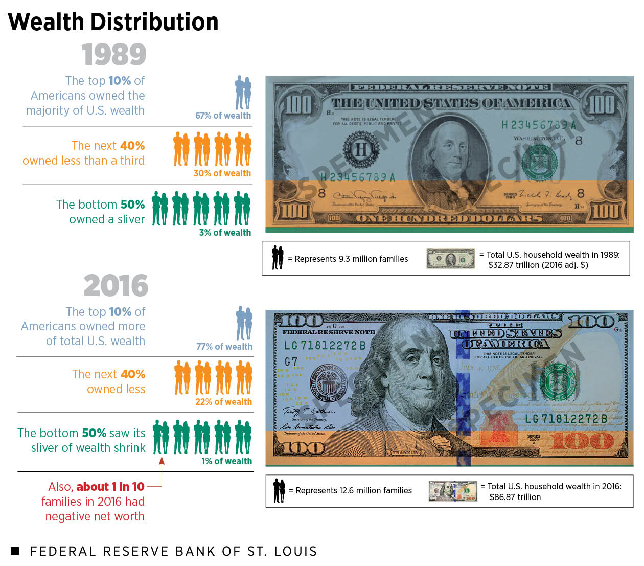
Notes: Dollar values are CPI-U adjusted to 2016 dollars and rounded to the nearest $10 billion.
Sources: Federal Reserve Board’s Survey of Consumer Finances and authors’ calculations.
Description: This figure shows the distribution of total U.S. wealth in 1989 and 2016, with the shares of the top 10%, middle 50%-90% and bottom 50% of families ordered by household wealth. In 1989, these shares were 67%, 30% and 3%, respectively. In 2016, the shares were 77%, 22% and 1%, respectively. A callout indicates that roughly 1 in 10 families in 2016 had negative net worth; that’s up from about 7% of families in 1989. The 1989 population was approximately 93 million families, while the 2016 population was approximately 126 million families.
Wealth inequality in America has grown tremendously from 1989 to 2016, to the point where the top 10% of families ranked by household wealth (with at least $1.2 million in net worth) own 77% of the wealth “pie.” The bottom half of families ranked by household wealth (with $97,000 or less in net worth) own only 1% of the pie.
You read that correctly. If we rank everyone according to their family net worth and add up the wealth of the bottom 50%, which includes roughly 63 million families, that sum is only 1% of the total household wealth of the United States.
Moreover, we can compare how average wealth within each group has changed. These are not the same families being compared over time. Each survey year of the Fed’s Survey of Consumer Finances samples new families, and estimates are weighted to be representative of the entire U.S. population.
- In 2016, the average wealth of families in the top 10% was larger than that of families in the same group in 1989.
- The same goes for the average wealth of families in the middle 50th to 90th percentiles.
- The average wealth of the bottom 50% however, decreased from about $21,000 to $16,000.
So, even though the total wealth pie grew, this rising economic tide did not lift all boats. On average, the bottom half of Americans are getting left behind.
An additional sign of economic insecurity? In 2016, more than 10% of families had negative net worth, up from about 7% of families in 1989.
3) The racial wealth gap is largely unchanged.
Aggregate trends can mask financial weakness revealed when splitting groups demographically: for example, the racial and ethnic wealth gaps.
Despite some fluctuation, the large racial and ethnic wealth gaps remain essentially unchanged when looking at white/black and white/Hispanic families. (Note that families are grouped by the survey respondent’s primary racial/ethnic choice.)
In 2016, the typical white family had about 10 times the wealth of the typical black family and about 7.5 times the wealth of the typical Hispanic family.
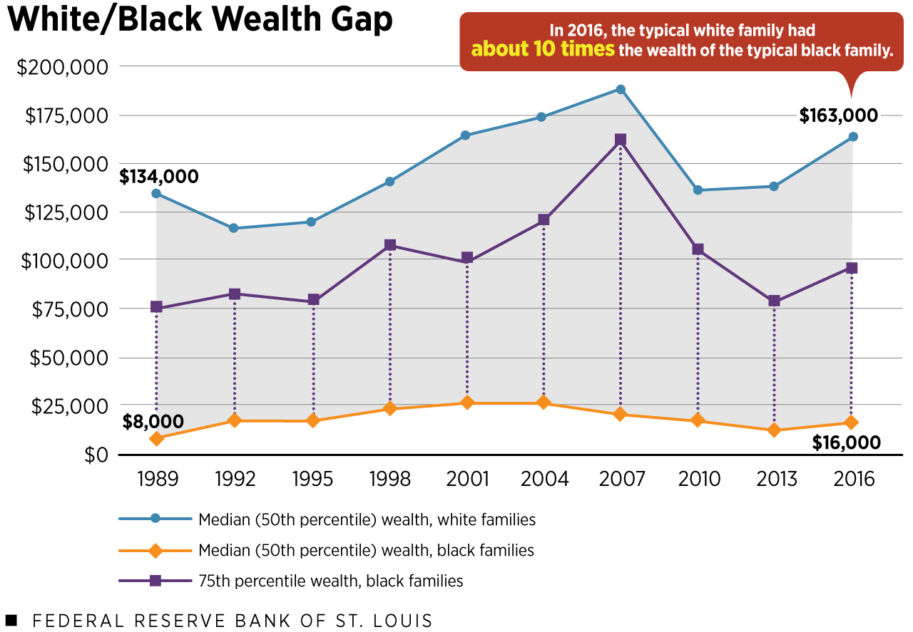
Notes: Dollar values are CPI-U adjusted to 2016 dollars and rounded to the nearest $1,000.
Sources: Federal Reserve Board’s Survey of Consumer Finances and authors’ calculations.
Description: This line chart displays the white/black racial wealth gap from 1989 to 2016. The top horizontal line shows the median (50th percentile) wealth of white families, which was $134,000 in 1989 and $163,000 in 2016. The bottom horizontal line shows the median (50th percentile) wealth of black families, which was $8,000 in 1989 and $16,000 in 2016. The tops of the dotted vertical lines indicate the 75th wealth percentile for black families; notably, these never reach the 50th wealth percentile of white families.
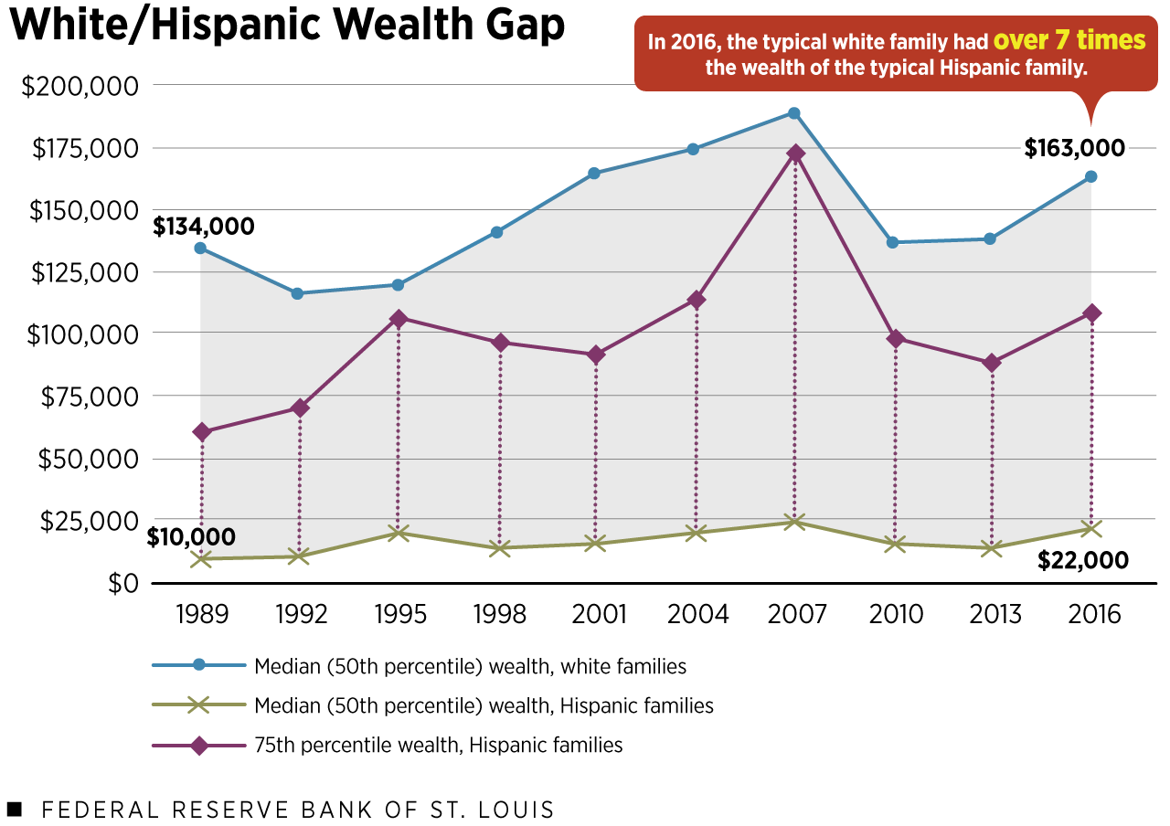
Notes: Dollar values are CPI-U adjusted to 2016 dollars and rounded to the nearest $1,000. Comparative figures result from using unrounded numbers.
Sources: Federal Reserve Board’s Survey of Consumer Finances and authors’ calculations.
Description: This line chart displays the white/Hispanic ethnicity wealth gap from 1989 to 2016. The top horizontal line shows the median (50th percentile) wealth of white families, which was $134,000 in 1989 and $163,000 in 2016. The bottom horizontal line shows the median wealth of Hispanic families, which was $10,000 in 1989 and $22,000 in 2016. The tops of the dotted vertical lines indicate the 75th wealth percentile for Hispanic families; these never reach the 50th wealth percentile of white families.
By “typical,” we mean a family at the middle or median; in other words, the 50th percentile of the wealth distribution for that race or ethnicity. This middle wealth value is a useful approximation of the “typical” family’s experience because it is more resistant to extremely high- or low-wealth families than the average.
The figures above show that over a nearly three-decade period, the U.S. has seen very little progress in narrowing racial and ethnic wealth gaps.
In terms of the total wealth pie that we examined earlier—$86.87 trillion in 2016—white families in 2016 owned 89% of it, while black and Hispanic families owned a 3% sliver each.
This is especially troubling given the changing racial makeup of the population. More than 1 in 4 families are headed by a black or Hispanic person, up from 1 in 5 in 1989. Yet their slivers of the economic pie have barely budged, according to our research.
What might be particularly indicative of the magnitude of the racial wealth gap? In no survey year of the Fed’s Survey of Consumer Finances, 1989 to 2016, did the wealth of black or Hispanic families in the 75th percentile reach the wealth level of white families at the 50th percentile.
4) The educational wealth gap has grown.
Thirty-four percent of families were headed by someone with at least a four-year college degree in 2016, up from 23% in 1989. This may reflect a growing belief that college helps people get ahead financially.
Indeed, looking at the whole, we find that families with a four-year degree or higher are doing quite well; they had roughly three-quarters of the wealth pie in 2016, up from half in 1989. Four-year college graduates and postgraduates have also seen their median wealth grow in real terms (i.e., after adjusting for inflation).
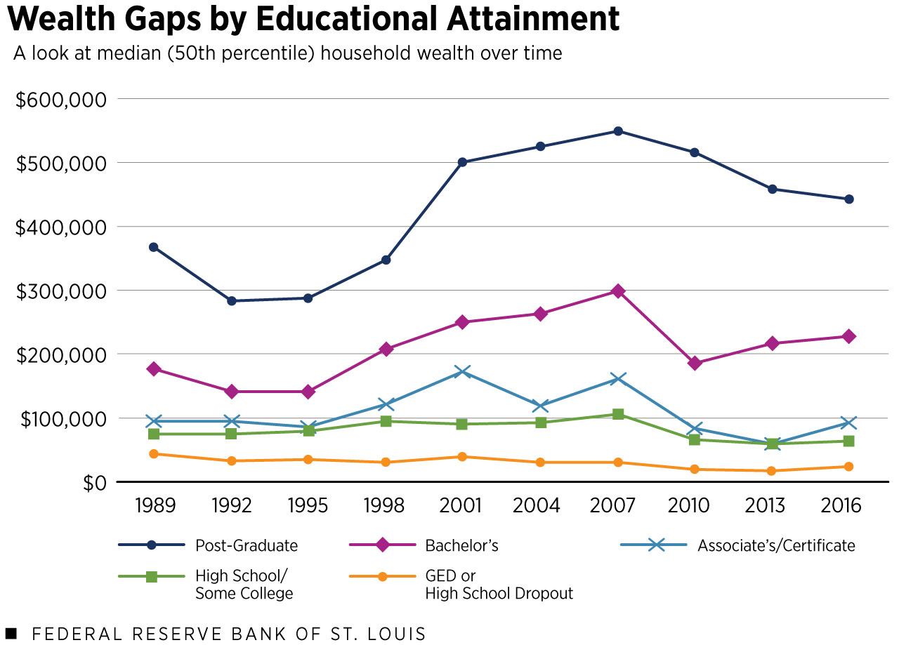
Sources: Federal Reserve Board’s Survey of Consumer Finances and authors’ calculations.
Description: This line chart displays the educational wealth gap, 1989 to 2016. From top to bottom, the median household wealth values of five educational groups are shown: families headed by someone with a postgraduate degree; a bachelor’s degree; an associate’s degree or certificate; a high school degree or some college (but no degree); and a GED or a high school dropout. In 1989, the median wealth of each group of families was $367,000, $176,000, $94,000, $76,000 and $45,000, respectively. In 2016, the median wealth values were $443,000, $229,000, $93,000, $64,000 and $24,000, respectively. Dollar values are CPI-U adjusted to 2016 dollars and rounded to the nearest $1,000.
On the other end of the spectrum, families with less than a high school degree or at most a GED have about half as much wealth at the median than families with the same education level did in 1989.
The group of families with at most an on-time high school degree (including families with some college experience, but no degree) has also experienced wealth losses at the middle, relative to similar families in earlier survey years.
Meanwhile, the median wealth of families with at most a two-year college degree or certificate has fluctuated, but in 2016 it was very similar to the median wealth of 1989 families headed by someone who’d attained the same level of education.
Taken together, the wealth gap has grown between families who are headed by someone with a four-year degree and families who are not.
5) The generational wealth gap also has widened.
The generational wealth gap has grown, too.
For example, let’s compare a group of younger families headed by 25- to 35-year olds to a group of older families headed by 65- to 75-year olds.
Taking the median, or middle, wealth value of each of those age groups, we see that older families had more than seven times the wealth of younger families in 1989. By 2016, this generational wealth gap had grown: older families had more than 12 times the wealth of younger families.
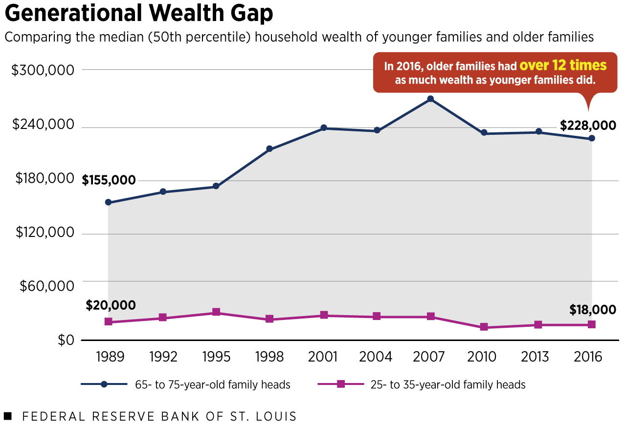
Notes: Dollar values are CPI-U adjusted to 2016 dollars and are rounded to the nearest $1,000.
Sources: Federal Reserve Board’s Survey of Consumer Finances and authors’ calculations.
Description: This line chart displays the generational wealth gap from 1989 to 2016. The top line shows the median (50th percentile) household wealth of families headed by 65- to 75-year olds, and the bottom line shows the median household wealth of families headed by 25- to 35-year olds. In 1989, these values were $155,000 and $20,000, respectively. In 2016, these values were $228,000 and $18,000, respectively.
Older families have more wealth than same-aged families did in years past, while younger families have less wealth. We find that age 60 is a demarcation point. Families headed by someone age 60 or older in 2016 had more wealth than similarly aged families in 1989. Meanwhile, families headed by someone younger than 60 had less wealth than similarly aged families.
My colleagues and I examine this in depth in our recent Demographics of Wealth series.
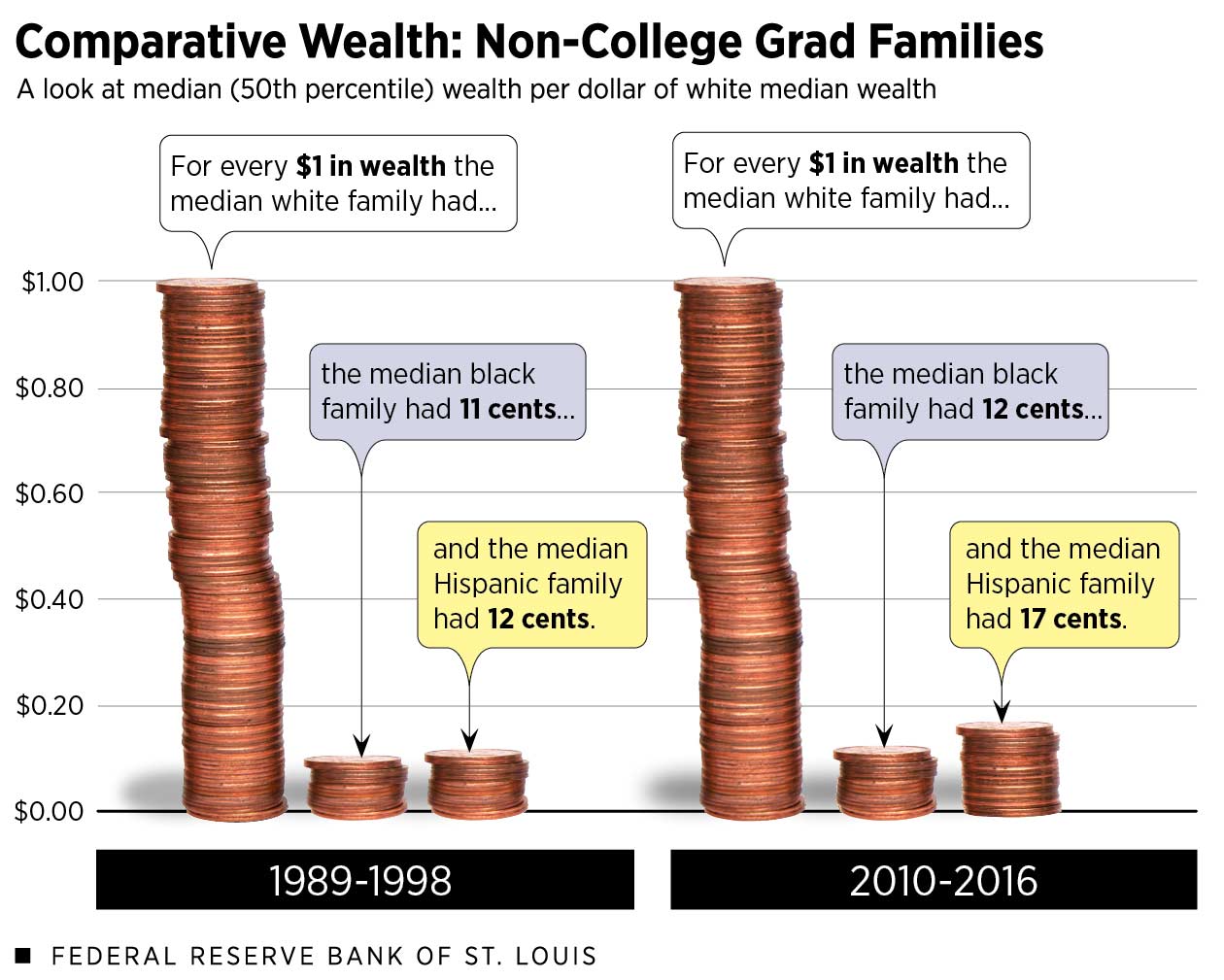
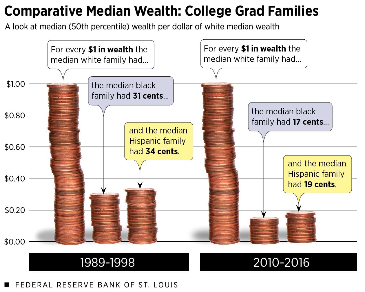
6) The racial wealth gap is large for college graduates and nongrads.
While college is touted as the great equalizer, the data show that large racial and ethnic wealth gaps remain.
To examine gaps, let’s look at the median wealth of white, black and Hispanic families with four-year college degrees. We’ll also look at the median wealth of white, black and Hispanic families without four-year degrees—from here on out, called “nongrads.” Taking this approach helps us to control for education.Because the sample size of black and Hispanic college graduates is very small in some survey waves, we grouped survey years into an earlier period (1989, 1992, 1995 and 1998) and a later period (2010, 2013 and 2016). This makes long-term trends easier to see. Each family’s wealth was standardized for each survey year and medians were calculated on these standardized wealth values for each period. See the Appendix in the third Demographics of Wealth essay for more detail.
Nongrads
“Nongrads” includes families with at most a two-year college degree, as their wealth outcomes more closely mirror the wealth of families with at most an on-time high school degree than the wealth of four-year college graduate families.
Notes: Dollar values are CPI-U adjusted to 2016 dollars.
Sources: Federal Reserve Board’s Survey of Consumer Finances and authors’ calculations.
Among nongrads, the white/black and white/Hispanic wealth gaps narrowed slightly between the earlier (1989-1998) and later (2010-2016) periods. This trend is largely due to the decline among white nongrads, whose median wealth shrank from $101,000 in the earlier period to $88,000 in the later period.
- At the median, black nongrad families had 11 cents per dollar of white nongrad wealth in the earlier period. By the later period, their wealth had grown to 12 cents per dollar of white wealth.
- For Hispanic nongrad families, their median wealth grew from 12 cents to 17 cents per dollar of white nongrad wealth between the earlier and later periods.
Grads
Among black and Hispanic families headed by someone with a four-year college degree, the racial wealth gaps were historically narrower than among nongrads.
However, the Great Recession hit them very hard, and in recent years the college boost has been depleted to the point where there is little difference in the racial and ethnic wealth gap among grads versus nongrads.
Notes: Dollar values are CPI-U adjusted to 2016 dollars.
Sources: Federal Reserve Board’s Survey of Consumer Finances and authors’ calculations.
This is due in large part to the gains of white college graduates. In the later period, black grads had 17 cents per dollar of white grad median wealth, down from 31 cents in the earlier period. Hispanic graduates’ median wealth went from 34 cents to 19 cents per dollar of white wealth between these time periods.
Conclusions
This series of charts illustrates the wide range in wealth outcomes within the United States. Demographic cuts illuminate vast differences otherwise obscured by aggregate statistics.
Demography may not be economic destiny, but it is strongly related to financial outcomes. Ongoing structural and systemic barriers may make it difficult to narrow gaps for some racial and ethnic groups.
Based on past research, here are four recommendations that could help families build wealth.
Help families build a rainy-day fund.
Having cash on hand contributes to financial stability and greatly reduces risk of hardship. These funds can be built through employers, at tax time, through mobile apps, and through innovations such as “prize-linked savings.”
Promote early-in-life investments.
In particular, efforts can be made to expand early education and early savings, such as child savings accounts, which have positive financial and social outcomes. These early investments are likely to have the largest effect on longer-term outcomes, and investing early in children can pay for itself over time.
Examine college costs.
Address the rising cost of college and reduce the need for students to finance post-secondary education with loans. While not for everyone, innovations such as Income Share Agreements, income-driven repayments and College Savings Accounts should be considered.
Support all forms of housing.
Increase the supply of affordable rental housing while promoting paths to sustainable homeownership. Homeownership should be treated as a “capstone” financial event, not a first step; building a diversified balance sheet—with low levels of consumer debts and high levels of liquid savings—should precede and help sustain homeownership.

For an in-depth discussion and additional resources, see the Demographics of Wealth series. Dig deeper into structural and systemic barriers to wealth accumulation here (PDF).
Notes and References
- Dollar values in all figures and text are adjusted with the Consumer Price Index for All Urban Consumers (CPI-U) to 2016 dollars (i.e., inflation-adjusted to represent comparable values or “real terms”).
- These are not the same families being compared over time. Each survey year of the Fed’s Survey of Consumer Finances samples new families, and estimates are weighted to be representative of the entire U.S. population.
- Because the sample size of black and Hispanic college graduates is very small in some survey waves, we grouped survey years into an earlier period (1989, 1992, 1995 and 1998) and a later period (2010, 2013 and 2016). This makes long-term trends easier to see. Each family’s wealth was standardized for each survey year and medians were calculated on these standardized wealth values for each period. See the Appendix in the third Demographics of Wealth essay for more detail.
This blog post was updated Dec. 5, 2019, with additional authorship attribution.


This blog explains everyday economics, consumer topics and the Fed. It also spotlights the people and programs that make the St. Louis Fed central to America’s economy. Views expressed are not necessarily those of the St. Louis Fed or Federal Reserve System.
Email Us
